

remember PCM is just libertarian bullshit
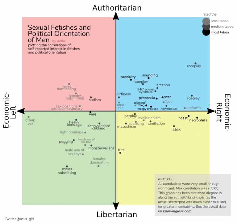
race play in authright smh
Thats the worst thing ive ever seem today, thx i hated it
deleted by creator
Removed by mod
damn authleft is into some serious domination complex
can’t say I’m opposed…
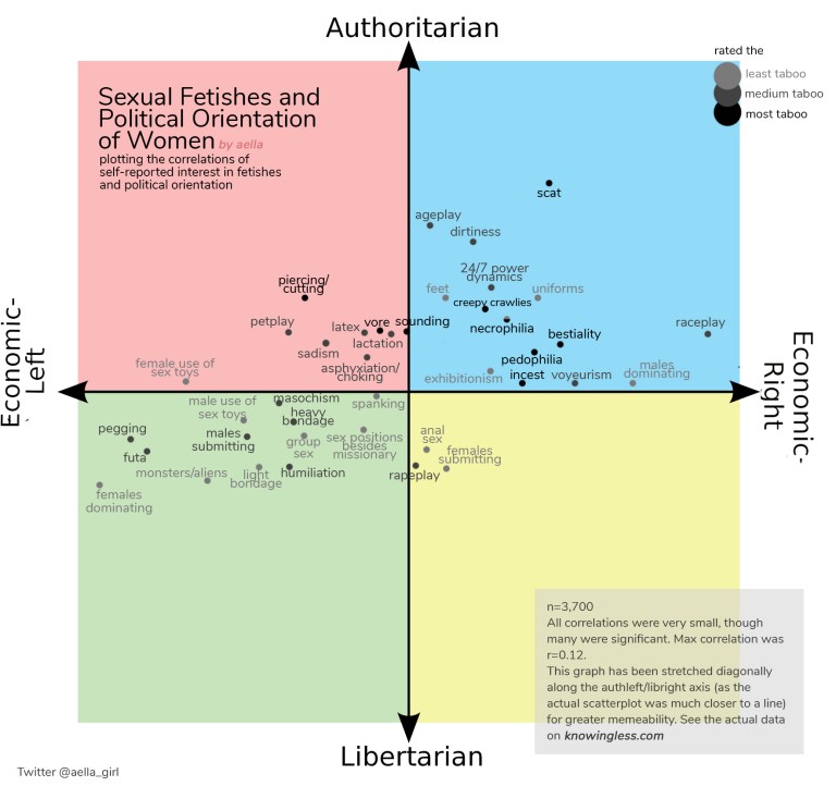
This looks like bullshit. What is the source for this? They even claim in the image that the correlations are very small so they stretched the graphs.
deleted by creator
Thanks
The chart is useless as it gives no ability to really compare. The correlation of “males submitting” in one quadrant doesn’t mean it’s not present in all the other quadrants but simply that it is stronger in that one. The absense of it elsewhere gives a wonky impression of the sexual landscape though.
It’s a dataset that absolutely should not be presented in this way.
Take any results from this with a grain of salt, especially if this is based off people’s results from the test on the political compass website. Even most hardline MLs tend to score deep in the “libertarian” left quadrant because you basically have to be a NazBol to score in anywhere the upper left.
deleted by creator
deleted by creator
deleted by creator
mark this post as nsfw, and pm me when you do.
deleted by creator