Liberal try to understand basic symbolism challenge (impossible, just make the flag red and put a hammer and sickle on it)
The union jack does not deserve to be even close to an socialist flag.
this, what are they doing, this is like a HOI4 flag
It might, if you superimpose a skull on it. Or have the sickle stabbing the shit out of it.
deleted by creator
Libs reading your comment: 😐🙂😀😊😁😳😡🤬
deleted by creator
I’d leave the Southern Cross in - it has always represented the Australian land mass. It’s not politically loaded.
On the other hand, the Commonwealth Star represents the original 6 colonies and “The Territory of Papua and any futre territories” and needs to fuck off. Replaceit with something that represents a forward-looking restoration of indigenous culture and synthesis of settler cultures; The aspiration to build something worthy out of the cultural destruction of colonialism.
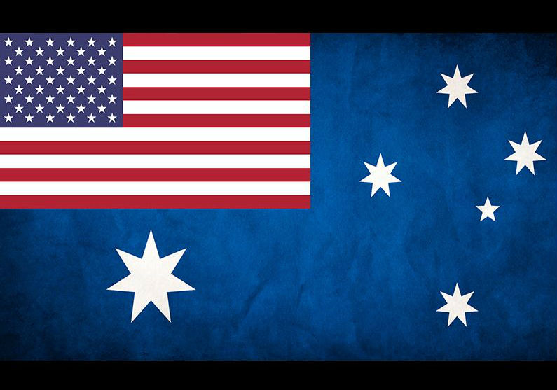
And then obvs the Union Flag in the canton should be replaced with either a Hammer and Sickle or a Drop Bear riding a surplus US submarine.
it has always represented the Australian land mass. It’s not politically loaded.
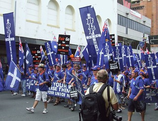
If anything, it’s become a long-standing symbol of the labor movement from their big miner’s rebellion (although it’s stylized differently). Pretty sure Australia has workers unions flying it.
edit: yep, their Builders Laborers Federation uses/used it along with some others
I’d be willing to accept the union jack if it’s surrounded by the local biodiversity showing it what for. Talking funnelweb spiders, cassowaries, kangaroos, inland taipans, topping it all off with gympie gympie.

Infinitely better than original
i dont even like the southern cross constellation being in our logo, but i only joined yesterday anyway so idk here’s what i think it should be
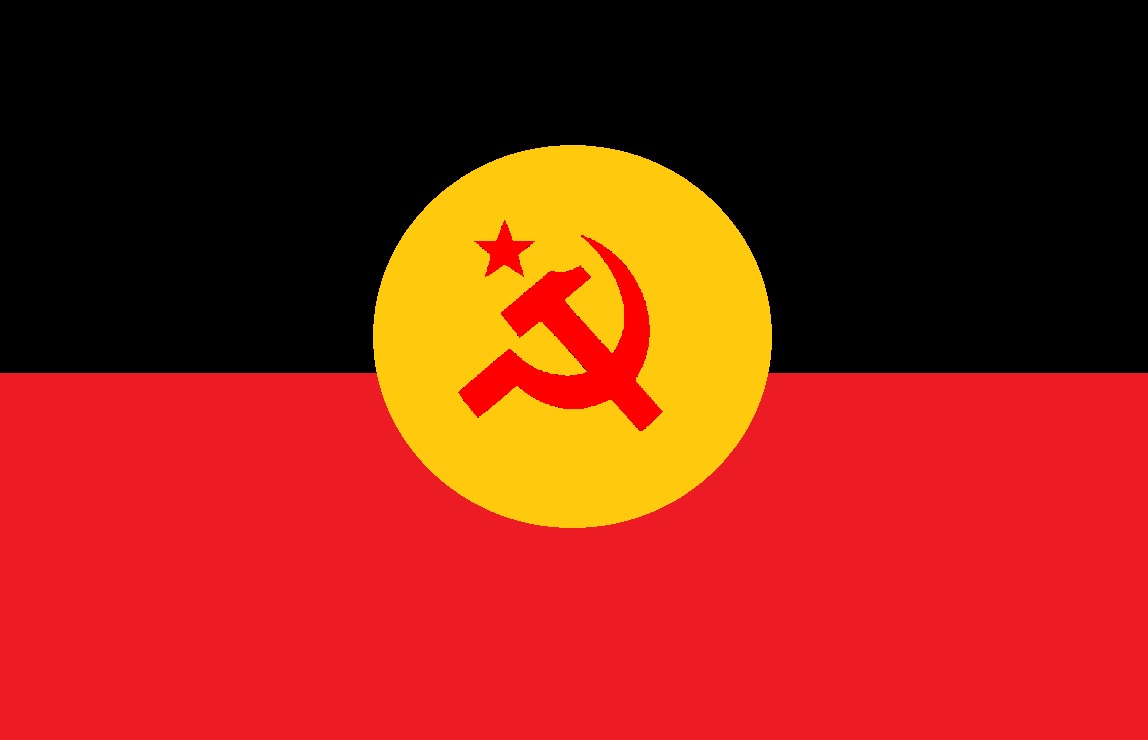
IMO, any country on the business end of colonialism needs to bring the symbols of the indigenous peoples to the forefront if we’re going to start redesigning flags.
Yes
What the Australian government really wants
Ugh, step 1, before doing any left aesthetic, get motherfucking RID OF THAT UNHOLY SYMBOL! Also, hammer and sickle in wrong corner+Lazy design+ratio lol jk but ya that flag is ass
Hmm, I have to remove one of the parts of the Australian flag to make space for hammer-and-sickle iconography. Should I discard the symbol of colonial and neocolonial repression, of the coexistence of miserable poverty and preposterous wealth, and of continuous resistance against social progress, that has been haunting billions for centuries; and keep the stars, universal sources of comfort and inspiration, observable by anyone but possessable by none, faraway and foreign worlds driving both fantasy and endeavour since the very dawn of humankind? I think I have a better idea…
FAKE! the first official decree regarding flag design would the obviously throw the whole thing out the window and make a new one from scratch, smh my head
Graphic design is my passion
this is pathetic and oversaturated
The five stars that make the Southern in one corner and a boomerang & shovel, to represent the Aboriginal people & mining, in the other.


