

looks pretty sick ngl, would probably use if given the option
disclaimer: some of my css work has received feedback such as “very stylish! wish i could read it tho”, “it’s like a disco flashbang”, and “why.” so take that for what it’s worth
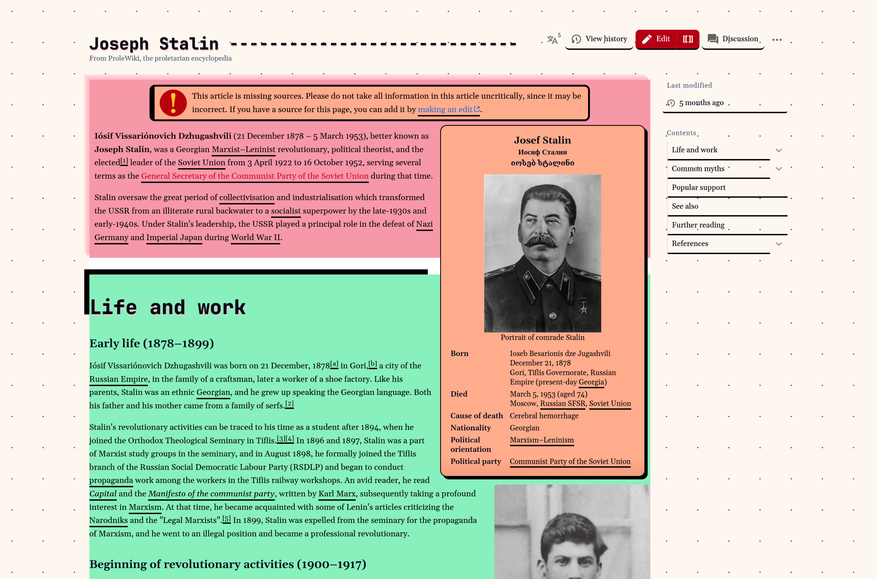
More like NeonBrutalist.
I don’t like the thick upside down L shaped black border. Otherwise it’s fine. But is the change really necessary? Does it help with readability or does it hinder?
It uhh does things to one’s brain and that’s about it
I wouldn’t be able to read from it. Maybe it could be an option?
Seems as if it’s suppose to be a shadow of the text box, look at the other text boxes. Guess they accidently fumbled that box shadow, and it just cut off. It’s pretty cool regardless, and a good visual interface can certainly help engagement and reading.
I am pro
I honestly kinda dig it. Although, I’d just stick with monochrome.
i think the colors are not the right ones but i like the idea
Tbh i like more colorful websites
I probably wouldn’t use it if I actually want to read something, but I think it looks dope af.
I like it but the green, red and orange does reduce readability too much, in fact it kinda discourages it.
I like this
that marxists.org feel
I like it


