Source: World Bank life expectancy data (indicator SP.DYN.LE00.IN)
Obviously, the “Russian Federation” here was the USSR before 1991
Whoever chose the colors for this can eat a bag of dicks.
deleted by creator
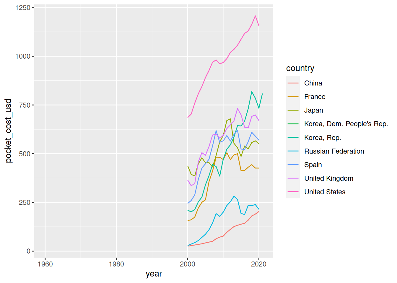
I got some more World Bank info (unfortunately only goes back to 2000) and it seems out of pocket healthcare cost has gotten a bit more expensive (although still quite cheap compared to other countries).

that’s a truly awful choice of colours
You got a link? I wanna see how some other countries fare on this metric.
Thanks
deleted by creator
why does the dprk’s drop so much around 2000?
Arduous march, period after the fall of the USSR. Losing your main trade partner does that.
ah, ok, thanks for the context. i forgot the fall of the ussr caused so much suffering in the world. another reason to hate amerikkka
“You see, its because gabitalism and fredome that were introduced by Dong XioBing that china has been able to lift millions out of poverty and increase the standards of living”
USA, how u doing?
wtf is that drop??
I’m pretty sure that’s the toll of the US’ abysmal handling of COVID-19
Is that
ggplot?


