
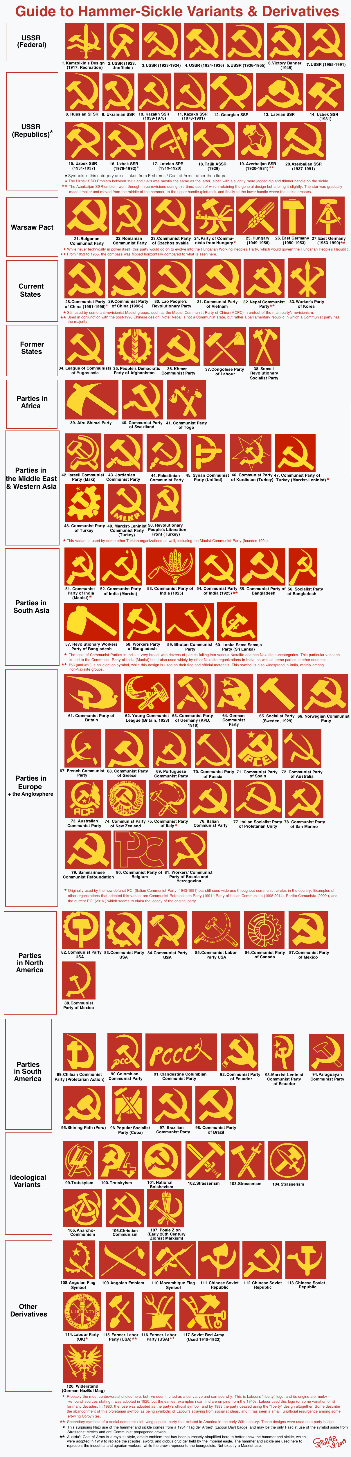
Why in the ever living fuck is strasserism and other nazbol stuff on here
Yeah who made this list???
Didn’t even put the CPA (1936 = 1965)
or the workers’ parties of Tunisia/Algeria (Trotskyists)
Tunesia one is beautiful. I love how it incorporates elements of the national flag like keeping it in the circle and also the star.
i would guess not an ml since they call post Mao china revisionist
Maki is anti-Zionist at least

deleted by creator
I just love DDR’s #27 symbol to death. I call it the “communist nerd symbol.” I also really like the Angola flag one as it is closer to the tools that would be used on the other side of the Atlantic in Brazil, rather than a sickle. We could easily appropriate it.
DDR one rules.
deleted by creator
I really like the gear/sprocket variants. Also, replacing the sickle with wheat makes more sense - sickles are artisanal these days.
I prefer gear/sprocket tbh as they are simpler , which makes them good on flags . Though I dont like what the Communist Party of Canada has going for it , to much detail imho
I like the People’s Democratic Party of Afghanistan - shows that wheat can be kept simple.
The Communist Party of Canada looks more fitting as a badge or pin - def too busy for a flag
it seems like the one here is an older design , the one they use now is a bit simpler:

🇦🇴’s symbol on their flag is the coolest
Angola and Mozambique are probably my favorites. Can’t think of better symbolism, for the struggle it must have taken them to drive the Portuguese out of their countries.
1dt place Korea, 2nd place Angola
seconded
this one
Where’s that one from?
party wise, none, it is an ideia that goes around on how the flag of future Democratic Republic of Brazil should be
It’s a good design
You know it’s gotta be Angola
i didnt like it at first but the CPB’s new logo’s been growing on me
It looks like the Disney ‘D’ though
i love the big sweeping sickle, goes hard af
Mozambique
This will be a perfect album cover for my upcoming anti-Imperialist rap album: Guns and Hoes.
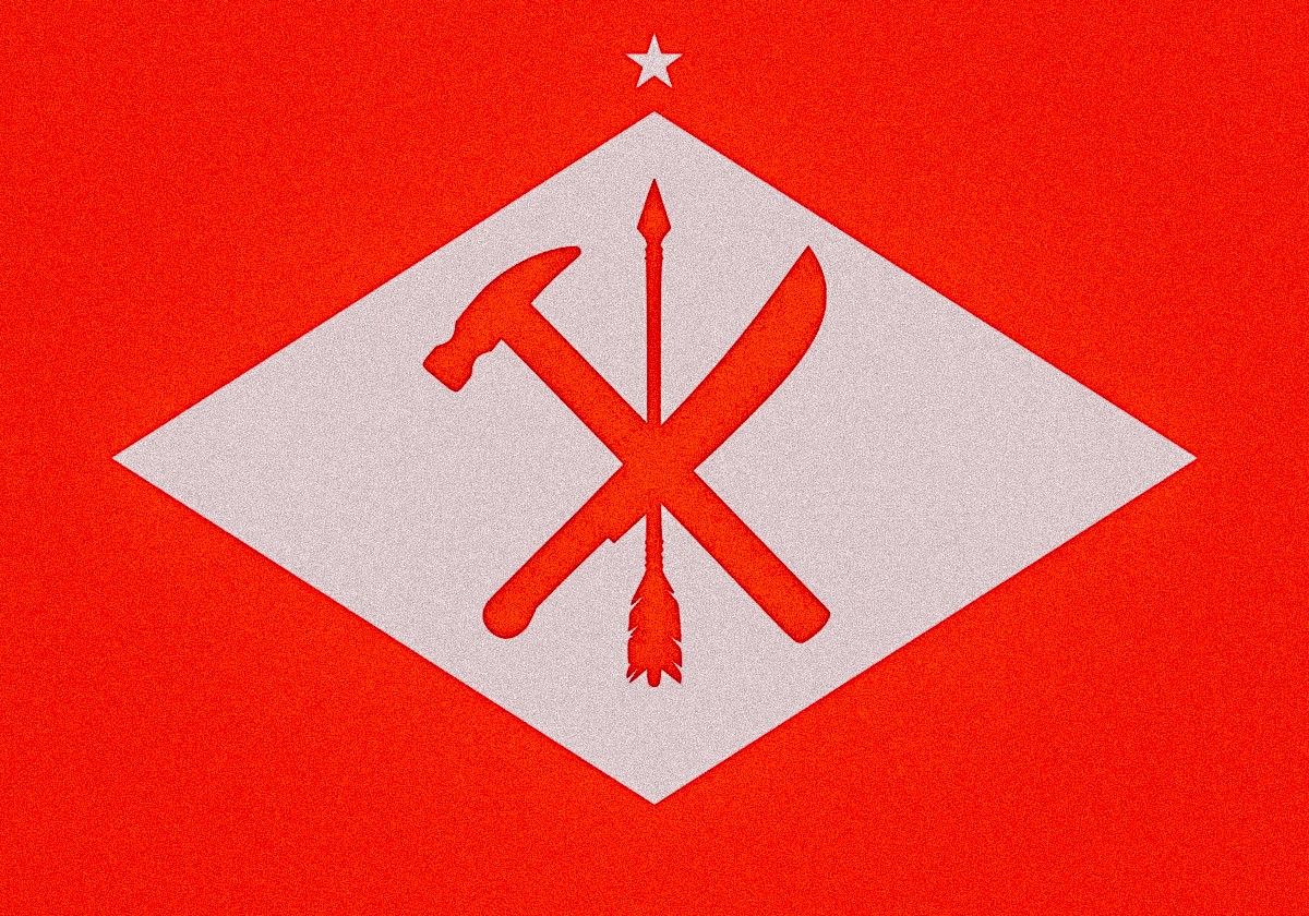
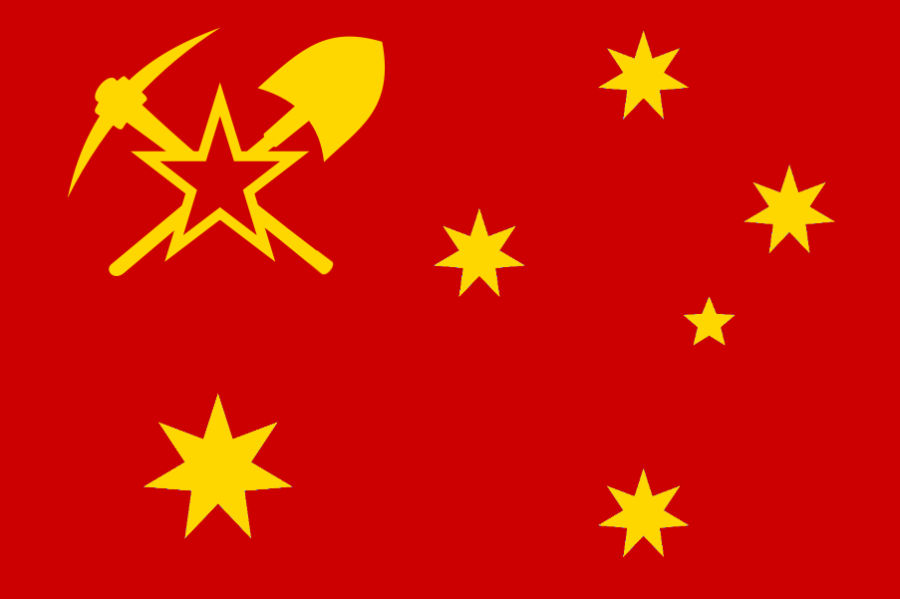
This is just a design some guy online made up, but I like this Aussie variant.
deleted by creator
there’s a couple of flags inspired by aboriginal designs that i’m fond of too, but they usually lack the hammer and sickle or just slap the soviet design on an aboriginal flag
Workers Party is Korea #33
I like that it includes a brush. It is meant to include not just laborers and farmers but also artists and writers and such. I think that pretty cool of them.


