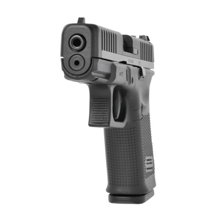
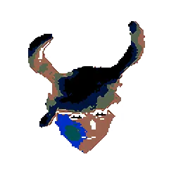
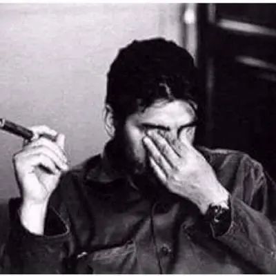
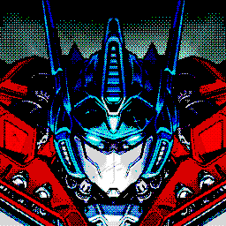
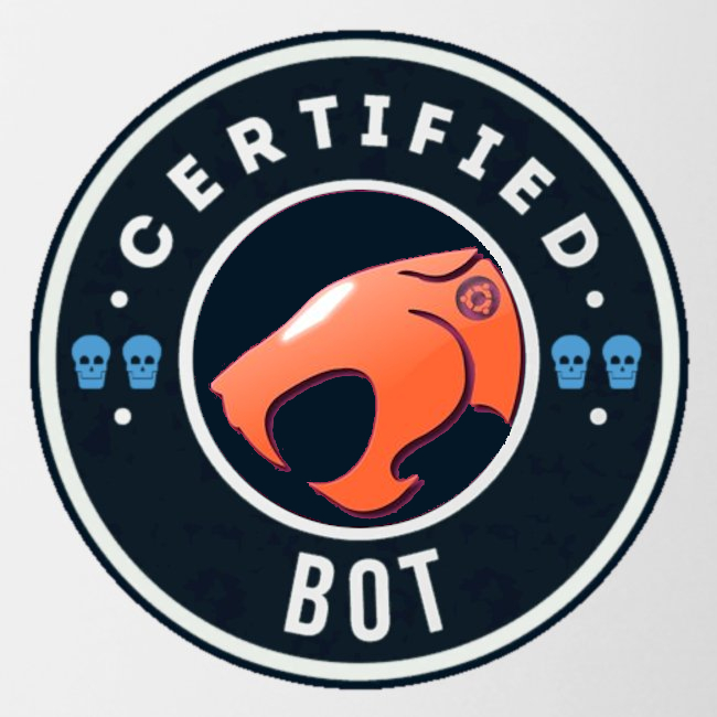
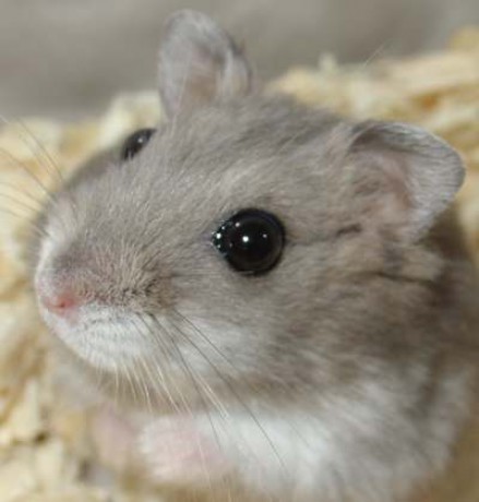
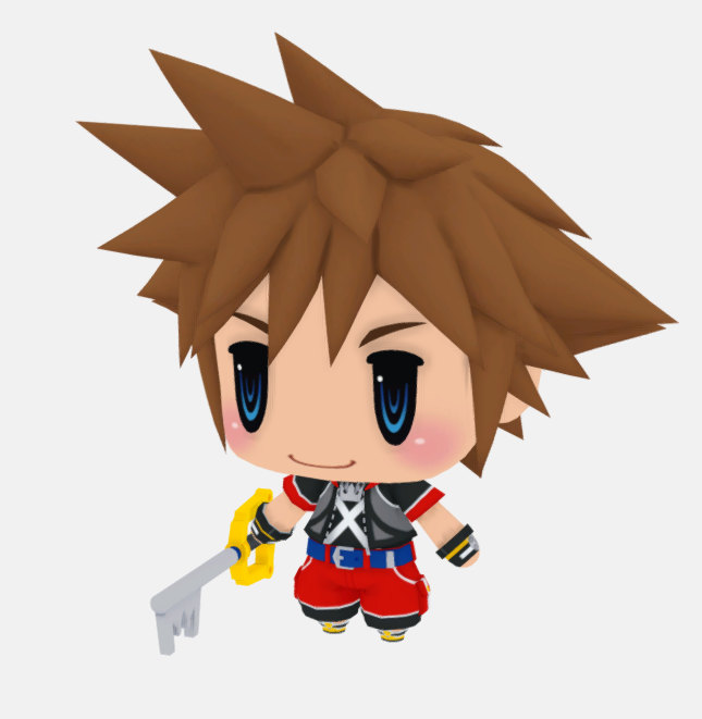
I noticed for one of the largest communities, there was no icon! It looks strange in the Communities view. Anyways, I mocked these up trying to use the Lemmy logo. If you like any of them but it’s not quite right, I can adjust it - or if you have a new idea, I’m down to try that too!
This looks like a perfect candidate for an interrobang!
I like the 1st one. I think I would like it even more if you filled in the nose with the black making it the dot in the question mark instead of a square dot.
5 is my favorite. 5 > 4. 2/3 would be great with a circle at the bottom of the question mark. 1 just looks weird to me.
2
5
(Hopefully) pinging Community owners so they can pick one - @Cloak@lemmy.ml @Gabe@lemmy.ml
Seems like they’re absent, so we need someone to take over this community.
Hey i’m back, sorry!
No probs.
Is there a way to “siege” communities with absent mods, or do you just make friends with the admins oO
Hehe no, u just be the first person to ask, and we check mod activity. I’ve added you as a mod here ☺
5
5
I like the third one!!!
I’d like it if the 3 Lemmys could have question marks over their heads
/edit: or only 2 Lemmys, and the one in the middle has an exclamation mark
I really like the second one, but all of them are cute and beautiful, in my opinion. Good work.
5
5, or 3 :)
4 is my favourite
Nice work throwing the choice out there, getting the power to make the decision, and putting a solution in place. It is a small thing, but I love how smoothly (and quickly) that went. Kudos especially to the OP and to the community. This is the kind of thing that keeps me engaged even when the option I was rooting for lost out.


