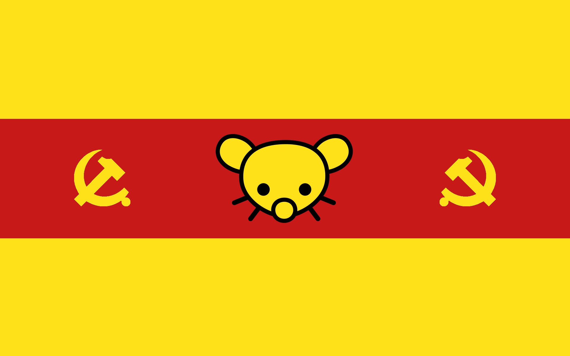
Why asymmetrical? It is perfectly symmetrical. But if everyone likes it better like that we’ll go with that. What do you think of the yellow lines between the blue and the red, should they be bigger?
What do you think of the yellow lines between the blue and the red, should they be bigger?
Would the yellow pinstripes be visible at a distance? And do you drop them in smaller renderings (e.g. in a 16x16 icon)?
I feel like a pragmatic flag design would still be iconically recognisable and consistent in different contexts, but on the other hand: rule of cool.
You can’t see the lines very well when it’s downscaled, but the shape of the symbols as well as the order of the colors make it easy to recognize regardless.
I guess that if it were so small the lines could be exagerated in that particular case to be noticeable. I mean Lemmygrad’s logo couldn’t be properly interpreted at such low resolutions anyway I think.
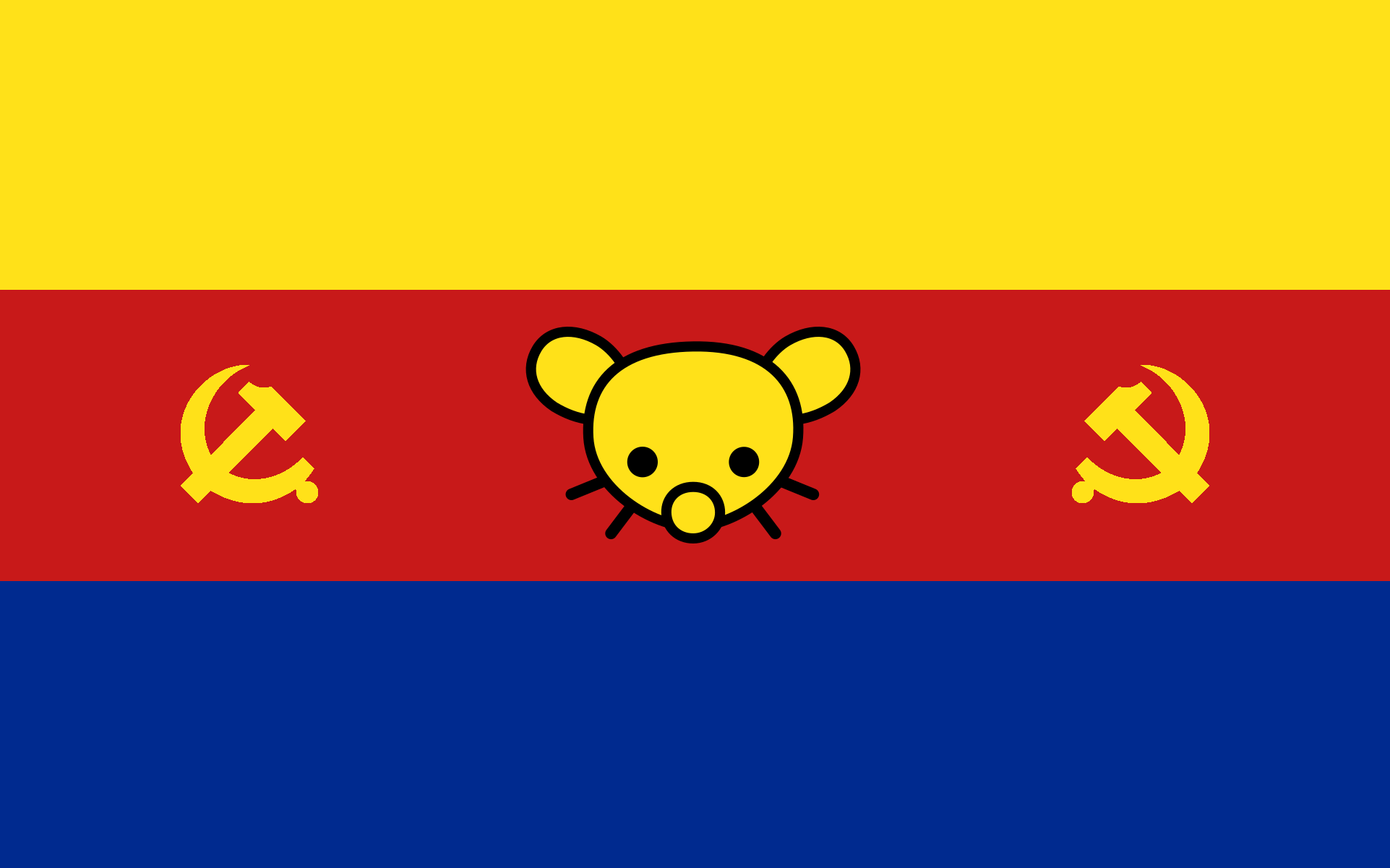
I mean that there’s a star on the top but not the bottom. If one was on the bottom, it would also look weird and make the sides look empty, which is why I’d prefer no star. That’s just my opinion, obviously.
I think the lines are perfect. Too much yellow distracts from the other colors because it looks brighter.


I feel the star makes it a bit too asymmetrical for my liking, so I prefer it without. Otherwise, that looks perfect to me.
Same here
Why asymmetrical? It is perfectly symmetrical. But if everyone likes it better like that we’ll go with that. What do you think of the yellow lines between the blue and the red, should they be bigger?
Would the yellow pinstripes be visible at a distance? And do you drop them in smaller renderings (e.g. in a 16x16 icon)? I feel like a pragmatic flag design would still be iconically recognisable and consistent in different contexts, but on the other hand: rule of cool.
You can’t see the lines very well when it’s downscaled, but the shape of the symbols as well as the order of the colors make it easy to recognize regardless.
I guess that if it were so small the lines could be exagerated in that particular case to be noticeable. I mean Lemmygrad’s logo couldn’t be properly interpreted at such low resolutions anyway I think.
I mean that there’s a star on the top but not the bottom. If one was on the bottom, it would also look weird and make the sides look empty, which is why I’d prefer no star. That’s just my opinion, obviously.
I think the lines are perfect. Too much yellow distracts from the other colors because it looks brighter.
Okay, I’ll wait to see what other people say otherwise I guess we’ll go with this one, but without the star, lol.
It’s asymmetrical around the X axis. Solution: put a star on the bottom as well 👍
Technically it will always be asymmetrical from both axis since the Lemmy logo is something you can’t reflect symmetrically.
I don’t know if it looks too good, though.
damn, you’re right 😑
I think it would probably look better either without any stars, or to center the star(s) vertically within the blue region(s)