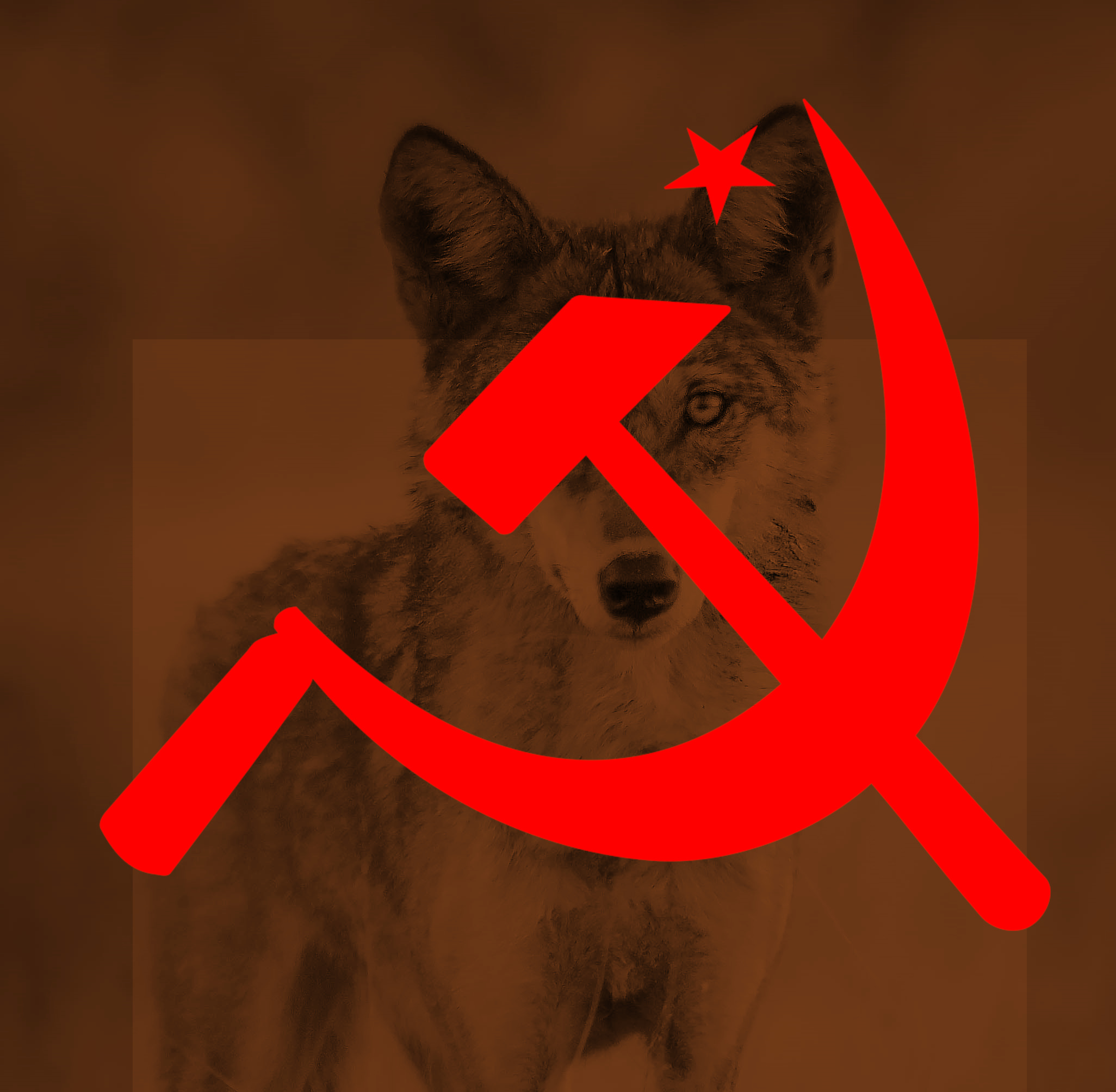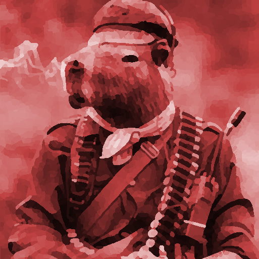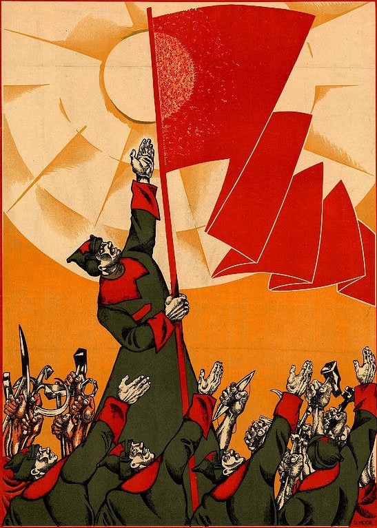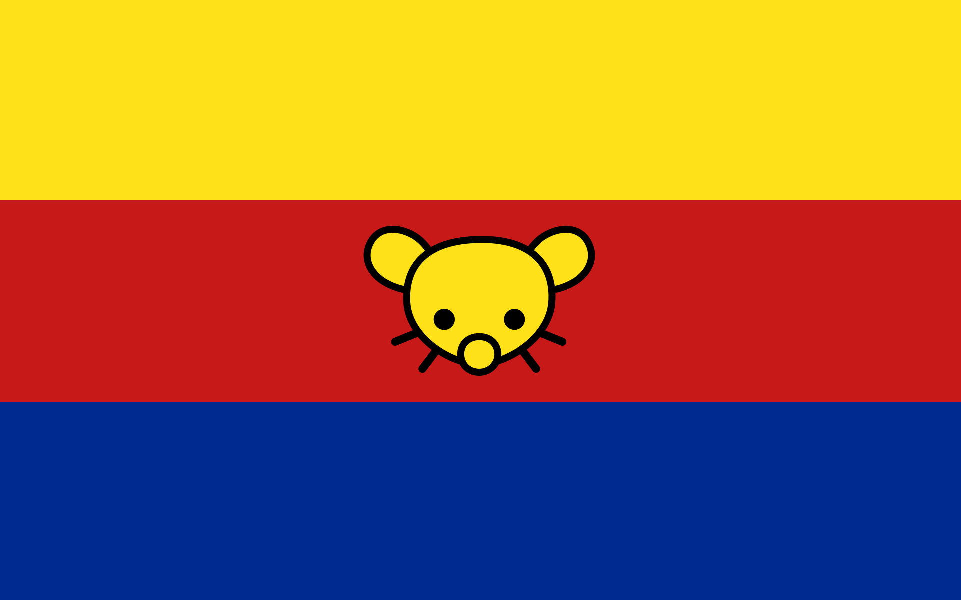
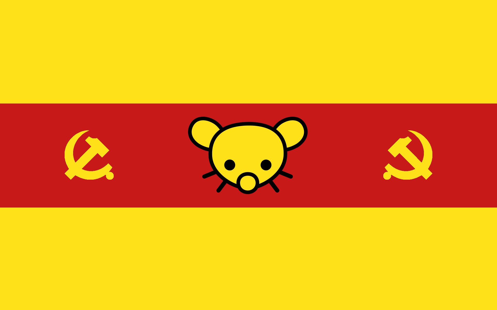
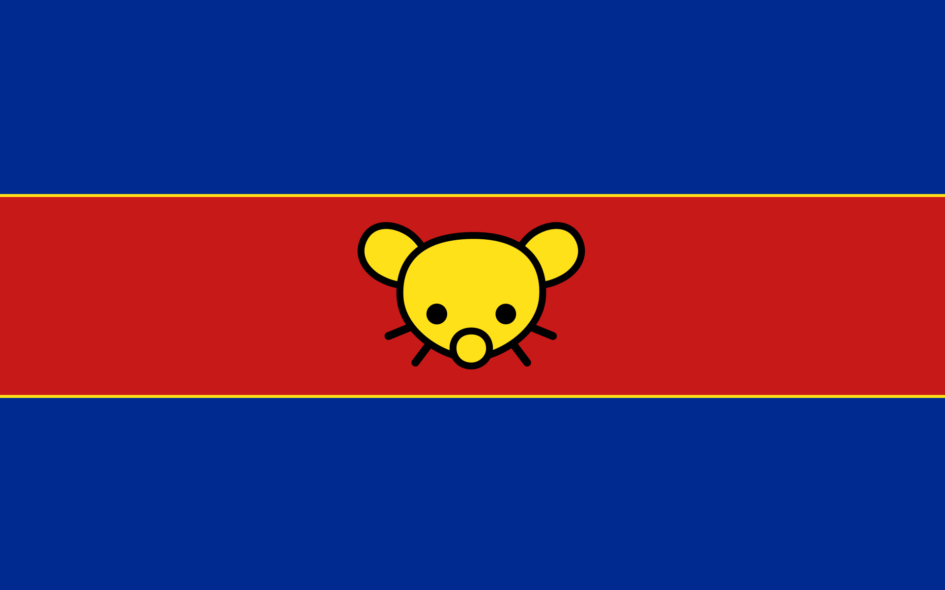
I think all are beautiful 😍
The hammers and sickles on both sides are very interesting. I loved the one with the blue, even though I have no idea what it was supposed to mean. Also why the CPC hammer and sickle? lol
I just used Cuba’s flag blue because communism which I think it is the same blue it’s used in the North Korean flag although I don’t understand colours very much. I don’t know, I like them although I know some people don’t because you couldn’t really use a sickle like that, but I guess to add a mix of various communist countries. Lol.
deleted by creator
I don’t know, to add some yellow because communism red and yellow?
Not particularly fond of tricolors in general, maybe add a canton or some other kind of asymmetry? Feels too European as it is right now.
I was thinking more about Latin American flags, but I guess they were probably designed by Europeans. I will create a design with a canton and share in a few hours.
I like the last one best, but all of them look nice. I think it would look even better if you took the hammer and sickles from the second one and put them in the same places on the last one.
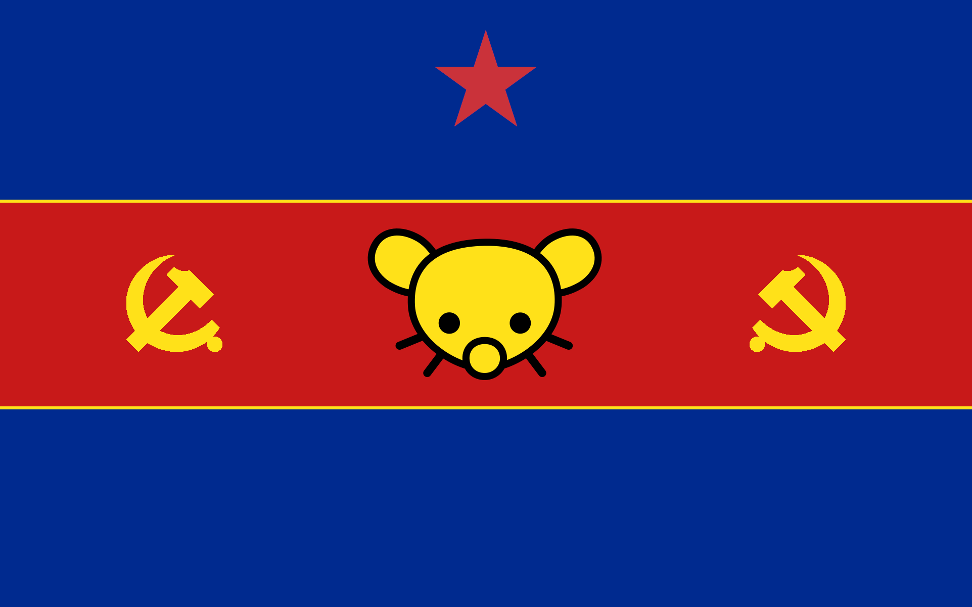
With, or without the star?
this one is wonderful with and without the star
I feel the star makes it a bit too asymmetrical for my liking, so I prefer it without. Otherwise, that looks perfect to me.
Same here
Why asymmetrical? It is perfectly symmetrical. But if everyone likes it better like that we’ll go with that. What do you think of the yellow lines between the blue and the red, should they be bigger?
What do you think of the yellow lines between the blue and the red, should they be bigger?
Would the yellow pinstripes be visible at a distance? And do you drop them in smaller renderings (e.g. in a 16x16 icon)? I feel like a pragmatic flag design would still be iconically recognisable and consistent in different contexts, but on the other hand: rule of cool.
You can’t see the lines very well when it’s downscaled, but the shape of the symbols as well as the order of the colors make it easy to recognize regardless.
I guess that if it were so small the lines could be exagerated in that particular case to be noticeable. I mean Lemmygrad’s logo couldn’t be properly interpreted at such low resolutions anyway I think.
I mean that there’s a star on the top but not the bottom. If one was on the bottom, it would also look weird and make the sides look empty, which is why I’d prefer no star. That’s just my opinion, obviously.
I think the lines are perfect. Too much yellow distracts from the other colors because it looks brighter.
Okay, I’ll wait to see what other people say otherwise I guess we’ll go with this one, but without the star, lol.
It’s asymmetrical around the X axis. Solution: put a star on the bottom as well 👍
Technically it will always be asymmetrical from both axis since the Lemmy logo is something you can’t reflect symmetrically.
I don’t know if it looks too good, though.
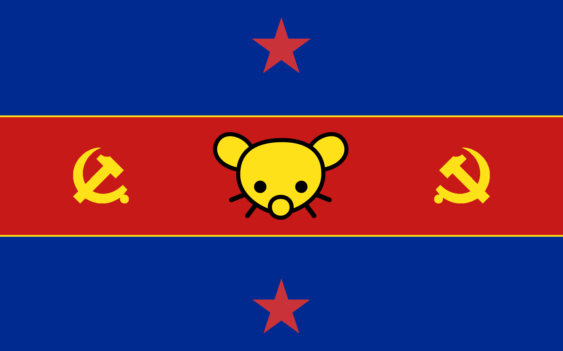
damn, you’re right 😑
I think it would probably look better either without any stars, or to center the star(s) vertically within the blue region(s)
Why choose dark blue? What does that mean? Light blue is more compatible with red stars.
As I mentioned in other comment, I just literally grabbed the Cuban flag colour with the colour picker tool and used it, I think it’s the same blue tone as in the North Korean flag. I am not a professional and have 0 idea of visual design or whatever it’s called, so there’s no particular meaning to everything, I just went with whatever because that’s how my brain thought it could produce something.
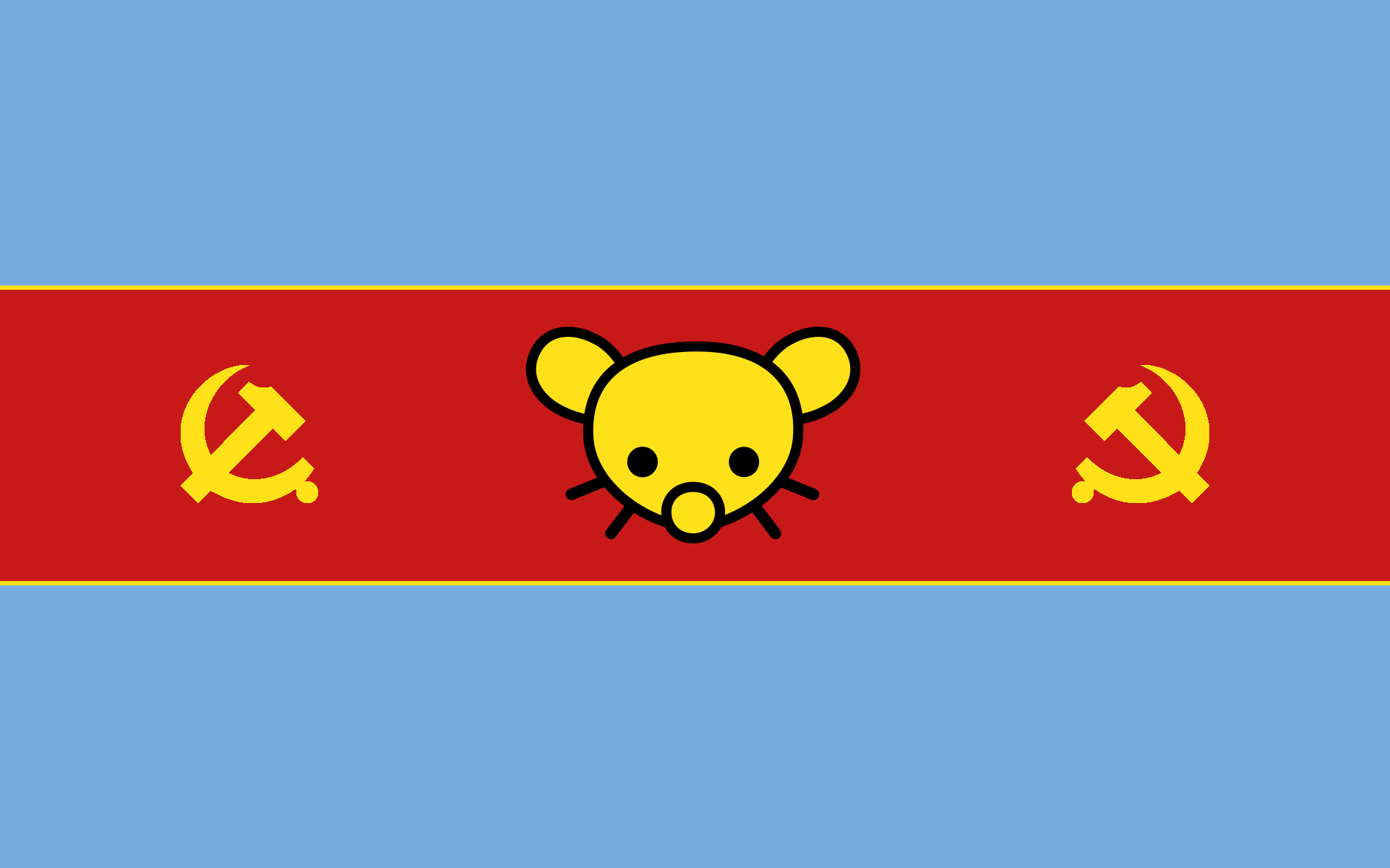
Here’s with the light blue from the Argentinian flag, I don’t think it looks very good:
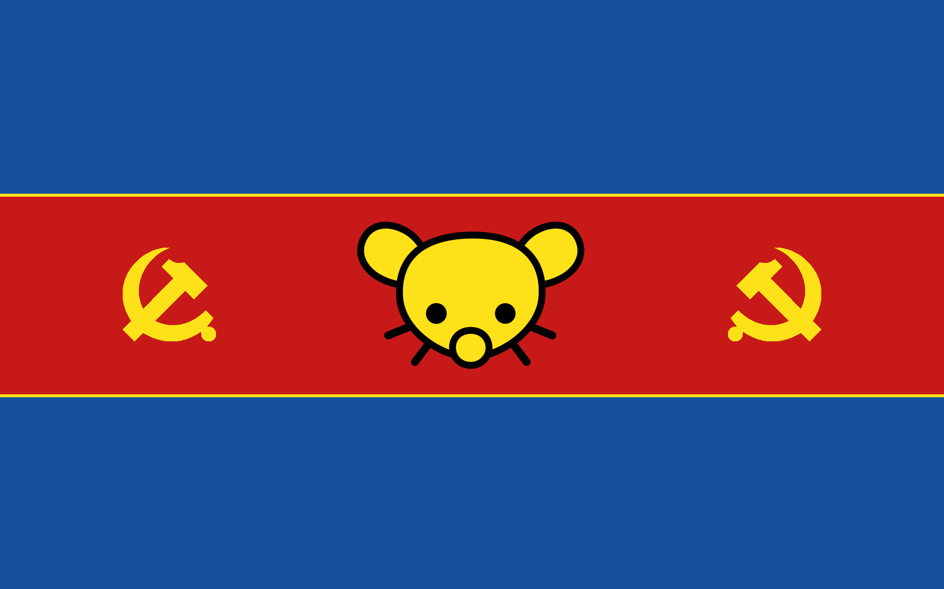
And here’s with a slighter more light blue than the previous, which I think it looks better:
Yeah, that’s the kind of opinion I wanted, if anyone has another symbol you’d like to add that’s also an option.
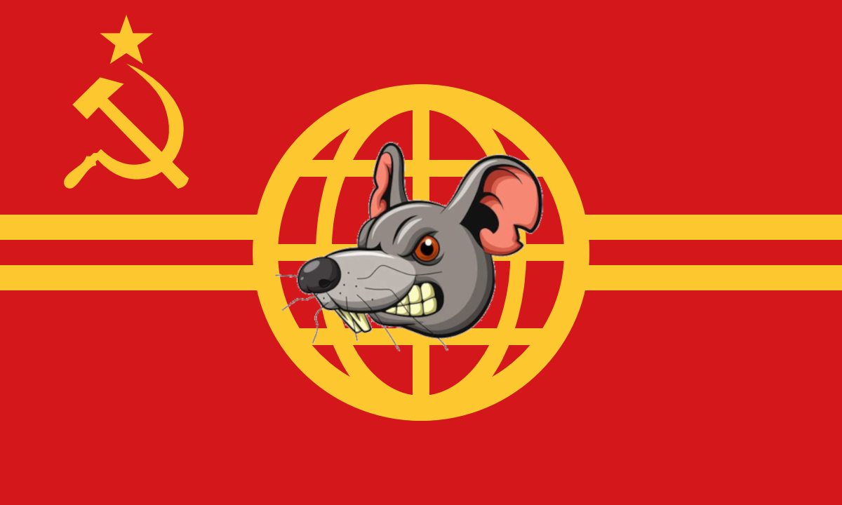
My plan.
It’s a nice design, although obviously with the real Lemmygrad logo on it, can you give me a link to the flag without the rat?
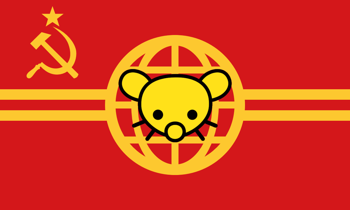
This?
Ehh, I think the lines inside the circle don’t make much sense with the Lemmy dude on top, but maybe it’s just me. Also I really like the Chinese hammer and sickle more but I think I’m the only one on that. Maybe if we only took the circle instead of it looking like a world?
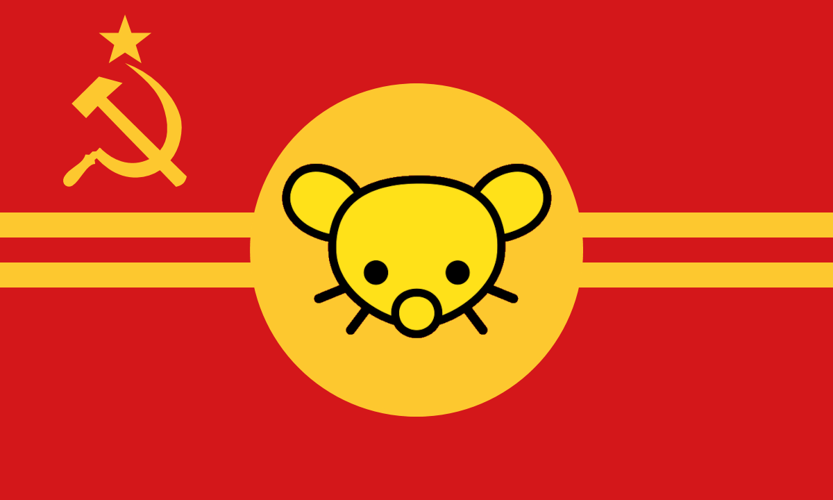
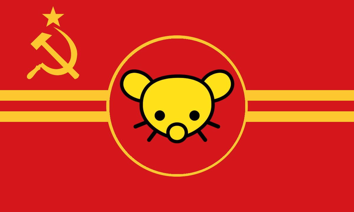
easy
The first design looks neat, where did you get the transparent Lemmygrad rabbity thingamabob by the way? It’d make working with this easier.
where did you get the transparent Lemmygrad rabbity thingamabob
Lemmygrad rabbity thingamabob
IT’S A LEMMING

The rabbity rat mouse chinchilla gerbil thingamabob is a Lemming? Don’t believe ya.

not cool, comrade. It’s just a simple question.
What?
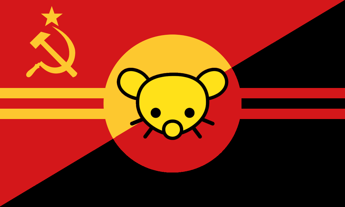
very future version
Sooo, it is a flag that is for and against dictatorship of the proletariat at the same time?
I am talking about the future, and Comrade Lenin believes that the era after the demise of the country.
Noice
Unfortunately, it can be sourced from reddit.
I like the last one best. The first one looks too much like the flag of the Dutch province of North Holland and the second looks too much like the flag of South Vietnam
Okay, I guess we’ll go with that one then, with or without the star?
Without the stars but with the hammer and sickles
So, I’d ask first, what’s the colour symbolism - red is obvious enough, I guess, but why red blue and yellow together in particular, and why a horizontal tricolour?
Also a lot of people in here disliking asymmetry but I would personally have gone for the emblem in the canton like on the Soviet and Chinese flags. But that’s just a matter of taste I guess /shrug
As I mentioned in other comment, I just literally grabbed the Cuban flag colour with the colour picker tool and used it, I think it’s the same blue tone as in the North Korean flag. I am not a professional and have 0 idea of visual design or whatever it’s called, so there’s no particular meaning to everything, I just went with whatever because that’s how my brain thought it could produce something. Nevertheless, though, if anyone has any idea that could have a meaning, I’m open to ideas. I guess blue represents the sky and that represents freedom? At least the Argentinian and Uruguayan flag seem to be like that, and blue is kind of used in Latin America so there’s that, and tricolour is most of the Latin American flags which are the ones I’ve seen the most.
Regarding that last part I’m open to change it, but I think most people like the design like that so I don’t know.
So, we probably associate blue, red and gold with Latin America, as they’re used by Venezuela, Colombia and Ecuador, all were part of Gran Colombia and the tricolour was proposed by a revolutionary Francisco de Miranda.
According to wiki he was inspired by a conversation with Goethe of all people to “create in your land a place where primary colors are not distorted.” Of course, Goethe didn’t understand science too well as he thought that we see light in red, blue and yellow (instead of RGB) but yeah, that seems to be the original meaning of this colour combo.
atm I like the middling blue you show below in the thread, but I’d also make the gold a bit wider, like Munrock said - at distance they’d be impossible to see. Oh and I think the mirrored hamsics look a bit weird, I like having a hamsic there, but I feel like the left one is just ‘wrong’ somehow for being flipped.
Of course, Goethe didn’t understand science too well as he thought that we see light in red, blue and yellow (instead of RGB)…
Does the human eye see color in varying intensities of red, green, and blue? I always thought that was just a technical limitation of TV/computer screens and LEDs. For instance, I recall a developer coworker of mine telling me that any brown you see on a computer screen isn’t true brown, only an approximation.
So, it’s not identical for every person (even discounting people with various forms of colour blindness or tetrachromats who have a 4th type of cone cell) but most humans have trichromatic vision, 3 types of cone cells, which have a peak sensitivity to 3 different wavelengths of light - roughly what we perceive as red, green and blue (they actually are like a bell curve over a range of frequencies/wavelengths, but the peaks are rgb)
I don’t know the exact explanation for the brown thing, but yeah I believe I saw a Technology Connections vid about that a few years ago. The other colour monitors have a hard time with is magenta, can’t do that one I believe. I never really looked into the history of why they chose rgb for colour displays, but I would guess maybe it’s because that’s how our vision works?
I never really looked into the history of why they chose rgb for colour displays, but I would guess maybe it’s because that’s how our vision works?
From what I understand, RGB are the primary colors for mixing different wavelengths of light to produce other colors, so it makes sense that it would more directly map with what the eye’s cones detect.
The RYB that Goethe was talking about are primary colors for mixing different pigments, so paint or ink instead of directly emitting different wavelengths of light. I’m pretty sure the technology to emit specific wavelengths of light didn’t exist at Goethe’s time, but the pigment mixing way of getting different hues had been around for a long time, so it’s not surprising that he would think that’s how eyes work as well. People’s ideas are going to be shaped by the dominant ideas of the time and all that.
Certainly true, no one had figured out electronic lights yet, I guess Newton had already shown the component spectrum of light centuries before this.
As for rgb being just how light works, I don’t think that’s true - other animals have cones different peak sensitivities to us, bees for instance have one type of cone that lets them see in the near-UV. I don’t think there’s anything preferred about rgb, they’re just the colours suited to (most) human vision
Okay, so I think the one you like and who everyone seems to like at least in its basic idea is the one to go, I think I’m going to create another one with a canton or something like that as another option and I’ll create another thread where people can vote better since this one is getting a little cluttered.
where is black color representing anarchy?
it’s invisible to match the historical success of anarchism

please stop being weirdly cryptic
sorry, we just dont encourage anarchism here. I also thought you responded to one of my other comments, through me for a loop, my apologies.
Comrade, there is nothing special. Let’s return to the topic.
Well, which topic? I mean I am just confused by your comment being we are a Marxist community opposed to anarchism.
OK, I’m leaving.
Okay, I dont mean to be rude to anyone, always open to people learning as well :)
Technically Lemmygrad’s logo has black in its outline.
Great idea.


