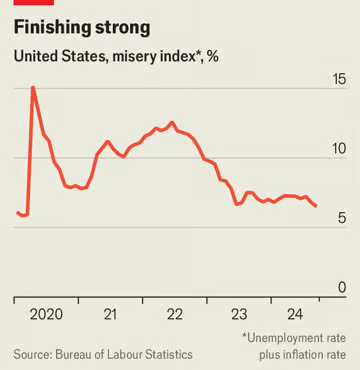
In real terms, after-tax income per person has risen at a year-on-year pace of roughly 2.6% in recent months.
🤣
Are people noticing these improvements? One of the biggest data puzzles of recent times remains as pertinent as ever: despite the economy’s strength, sentiment has been persistently glum.
I wonder why. Couldn’t be because abstract percentages mean nothing if people are working multiple jobs to afford rent, people who should have been able to retire are still working, and prices in stores stay at ludicrous rates while the minimum wage fails to come even close to where it needs to be.
Meanwhile, an alternative measure of economic sentiment—an index calculated by Goldman Sachs, a bank, and based on social-media posts—is much rosier. Its upward lilt points to a clear increase in optimism in the past half year.
Oh my mistake, they forgot to consult Goldman Sachs. 😂 All is okay in the world after all.
Not just Goldman Sachs but the version of Goldman Sachs that is apparently using social media as an improved method of reading tea leaves.
2.6% increase in income is a decrease when food is up 33%, energy up 10%, and housing is up 20–100%. I was once under the impression that economists are essentially mathematicians. Turns out they missed the very basics.
They can delude themselves and their already-deluded readership but they can’t convince people that they’re better off when those people know, viscerally, that their tummy is rumbling all day and that they’re shivering under the covers every night.
If only I could afford an Economist subscription to read about how glorious our economy is
For some time analysts were concerned that this meant Americans were living beyond their means and racking up uncomfortable credit-card debts. But a sizeable revision to income figures last month revealed that the personal savings rate is now about 5%, more than twice as high as in early 2022. The implication is that robust consumer spending is more sustainable than previously thought.
Wait what? Americans save that little amounts of money? And also, is this graph a joke? You’re going to start at 2020? Really?

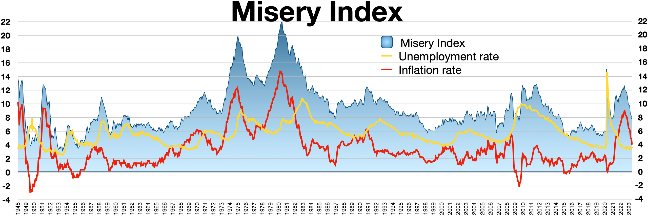
I got a graph of the misery index (honestly, kind of a stupid statistic) for a much longer period of time

The whole of the Trump period has a misery index way lower than Biden’s.
Article lists a bunch of data points.
Are people noticing these improvements?
Gaslighting like only The Economist can do.
I really love the whole whom are you gonna believe me or your lying eyes thing.
XD


