Okay, so everyone liked this one the better, but there’s still a few issues to resolve, since there’s some disagreements over a few small details.
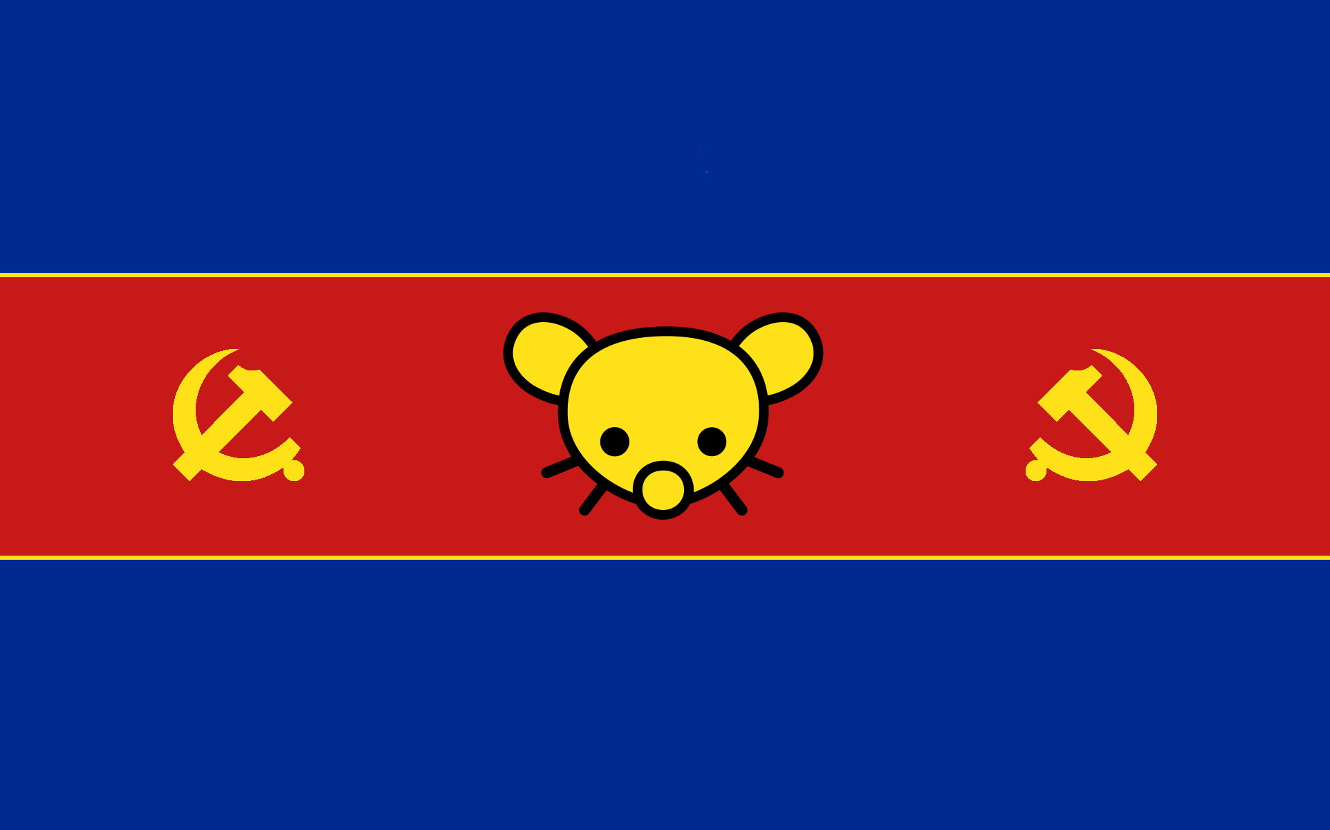 Most liked design so far.
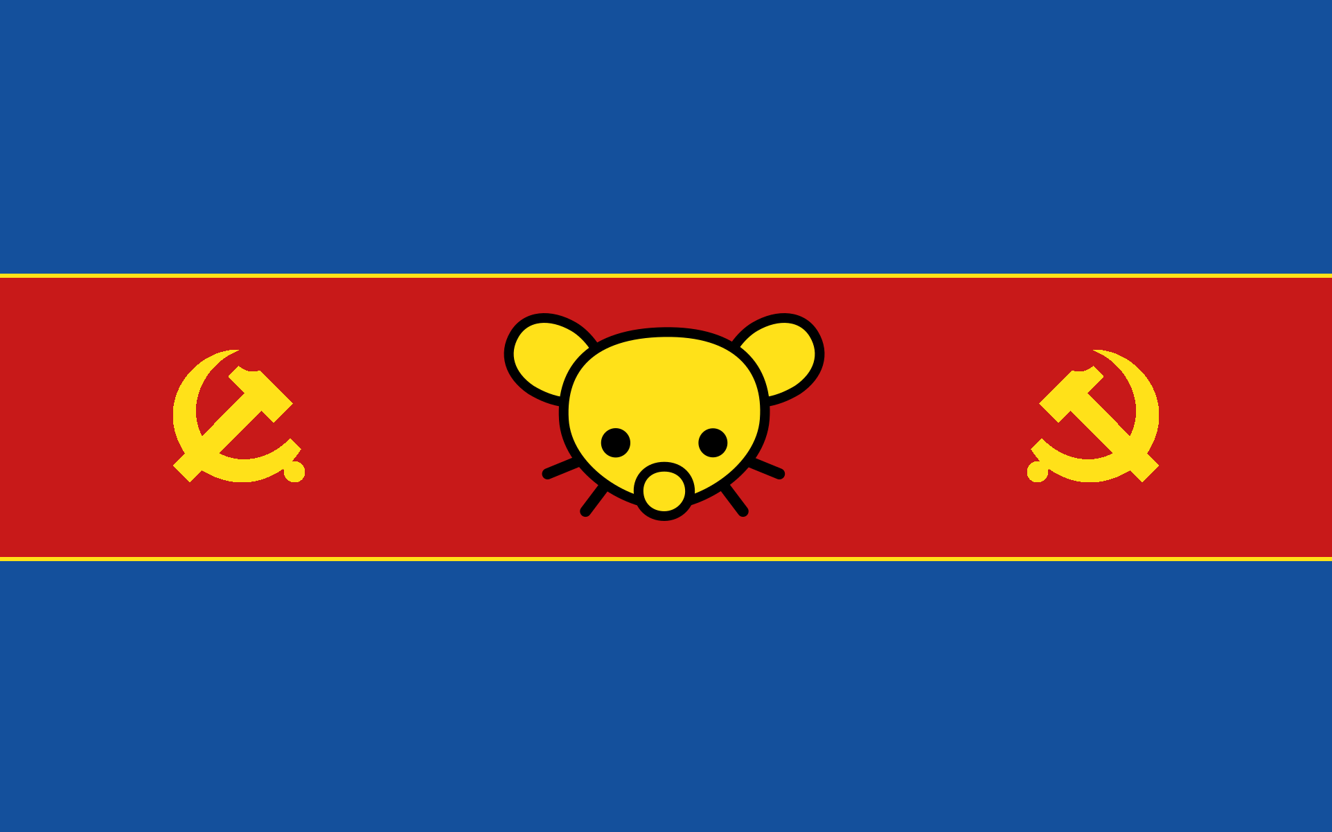 Version with a slight lighter blue.
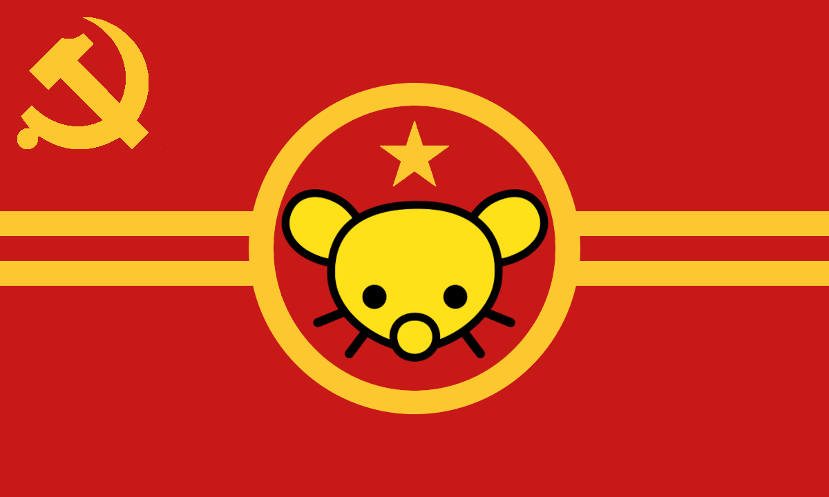
Regarding this flag, the main complaints where the golden lines, I will leave three comments so you can up vote them to see which one is the one who most people want. The options will be, the lines remains as they are, we make them bigger, or me remove them completely.
Then another complaint was that people wanted a more asymmetrical option, so someone came up with a design which I used to produce these options. Let me know what you think of these new ideas, or if we should stick to the blue one.
 With blue lines things.
 Without them.
In this new design the star is kind of a must because the way the mouse rabbit gerbil thingamabob is designed it can’t properly fit in the centre and it leaves a pretty big space above its head.
By the way, before people start asking, I don’t have the slightest idea of symbology or whatever, I don’t have any idea on design, so feel free to propose symbolism or correct any mistakes I did on design.
Was there a reason the Chinese hammer and cycle was chosen as opposed to the more common Soviet depiction of the emblem? Stylistic choice? Or as reference to GenZedong maybe?
I like it more aesthetically and I guess it kind of represents us a bit since not many Marxists support China.