

I think we’ll have to wait until there are a few comments at least, otherwise it’s going to look too suspicious.
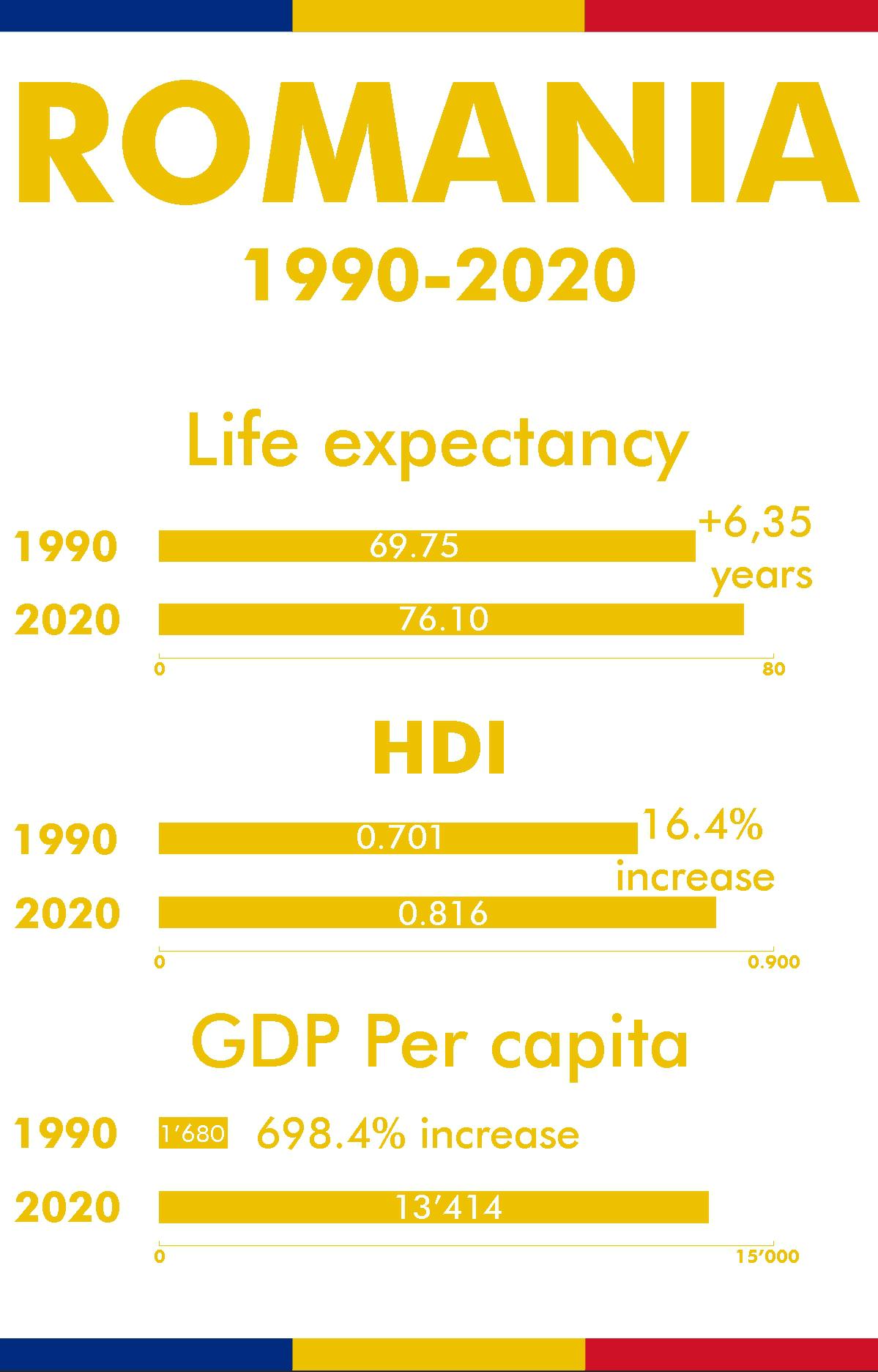
Regarding the infographic it’s easy to argue against GDP per capita increases. It doesn’t mean people make 13k a year, it means there’s more GDP per person. Doesn’t mean anything if all that value is going to the wealthy.
I crunched the numbers once regarding Romania and 25% of their population lives under the poverty threshold set by the EU, which is 5.5€ a day. The equivalent to 50% of their GDP is held by foreign capital.
What’s interesting is that HDI is just a combo Gross National Income, (which is similar to GDP, already on the chart), as well as life expectancy (also there on the chart) and access to education (measured by how many years a person is expected to spend in education). I suspect the HDI is up because, well, every country in the world has been having an upwards trend in HDI, last I checked. What I do appreciate about the HDI is that it uses a logarithmic GNI, to reduce the impact that wealthy people have on it. Anyway, since HDI is a geometric mean of indexed measures of GNI, life expectancy, and education, and life expectancy and GDP are already on the chart, I’ll just treat it like it’s just showing life expectancy and GDP, since HDI is a little bit redundant and doesn’t really give us any new information.
So, logical issue: correlation does not mean causation. I believe that the data presented is accurate, but that doesn’t in any way prove that that data is the result of capitalism. Maybe GDP? But this data doesn’t support that conclusion. The chart is being presented to the audience and framed in a way to suggest the conclusion that it’s because of capitalism, but it’s not actually evidence of that.
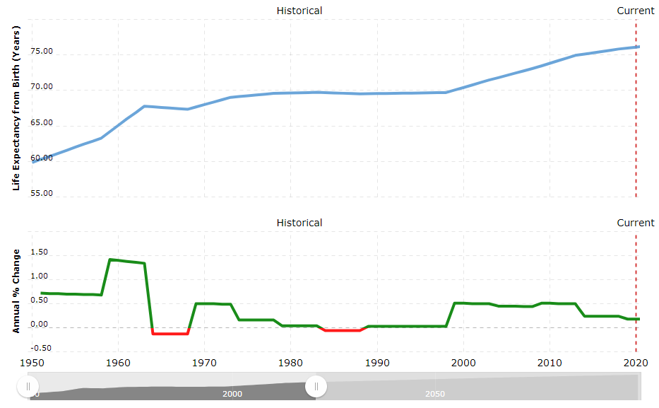
Also it omits data from when it was still part of the Soviet Union. So we don’t know from this chart 1. how things were pre-1990, or 2. what the trends were pre-1990. At what rate was life expectancy going up pre-1990? We don’t know from this chart. If the life expectancy was going up pre-1990, and continued to go up post-1990, then nothing special happened in 1990 (regarding life expectancy). And, if we look at the pre-1990 graph, whaddya know, it goes up!! (gosh I hope I’m attaching an image correctly)
Also U.S. for comparison
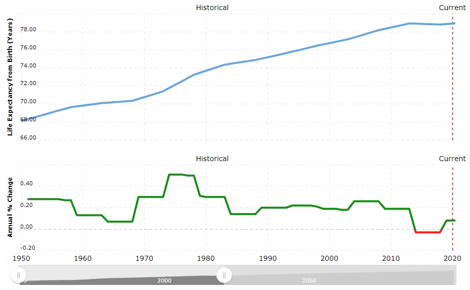
So you can see the red parts of the Romania graph coincides with relative low points on the U.S. graph.
Also, Russia
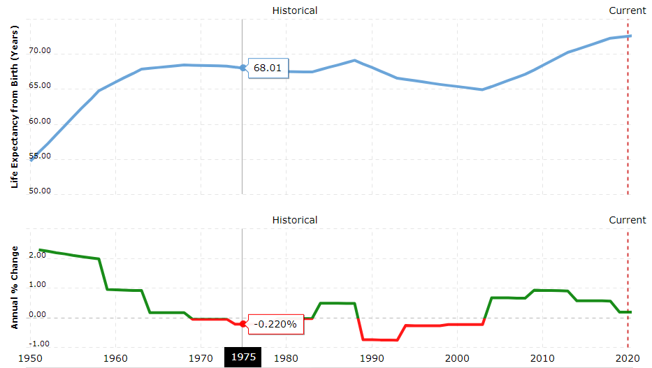 This one has interesting ups and downs. I’m curious as to why, but just looking at changes in life expectancy doesn’t actually prove anything.
I just wanna step into the shoes of OP for that reddit post, but, like, thinking about the scientific method. Let’s say we start with the observation that life expectancy is higher than it was in 1990. Now we ask our question “Why is that?” And then we trip down the stairs, skip all the other steps, and land on the conclusion “oh, because the thing I already believed is true” without putting in any effort to actually figuring out why.
deleted by creator