Also, Russia
This one has interesting ups and downs. I’m curious as to why, but just looking at changes in life expectancy doesn’t actually prove anything.
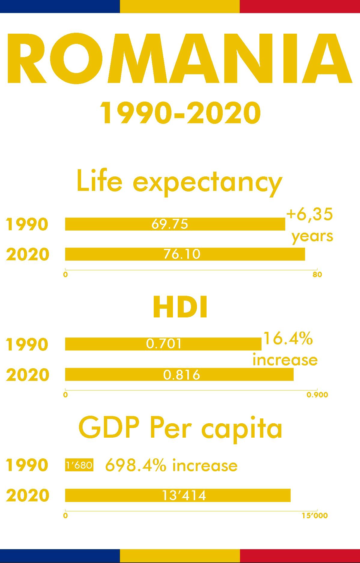
I just wanna step into the shoes of OP for that reddit post, but, like, thinking about the scientific method. Let’s say we start with the observation that life expectancy is higher than it was in 1990. Now we ask our question “Why is that?” And then we trip down the stairs, skip all the other steps, and land on the conclusion “oh, because the thing I already believed is true” without putting in any effort to actually figuring out why.


Also U.S. for comparison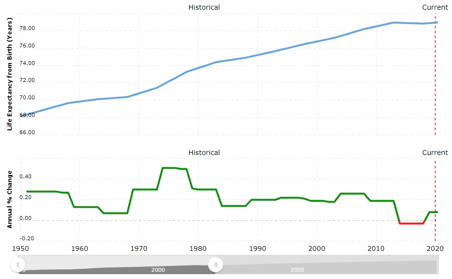
So you can see the red parts of the Romania graph coincides with relative low points on the U.S. graph.
Also, Russia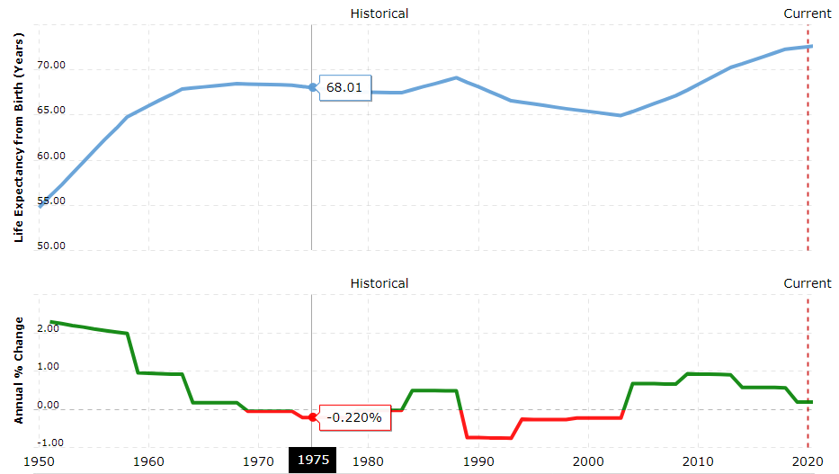 This one has interesting ups and downs. I’m curious as to why, but just looking at changes in life expectancy doesn’t actually prove anything.
I just wanna step into the shoes of OP for that reddit post, but, like, thinking about the scientific method. Let’s say we start with the observation that life expectancy is higher than it was in 1990. Now we ask our question “Why is that?” And then we trip down the stairs, skip all the other steps, and land on the conclusion “oh, because the thing I already believed is true” without putting in any effort to actually figuring out why.