
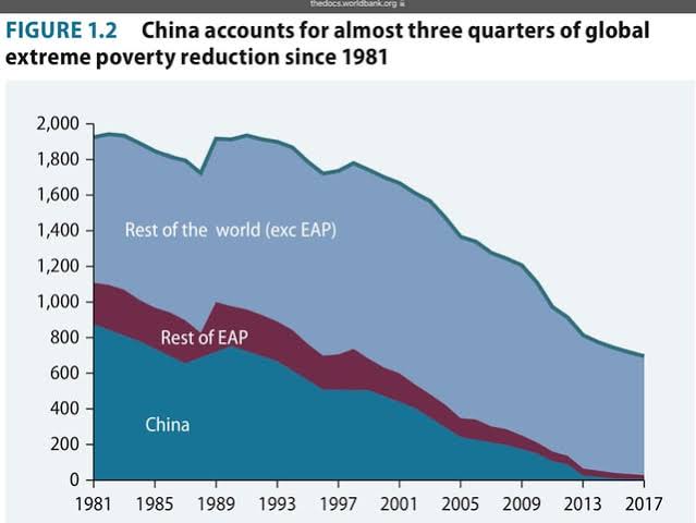
From “Four Decades of Poverty Reduction in China”:
“Over the past 40 years, the number of people in China with incomes below US$1.90 per day has fallen by close to 800 million, accounting for close to three-quarters of global poverty reduction since 1980. At China’s current poverty standards, the number of poor people in China fell by 770 million. By any measure, the speed and scale of China’s poverty reduction is historically unprecedented.”
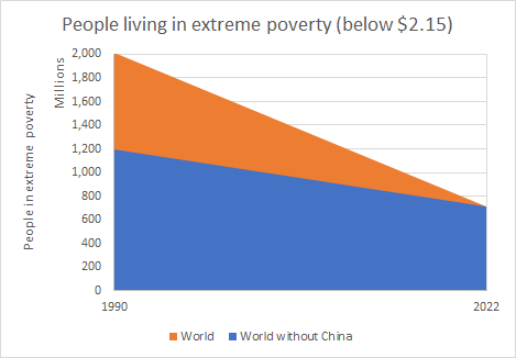
I’ve been wondering if there is a sort of debunk of this popular post from ourworldindata.org: (Was the global decline of extreme poverty only due to China?)[https://ourworldindata.org/data-insights/was-the-global-decline-of-extreme-poverty-only-due-to-china]
Part of the problem is that this article is pretty much zero effort which makes sense since its point is to be disingenuous.
The chart shows the data that answers this question. In red, we see the global decline. In green, we see the decline if we exclude China from the data. In the world outside of China, 29% lived in extreme poverty in 1990 — by 2022, this share was down to 11%.
India’s poverty reduction stats are pretty bs. For example, look at this visualisation:
This is “multidimensional” poverty which is the defacto standard for measuring poverty in India right now. According to it, if you are malnourished and physically stunted because of it, you can still be classified as not poor if you have a phone.
According to it, if you are malnourished and physically stunted because of it, you can still be classified as not poor if you have a phone.
Next the US will claim to have solved homelessness because you can’t possibly be homeless if you have a phone.
That post is extremely unserious. They have one dubiously sourced graph and a couple of numbers thrown in with zero explanation of how they arrived at them. It’s about the same level of effort as your average Reddit post.
I mean they don’t even bother to define what they mean by “extreme poverty” whereas the paper that i linked does. Of course if you play definition games you can adjust the poverty line until your data says what you want it to say. They’re also talking about percentages of population in poverty rather than absolute numbers.
You can go to the website of the World Bank yourself where they claim to have gotten their data from (though they never specify exactly which World Bank data set they used) and look at the charts, what they are depicting, whether they specify total numbers of people in poverty or percentage poverty rates, and how they change depending on where you set the poverty line:
https://pip.worldbank.org/home
For instance if you use a slightly higher cutoff line then suddenly the story becomes even worse without China, and the global number of people in poverty actually becomes higher rather than lower while the rates barely decline. On every chart you see one striking feature: the sharpest decline occurs in the East Asia Pacific region, most of that is of course China.
If raw population size were the only thing explaining why China has such a big impact on the statistics you would expect to see similar effects coming from India, but you don’t. And this is all assuming that the World Bank is an objective and neutral source of data whose pro-capitalist ideological bias doesn’t affect how they measure and define certain things.
Also, another thing to consider: a problem with just looking at the poverty rate decline is that you can have a “global poverty reduction” simply by population growth in the developed world. What you’d really need to do is exclude China and the developed countries.
(Figure 1: Simple Area chart)After doing the math (below) and calculating the absolute values ONLY by using what was provided in the graph by OurWorldInData (pixel counting), I can get the above graph. I used a simple area chart for Figure 1 because it’s close in content and character to what they posted. The reason the left side of Figure 1 appears proportionally different to theirs is because their Y-axis is %, mine is an absolute value. The world population Changed which is not captured in their graph, but is captured in mine. A “simple” area chart is effectively a line chart, as each individual point is with reference to 0, and is therefore it is not suitable to showcase a relationship of each individual part to a whole over time.
Figure 1 can also be represented as Figure 2 simply by subtracting the two quantities to calculate for “Only China” and switching to a stacked area chart. A stacked area chart is what is used in the OP, and it is used to show relationships between two different quantities and also their relationship to the whole over time. On the contrary, a line chart/“simple” area chart is better used to look at different quantities in isolation.
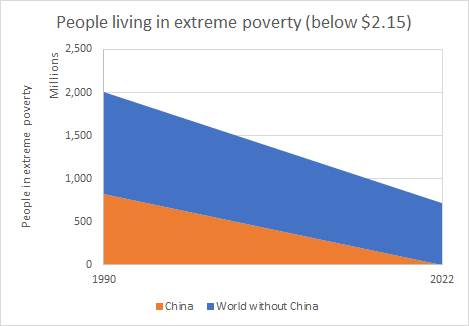
(Figure 2: Stacked Area chart)So, using ONLY their graph, and converting it to absolute values, we get basically the same graph as in the OP (only with 2 points over time instead of however many there are in the full dataset).
In effect, they’re using two clever tricks in the OurWorldInData graph - one trick is that they calculate from the perspective of World and World-minus-China and use a line chart two draw an equivalence between them. Another trick is that they use Share of Population (%) as the Y-axis, which is inherently problematic for comparisons, as (a) the world population changed (b) the chinese population stayed basically the same. This means that although the share might decrease, the absolute value (the raw number of people in extreme poverty) may stay the same (or even increase! though it didn’t), and finally © it’s easier for people to conceptualize an absolute count of individuals who were lifted out of poverty rather than thinking of percentages of population.
Their conclusion is that China was not solely responsible for poverty alleviation. No shit. Even the OP says China accounts “only” for 75% of world poverty alleviation, and uses $1.90 as benchmark for extreme poverty whereas this uses $2.15. If we do the math, using their benchmark and their data, China accounted for 62% of poverty alleviation.
For a website called OurWorldInData, they sure can’t represent data for shit.
Math
By pixel counting, the graph says extreme poverty (below $2.15) in the…
World 2022 8.983%
World minus China 2022 10.913%World 1990 37.992%
World minus China 1990 28.726%Then…
World population in 1990
- 5.293 billion (5,293,000,000)
China population in 1990
- 1.135 billion (1,135,000,000)
World population without China in 1990
- 4.158 billion (4,158,000,000)World population in 2022
- 7.951 billion (7,951,000,000)
China population in 2022
- 1.412 billion (1,412,000,000)
World population without China in 2022
- 6.539 billion (6,539,000,000)Absolute values for extreme poverty (below $2.15) in the…
World 2022…714,238,330
China 2022…637,260
World minus China 2022…713,601,070World 1990…2,010,916,560
China 1990…816,489,490
World minus China 1990…1,194,427,080This also matches the graph in the OP. By pixel counting the world-minus-china has 1195 million in 1990, which is what we got, and 701 million in 2017 which is close to what we got. The differences can be explained by the fact that the OurWorldInData graph goes to 2022 and that they define extreme poverty by $2.15 whereas OP’s WorldBank goes by $1.90.
Wow, great work! That’s pretty much what i intuitively expected was the case when i looked a bit into how they were representing the data in their graph and what the World Bank source actually says.
I also went ahead and tried to see what changes if you use a higher poverty line, like something around $5 for instance, and it turns out that in this case we may actually have an increase in total number of people in poverty if you exclude China. Whichever metric you use, it is indisputable that China has done something no one else in the world has managed to do.

