I just refuse to watch any YT video where they make a face like this in the splash image.
OP, if this video is yours, sorry, but not very.
Agreed. Most Youtube thumbnails are cancer. Bug eyes with mouth wide open or pointing at something. Enough already.
Tom Scott did an episode where he explained that going back and retrofitting old videos with the shock face and click bait titles upped his views by a lot
And that is what nobody cares to admit. They do those thumbnails cause they work.
Great for Tom Scott and everyone one using this (sincerely) and everyone attracted to videos with images like this.
I am still out.
Good for you? I guess.
I do not really like them either but I am not sure what point you are making. Their point is that these images result in more viewers, even accounting for your absence. What are we meant to do with the information that you are out?
And around 70% of titles are replaced by DeArrow for me, and of the other 30% around 80% are probably just too unknown. So in total just 6% are actually not clickbait, and those 6% are basically just dashcam channels with the numbering as title, the largest german channel about Lego-style bricks and media.ccc.de
De-arrow is a godsend for these thumbnails.
That being said, I set a “Don’t recommend channel” on Brodie Robertson because he took part in harassing a developer about some barely nsfw furry art being hidden in some software but refuses to block Nazis from his mastodon profile. It seemed like a double standard that demonstrated tolerance for said Nazis.
Fuck Nazis. Raw. With a rusty iron cactus. Dry. In the ass.
If that’s what gets you going :s
( ͡° ͜ʖ ͡°)
barely nsfw furry art being hidden in some software
Can you elaborate on what software and developer? That’s funny af. Harassing someone for it is really stupid
Its trickier to piece together what happened now but if you search “thorium browser furry”, you’ll probably find a few posts about it. There was a hell of a lot of misinfo including about it being CP for some reason when iirc it was just an anthropomorphic dog with the camera facing upwards towards them wearing panties or something like that.
So I did some digging, and it actually goes a little deeper than just a furry image. There was some anti-circumcision stuff on the developers site it seems, not in the browser itself. Apparently they weren’t even linked. They were all removed with a single commit. I took a look on the commit history, and there were some pictures of circumcised penises. Including some extremely botched ones, some belonging to babies. I didn’t take a look at all of them, but once I did are hardly labelable as CP. If anything, they’re educational content. Wikipedia contains some similar pictures as well, you can’t label Wikipedia as a CP website for those either, can you? They were running a campaign against circumcision, as one should. It’s unethical genital mutilation (speaking as someone who was circumcised). Labeling this anti-circumcision stuff as CP is really stupid imo. Fuck circumcision. And imo harassing someone for this is even worse than sneaking a furry pic in a browser.
Agreed. Circumcision is fucked up.
CircumcisionGenital mutilationFixed that for you
That techlore guy just confused furry art with CSAM and dropped that in a video as if it was nothing.
Chris Titus did a really stupid video about that too.
I dont remember Brodie actively harassing them. But of course that whole thing was not nice.
Chris Titus convinced Brodie not to make a video on it after Brodie took an active role and Chrisb took a passive role in the dogpile on Twitter.
refuses to block Nazis from his mastodon profile
This tells me enough about a person to dissociate completely from anything they say or make.
Just installed that extension in Firefox and instantly recognized the difference. Thanks so much!
What does “block nazis on his profile” mean, like block comments?
He has a great content though. Some of his takes are a bit strange, but he didnt cross the line yet for me.
@CatTrickery @perishthethought do you have any proof of what you assert ?
Whoa - Hey, I am not asserting anything here about the vlogger. I just don’t like the image they used for the video. I don’t know anything about this channel.
@perishthethought sorry for mentioning you too 🙇
I was answering to @CatTrickery regarding his message asserting that Brodie “harassed people but did not block nazis” (https://lemmy.blahaj.zone/comment/6985902)All good. Just making sure that’s clear. Cheers,
I do the same. I don’t care if there is an algorithm or not, I don’t care if you get 0,00001% more money. The end doesn’t justify the means. I am on a personal vendetta, every time I am on YT and I see a thumbnail like that or one with clickbait text or arrows. It’s instant don’t recommend channel. I don’t care if I am subbed to that channel or not. Stop finding excuses, we need a gram of human decency, stop removed yourself like that
yt creators really don’t have a choice, if they deviate from the stuff that the algorithm likes it kills the channel
Don’t only blame the algorithm. The users are to blame as well. People tend to click on these thumbnails more. It’s a clickbait technique and it works.
I like Brodie and click on every video lol, the thumbnails are funny
There are successful channels which don’t do this.
I can’t blame a creator for doing this, but I do lose a lot of respect for them when they do.
Check out Technology Connections. Very successful channel. Not a single clickbaity face in sight. It has the bold text, sure, but it mostly describes the actual video.
I think you missed the critical word “deviate” if you stick to the same thing it works, whatever it is
Just a friendly reminder that there’s accessibility problems with dark themes.
For me dark themes look like this because I have astigmatism:
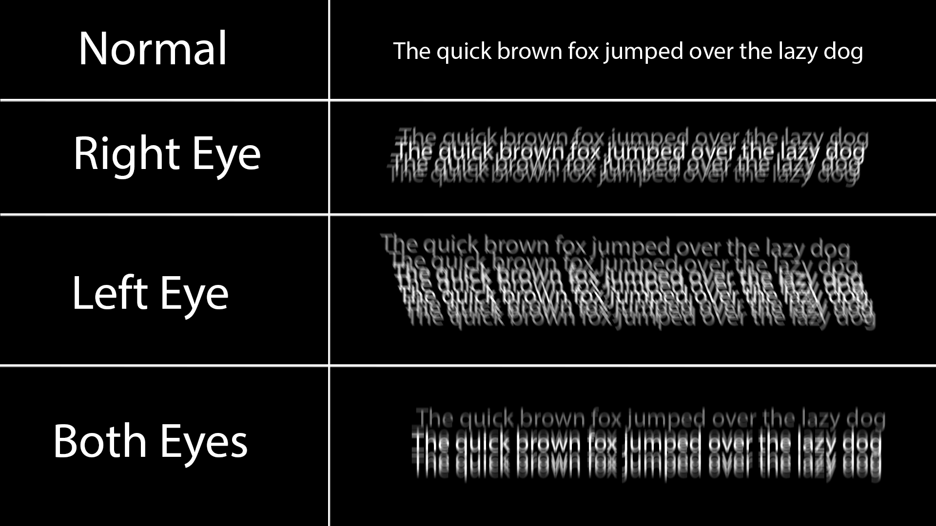
Black on white doesn’t have this issue because all the white around it does is slightly blur into the black text and makes it a little grey at worst.
Any dark theme for a longer period of time also causes the white text to burn in my retina for a couple minutes, and I just see lines when I look away, and also makes reading a long article difficult and painful.
Dark themes look so much better, but keep in mind some people have very good reasons to prefer light themes. There’s no need for dark theme elitism.
Well TIL, thanks for the graphic!
Nobody watched the video lol, dark themes are an easy fix but not the best solution. But very interesting, thanks for sharing
The point of the video is that current default themes (particularly light themes) are too high contrast and too monochromatic. And in that scenario, a dark theme becomes a necessity because a high contrast dark theme is usually better received than a white one.
btw you can get glasses if you have astigmatism. certainly made my life easier.
If you are on Android, repainter can be really nice to find an accessible background/foreground combo using the new Material You theme engine. I get the impression it wasn’t designed for that purpose but it does the job if you try to use mostly Material You apps.
I’m certainly not that bad, but I see where you are coming from. I like a very light grey text on a medium to dark background for this reason that white text on black ‘shadows’
I like light themes and agree that they can be done well. Overall my problem with dark themes is they are too low contrast everything melts into everything else. Who doesn’t want a distinct border around a window?
looks at the KDE settings with window borders and title bars disabled
I think what Brodie showed at the end was already really great. I know a graphics designer and number 1 rule is to never use black and white.
But of course this only works if you have full control over all apps, libadwaita? Dont theme my apps? Damn Electron?
dark themes are fine but they’re horrible on TN/cheap IPS panels
That’s why I use light mode, looks miles better in my IPS
Why is that?
the contrast of black on white isn’t uniform because of bad viewing angles
Oh, that trick where you could make the screen unreadable by tilting it far back enough.
To be honest, this seems to me like a pretty bad take with weird and kind of BS arguments. Why are professional designer, both those working for some of the biggest tech companies and those working in open source project, making these choices? It couldn’t be for actual reasons or because they actually prefer it like that. No, they are “afraid of color”. Or implying that dark theme exist because of these black on white themes, as a mean to escape it. It just weird backwards logic to justify his taste and shouldn’t be necessary to just state that he prefer a different kind of themes.
To me, the Windows themes he showed as positive examples look way to cluttered and busy, even though they don’t show this much information. I don’t need the theme to be “exiting”, I need them to display the information in an easily readable way. And dark theme aren’t there just for people who dislike the modern light theme. Having a light and a dark theme (and ideally having the app follow your system preference) actually serves a purpose. You can actively switch between them depending on the context, the time of day, the brightness of the room or any other reason to make the screen easily readable and comfortable to look at.
I have astigmatism, so I can’t work with dark themes. I can’t read correctly when everything is black around. For me, the perfect theme is the one that has a black window manager, gray variations on specific widgets, and white windows (the background desktop image I prefer it to be blue-ish). Basically, to work properly, I need a mostly light, but mixed environment that provides contrast. Not all white, and definitely not all black. So far, I haven’t found such a theme, because no GUI environment allows for such specificity in theming for the various widgets. Although the default Gnome theme ain’t too bad.
Huh, I should look into that - I have astigmatism and with LCD & OLED monitors its much easier for me to read light text on dark background.
The font effects the clarity for me much more.
Layan with a transparent Kvantum theme
layan looks so nice but it’s so slow :(
Can’t go away from Breeze Dark.
I use a Medium theme on my desktop. It’s not dark or light. It really works for me.
I found it here, https://github.com/blue-mood/blue-mood-kde-color-scheme
I was actually looking for a Med-Dark charcoal theme and decided to try this first. I’ve used it for years now.I tried making a KDE theme too and it either looks like that, or random parts are colored differently.
But everything blue… haha no thanks
I tried a few themes but always go back to Breeze Twilight (dark bar with light windows).
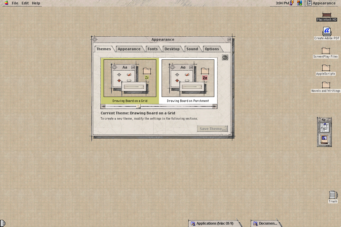
Not what you asked (Plasma theme), but my favorite UI theme since always has been MacOS Drawingboard:
https://www.appimagehub.com/p/1219916Wishing it was possible on Linux for +20 years…
If you add an “!” Before the image link it is displayed in line!
I might consider using a light theme if I had a nicer monitor and a clean desk.