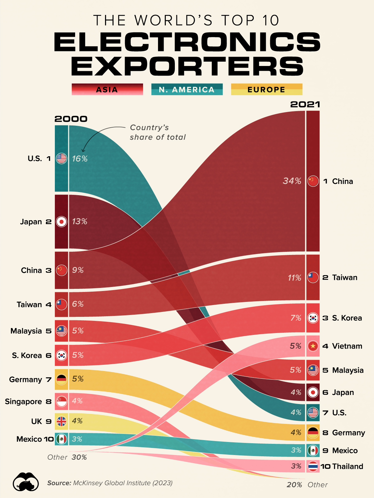
Starting at 2000 overstates the initial US share, after the dotcom crash the US doesn’t reach that export amount again until 2007. Additionally, the infographic manages to understate the growth in exports of both China and Chinese Taipei because the sector has grown in real terms. I wasn’t able to find an unpaid version of the original data (even though the source is from the UN via McKinsey), so I couldn’t do more of an analysis than that.

Starting at 2000 overstates the initial US share, after the dotcom crash the US doesn’t reach that export amount again until 2007. Additionally, the infographic manages to understate the growth in exports of both China and Chinese Taipei because the sector has grown in real terms. I wasn’t able to find an unpaid version of the original data (even though the source is from the UN via McKinsey), so I couldn’t do more of an analysis than that.
good points, the graphic still gives a pretty good visual overview even if understated