All colours are and should be under the full control of the user, as it always has been so. So called “accent colours” removed critical functionality from Windows as well as breaking the UI since windows 8.
As a software tester of 10 years and a CS Degree holder, I certainly would have never passed software that didn’t meet these usability tests.
I’m colourblind. I must have full and unhindered colour modification options, the GUI will look the way I decide based on what I want and how my eyes perceive it. This especially means I must have full control over titlebar colours and any other colours that used to differ based on window focus.
At work in Win 10 I have chosen an “accent colour” which seems to me a massive limitation, having had used superior GUI’s since Win 3.1 where the user is able to chose and adjust anything from the colour of title bars when focused or unfocused to the font used on numerous UI elements and widgets.
The problem is simple. Windows 10 grants (I say that in a sarcastic way) the user have the option to chose a so called “accent colour”. This however fails to do two things. Firstly it forces the design choices of the development team onto every user, something that is clearly wrong for Linux as history shows it was a plus over windows. Secondly, the accent colour fails to address several UI modal changes, completely obliterating them yet the modal elements remain part of the UI!!!
How in windows 10 can I tell if a window has focus or not? In Win 3.1 to 7 and anything running on Linux it was easy: the title bar colour was different. But since Win 8 that was dropped, windows still have focus and modal dialogs but you, the user, can not determine which has what and when.
Now, like I said I’m colour blind which means maybe there is a difference but I can’t see it. So what do I do? Well I randomly start typing commands into the wrong powershell window, or I want to control the browser using the keyboard only to discover that Outlook has focus and has started doing things in response to me banging keys. I have two monitors at work and focus moves between them and windows gives me no indication what has focus at all. Nothing I can see, out of the corner of my eye that is.
Thing is there is just one difference, the focused window might have a bold titlebar text or not. Note I bolded that. But I can’t see this difference without pixel peeping.
Every day I have to put up with this in the windows world and it annoys the hell out of me because the essential functionality was always there and has been removed because someone tossed a coin*. Maybe GNOME won’t fall into the trap of preventing full customisation of the UI, I hope so, user accessibility needs require it. I moved away from GNOME when they moved away from the desktop metaphor as I thought the alternative was terrible, and it still is, so this won’t affect me but it will affect loads of new colourblind users from the start.
The user has the last say and should be able to override anything.
HCI (Human Computer Interaction) rules exist for a good reason, stop chucking them away and make them options if needed.
And finally, take it from an actual colourblind computer users and electronics geek. Colour blindness accessibility filters DO NOT WORK. They simply don’t because everyone has a different kind/degree/combination of colour blindness. Normal visioned people are easy to demonstrate to as all we have to do is apply such a filter in reverse and they are like “Whoa what the hell” yet they fail to see (pun intended) that it’s a simulation that barely represents our individual colour ranges. Windows 10 has a colourblind mode, does nothing. Android has one, which has me try and sort colours to determine my specific adjustments, works better but still barely is used by myself.
The only fix is to give the user full control over all colours because then they, they can adjust the UI for the way they see the universe.
Here is an example from the linked blog. See this GUI. Which window has focus? The one on top? Well if GNOME prevents windows from always remaining above others regardless of focus, yes that would be the case. But if GNOME does allow focus to windows beneath others, well, which has focus? I cant tell.
I had intended on uploading images but that seems to not be working with this post/lemmy instance at the moment. Basically if you look at the blog there are examples. First of all the “pink” example, well that shades of grey to my eyes as pink rarely is a colour I can notice, most pinks are grey. Further down are examples of a stop clock application. Looking at the image I see most of the clocks digits are disabled, thats what grey means, disabled elements. However it turns out that they may be pink? Only the seconds are enabled, this is highly confusing as why would anyone be allowed to think a clock has digits disabled? It makes no sense and has me figure out the answer, which is bad UI design from the start. All the digits should be the same colour. It’s basic HCI rules there.
Further down you see the screenshots of the entire desktop with a window above another. In none of those examples can I tell which has focus. I can not assume its the one on top, plenty of UI’s have “keep on top” functionality, if I’m coming from something else why would I assume GNOME to be different?
Accent colours are bad. They force users to use static themes and UI choices made by other people, that is bad UI design, really bad. Windows 10 is lambasted for it often. If you are going to do it, do it right. The “accent” feature should be part of a simple customisation mode, but it all gets overridden by the advanced tickbox.
GNOME’s stance on user customization has been “users can do whatever they feel like using 3rd party tools like Gradience or entirely custom CSS, but if you’re a distro maker then only use the Approved Ways™ to customize things”
Now, I have zero clue if that solves anything (it very likely doesn’t), but it’s actually more than most people give them credit for.
I’d say “go join in on the issue tracker and tell GNOME about this” but hearing from some people who tried that before you I’m not too hopeful that would do much of a difference. All I know is that complaining here isn’t going to solve anything.
GNOME’s stance on user customization is: we don’t give a shit about having basic desktop functionality because its hard to implement and you may use 3rd party stuff that will never be as good or as integrated as something implemented on the DE.
That’s not really fair. GNOME has been working on LibAdwaita and GTK4 for quite some while to actually have stable and usable tools to make the missing functionalities happen. And they been adding these in a really good rate in the last 2 releases. Until now we really just didn’t had the tools to implement a lot of stuff.
If you look across to KDE land, and not to bash on them I love KDE, they’ve been much quicker to introduce features but then also spent many releases fixing bugs and sometimes completely re-implementing those features to work properly.
Hmm… isn’t that the same thing they told us when GTK3 was made? That they had to do a major rewrite in order to move forward and implement all the things people were requesting…
KDE can be fast and all but they seem to lack some common sense when it comes to design, you’ve, for instance, inconsistent spacing across DE elements.
People bash the GNOME team for being too strickt with their design rules and implementations but honestly, I like that they have at least a central vision that they are trying to implement. I don’t agree with all of them but so far, all in all, I like the direction GNOME has taken since switching to GTK3 and update 40. Things haven’t been fast for sure, the road was bumpy and it took some time and several revisions but the fact that such a comperatably tiny team, a lot of them working on this in their spare time, managed to make something that I can honest to God say is a comparable replacement to the Windows or iOS user interfaces is remarkable.
And Wayland also threw a wrench into everything and required several rewrites to old protocols but we are really getting some long awaited features like the task bar icons are being actively worked on, a lot of window UI enhancements with LibAdwaita, HDR, fractional scaling and more.
I can honest to God say is a comparable replacement to the Windows
No it isn’t, you can’t say that when it lacks desktop icons. Look I’m happy and thankful for their efforts but Linux is all about customization, if they don’t want desktop icons cause it goes against their view they can still have a checkbox to enable them. They had this in the past and then removed it.
I think there is a disconnect in what you call a feature and what is a design decision. GNOME consciously deviated from the “desktop” paradigm. I’m not saying that’s a good thing or everyone has to like it but this is what they did. I’m not trying to nitpick here but I think it’s important to see what is actually happening here, desktop icons are not being worked on not because they hate the users and are lazy in implementing things but because there is no traditional desktop. The overall GNOME UI is not made along this line of implementation, instead it has the activities view. Again, I’m not saying you have to like this and maybe it’s a dumb way to make a UI, idk, but criticizing it for not having desktop icons is like criticizing MacOS for not having a start menu. It’s just not made that way.
I think quite a big problem with KDE that they are also trying to break away from is making the UI resemble too much of Windows. New users then will expect things to behave exactly like Windows when it just can’t. That doesn’t mean that there are missing features necesserally but that things are implemented differently and the uninitiated user should know that from a first glance.
Overall I get the sentiment. GNOME is different and needs getting used to and does not fit all workflows out of the box. It has missing features that I wish would be implemented but overall I like the direction they took. It’s new, different and after a couple of weeks of adjusting I really gotten to like it. I don’t really miss desktop icons because I haven’t used them in Windows anyway, I personally like to launch my programs from the start menu/app launcher.
GNOME always has looked like a cheap copy of macOS. Until version 3.28 they had the desktop icons and later on they also decided to hide the “dash” under the “activities” menu. I call this “a feature” because it was effectively something that existed and was removed.
KDE that they are also trying to break away from is making the UI resemble too much of Windows.
Well they don’t need, Microsoft itself seems to be more than happy to obliterate the start menu and so on on… Windows 8, now Windows 11… you know that old saying Microsoft does a good version of windows and always makes a very bad one right after.
The think with the desktop as Microsoft and Apple are doing it is that it people are familiar with them, they’ve years of UI/UX research of development and they’re the most effective way of designing a desktop. What GNOME is pushing for here, as you said, is some kind of half hassled DE that takes a few ideas from crippled mobile OSes that ironically have some kind of desktop icons (iOS and Android home screens). Unfortunately for them GNOME has close to zero expression in the mobile market and even if it did the rest of their UI isn’t designed to be workable on a touch screen.
i agree with almost all of this, but i just want to say:
How in windows 10 can I tell if a window has focus or not? In Win 3.1 to 7 and anything running on Linux it was easy: the title bar colour was different. But since Win 8 that was dropped, windows still have focus and modal dialogs but you, the user, can not determine which has what and when.
if you tick “show accent colour on titlebars”, windows does draw the current window titlebar distinctly coloured (so i guess it’s actually better than gnome in that sense)
You are in explorer. Try other apps. You’ll find they are very different, Outlook for example. Firefox, chrome all break the rules, Firefox looks inactive all the time unless you enable the menu bar and notice the boldness of the text.


What? This crazyness is coming over from Windows?
All colours are and should be under the full control of the user, as it always has been so. So called “accent colours” removed critical functionality from Windows as well as breaking the UI since windows 8.
As a software tester of 10 years and a CS Degree holder, I certainly would have never passed software that didn’t meet these usability tests.
I’m colourblind. I must have full and unhindered colour modification options, the GUI will look the way I decide based on what I want and how my eyes perceive it. This especially means I must have full control over titlebar colours and any other colours that used to differ based on window focus.
At work in Win 10 I have chosen an “accent colour” which seems to me a massive limitation, having had used superior GUI’s since Win 3.1 where the user is able to chose and adjust anything from the colour of title bars when focused or unfocused to the font used on numerous UI elements and widgets.
The problem is simple. Windows 10 grants (I say that in a sarcastic way) the user have the option to chose a so called “accent colour”. This however fails to do two things. Firstly it forces the design choices of the development team onto every user, something that is clearly wrong for Linux as history shows it was a plus over windows. Secondly, the accent colour fails to address several UI modal changes, completely obliterating them yet the modal elements remain part of the UI!!!
How in windows 10 can I tell if a window has focus or not? In Win 3.1 to 7 and anything running on Linux it was easy: the title bar colour was different. But since Win 8 that was dropped, windows still have focus and modal dialogs but you, the user, can not determine which has what and when.
Now, like I said I’m colour blind which means maybe there is a difference but I can’t see it. So what do I do? Well I randomly start typing commands into the wrong powershell window, or I want to control the browser using the keyboard only to discover that Outlook has focus and has started doing things in response to me banging keys. I have two monitors at work and focus moves between them and windows gives me no indication what has focus at all. Nothing I can see, out of the corner of my eye that is.
Thing is there is just one difference, the focused window might have a bold titlebar text or not. Note I bolded that. But I can’t see this difference without pixel peeping.
Every day I have to put up with this in the windows world and it annoys the hell out of me because the essential functionality was always there and has been removed because someone tossed a coin*. Maybe GNOME won’t fall into the trap of preventing full customisation of the UI, I hope so, user accessibility needs require it. I moved away from GNOME when they moved away from the desktop metaphor as I thought the alternative was terrible, and it still is, so this won’t affect me but it will affect loads of new colourblind users from the start.
The user has the last say and should be able to override anything.
HCI (Human Computer Interaction) rules exist for a good reason, stop chucking them away and make them options if needed.
And finally, take it from an actual colourblind computer users and electronics geek. Colour blindness accessibility filters DO NOT WORK. They simply don’t because everyone has a different kind/degree/combination of colour blindness. Normal visioned people are easy to demonstrate to as all we have to do is apply such a filter in reverse and they are like “Whoa what the hell” yet they fail to see (pun intended) that it’s a simulation that barely represents our individual colour ranges. Windows 10 has a colourblind mode, does nothing. Android has one, which has me try and sort colours to determine my specific adjustments, works better but still barely is used by myself.
The only fix is to give the user full control over all colours because then they, they can adjust the UI for the way they see the universe.
Here is an example from the linked blog. See this GUI. Which window has focus? The one on top? Well if GNOME prevents windows from always remaining above others regardless of focus, yes that would be the case. But if GNOME does allow focus to windows beneath others, well, which has focus? I cant tell.
I had intended on uploading images but that seems to not be working with this post/lemmy instance at the moment. Basically if you look at the blog there are examples. First of all the “pink” example, well that shades of grey to my eyes as pink rarely is a colour I can notice, most pinks are grey. Further down are examples of a stop clock application. Looking at the image I see most of the clocks digits are disabled, thats what grey means, disabled elements. However it turns out that they may be pink? Only the seconds are enabled, this is highly confusing as why would anyone be allowed to think a clock has digits disabled? It makes no sense and has me figure out the answer, which is bad UI design from the start. All the digits should be the same colour. It’s basic HCI rules there.
Further down you see the screenshots of the entire desktop with a window above another. In none of those examples can I tell which has focus. I can not assume its the one on top, plenty of UI’s have “keep on top” functionality, if I’m coming from something else why would I assume GNOME to be different?
Accent colours are bad. They force users to use static themes and UI choices made by other people, that is bad UI design, really bad. Windows 10 is lambasted for it often. If you are going to do it, do it right. The “accent” feature should be part of a simple customisation mode, but it all gets overridden by the advanced tickbox.
GNOME’s stance on user customization has been “users can do whatever they feel like using 3rd party tools like Gradience or entirely custom CSS, but if you’re a distro maker then only use the Approved Ways™ to customize things”
Now, I have zero clue if that solves anything (it very likely doesn’t), but it’s actually more than most people give them credit for.
I’d say “go join in on the issue tracker and tell GNOME about this” but hearing from some people who tried that before you I’m not too hopeful that would do much of a difference. All I know is that complaining here isn’t going to solve anything.
GNOME’s stance on user customization is: we don’t give a shit about having basic desktop functionality because its hard to implement and you may use 3rd party stuff that will never be as good or as integrated as something implemented on the DE.
That’s not really fair. GNOME has been working on LibAdwaita and GTK4 for quite some while to actually have stable and usable tools to make the missing functionalities happen. And they been adding these in a really good rate in the last 2 releases. Until now we really just didn’t had the tools to implement a lot of stuff.
If you look across to KDE land, and not to bash on them I love KDE, they’ve been much quicker to introduce features but then also spent many releases fixing bugs and sometimes completely re-implementing those features to work properly.
Hmm… isn’t that the same thing they told us when GTK3 was made? That they had to do a major rewrite in order to move forward and implement all the things people were requesting…
KDE can be fast and all but they seem to lack some common sense when it comes to design, you’ve, for instance, inconsistent spacing across DE elements.
People bash the GNOME team for being too strickt with their design rules and implementations but honestly, I like that they have at least a central vision that they are trying to implement. I don’t agree with all of them but so far, all in all, I like the direction GNOME has taken since switching to GTK3 and update 40. Things haven’t been fast for sure, the road was bumpy and it took some time and several revisions but the fact that such a comperatably tiny team, a lot of them working on this in their spare time, managed to make something that I can honest to God say is a comparable replacement to the Windows or iOS user interfaces is remarkable.
And Wayland also threw a wrench into everything and required several rewrites to old protocols but we are really getting some long awaited features like the task bar icons are being actively worked on, a lot of window UI enhancements with LibAdwaita, HDR, fractional scaling and more.
No it isn’t, you can’t say that when it lacks desktop icons. Look I’m happy and thankful for their efforts but Linux is all about customization, if they don’t want desktop icons cause it goes against their view they can still have a checkbox to enable them. They had this in the past and then removed it.
I think there is a disconnect in what you call a feature and what is a design decision. GNOME consciously deviated from the “desktop” paradigm. I’m not saying that’s a good thing or everyone has to like it but this is what they did. I’m not trying to nitpick here but I think it’s important to see what is actually happening here, desktop icons are not being worked on not because they hate the users and are lazy in implementing things but because there is no traditional desktop. The overall GNOME UI is not made along this line of implementation, instead it has the activities view. Again, I’m not saying you have to like this and maybe it’s a dumb way to make a UI, idk, but criticizing it for not having desktop icons is like criticizing MacOS for not having a start menu. It’s just not made that way.
I think quite a big problem with KDE that they are also trying to break away from is making the UI resemble too much of Windows. New users then will expect things to behave exactly like Windows when it just can’t. That doesn’t mean that there are missing features necesserally but that things are implemented differently and the uninitiated user should know that from a first glance.
Overall I get the sentiment. GNOME is different and needs getting used to and does not fit all workflows out of the box. It has missing features that I wish would be implemented but overall I like the direction they took. It’s new, different and after a couple of weeks of adjusting I really gotten to like it. I don’t really miss desktop icons because I haven’t used them in Windows anyway, I personally like to launch my programs from the start menu/app launcher.
GNOME always has looked like a cheap copy of macOS. Until version 3.28 they had the desktop icons and later on they also decided to hide the “dash” under the “activities” menu. I call this “a feature” because it was effectively something that existed and was removed.
Well they don’t need, Microsoft itself seems to be more than happy to obliterate the start menu and so on on… Windows 8, now Windows 11… you know that old saying Microsoft does a good version of windows and always makes a very bad one right after.
The think with the desktop as Microsoft and Apple are doing it is that it people are familiar with them, they’ve years of UI/UX research of development and they’re the most effective way of designing a desktop. What GNOME is pushing for here, as you said, is some kind of half hassled DE that takes a few ideas from crippled mobile OSes that ironically have some kind of desktop icons (iOS and Android home screens). Unfortunately for them GNOME has close to zero expression in the mobile market and even if it did the rest of their UI isn’t designed to be workable on a touch screen.
i agree with almost all of this, but i just want to say:
if you tick “show accent colour on titlebars”, windows does draw the current window titlebar distinctly coloured (so i guess it’s actually better than gnome in that sense)
win10 win11
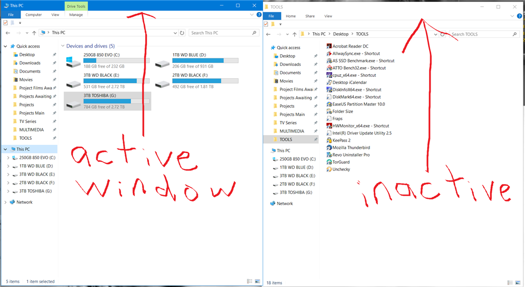
You are in explorer. Try other apps. You’ll find they are very different, Outlook for example. Firefox, chrome all break the rules, Firefox looks inactive all the time unless you enable the menu bar and notice the boldness of the text.
At first I thought “wow that’s a long rant for something so miniscule” but you are right, it should absolutely be an option.