User flairs!
There is an open issue already for some time. Hopefully with the new user influx this gets more attention. Certain communities, like sports, feel incomplete without flairs.
User and post flares!
Karma
/s
I’m actually curious the reason why Lemmy does not have a karma equivalent.
I don’t miss it since I rarely checked my reddit karma but it does have pros and cons.
I got permabaned just before i could reach 10K karma :(
Karma might work on a per instance basis, but if implemented on a federation wide scale you’d have to trust every instance. It would be far too easy to artificially increase your karma with your own rogue instance just by editing the database.
Ways to group communities to browse at once rather than just local, all, and subscribed. A multi-Lemmy if you will.
deleted by creator
More of an app than a platform feature, but the ability to collapse all child comments.
On Jerboa at least you can do this by tapping on the comment
True, but I mean for all comments in the thread at once.
If you tap the top comment, it also hides all of the replies under it. Am I misunderstanding what you mean by thread?
easy subscribe links - like, click on it and then subscribe, not the current method (which totally functions but its cumbersome and unwieldly).
Turn off porn on the “all” thread without having to block other NSFW content. It’s getting pretty bad blocking three or four porn communities every time I try to browse, but not being able to block the instances they’re all coming from.
More for jerboa, but RIF had an option to confirm you want to go back/refresh feed. My palm accidentally hits the back button often, and I have to start scrolling back from the top.
When i scroll on the website, the website header does not follow. Meaning if I want to go somewhere or refresh the feed, i have to scroll way up to do so. Its a bit frustrating.
In the meantime you can use Stylus, there are styles already supporting this, basically it’s just setting the navbar position to fixed.
The ability to merge/join communities across instances. Right now, there’s lots of duplicated communities - which isn’t a big problem, but I feel that it’ll hinder adoption as it fragments the audience for a given topic.
Edit: also worth saying that it seems like that the if the instance hosting a community goes away, so does the community.
Yes, it is worth saying. In fact I was scrolling for this. There should be a way to adopt refugee communities with all its posts from other instances so as to not lose all the information when the server goes down for good. It needs consensus, but only from admins of original community and the new host, this last to prevent server abuse. Also, if communities can get merged, the list of instances hosting the community would serve both as redundant backup and as distributed (instead of fragmented) service.
When people link other instances in posts or comments, it should automatically be translated to view it on your own instance instead of having to take it and search for it.
Default to showing subscribed communities, rather than local ones. De-emphasise the server in certain areas (eg community list) - I think the community is more important than the server it’s on and having it there so prominently causes confusion about it’s importance.
I can see why it has the server focus but I’d argue most people want to join a general server with a wide reach rather than something isolated.
Though this is me trying to use Lemmy as “distributed Reddit” so maybe I just don’t get it.
Better ways to explore the communities available. Also maybe improving the Android app ecosystem.
Highlight new comments (if there’s already a way to do this please let me know as I’m brand new here)
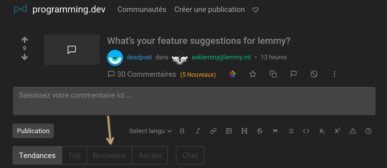
Do you mean, sorting by new? This can be done in a specific post’s comments:
 And in the global view: (It’s all in French, sorry 'bout that 😅)
 From what I’ve seen, they pop up automatically and you can have notifications enabled in your browser.
I meant more like when you re-open a thread you’ve read before and there are x new comments. It would be nice to have those comments highlighted so they’re easy to find. Sorting by new works but only for top level comments.
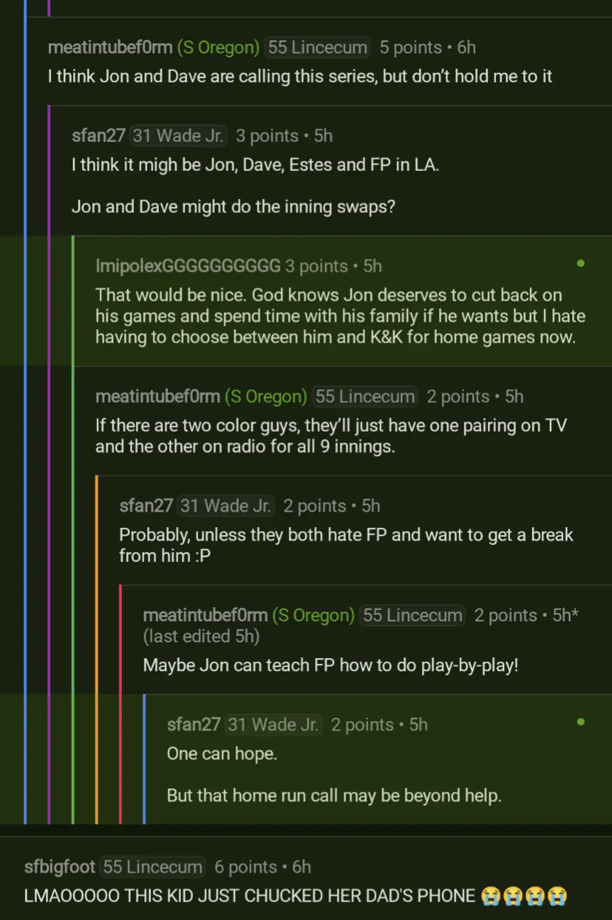
I’m used to it coming from Sync for Reddit. See the green comments with dots:


