Eh, I think you can illustrate your point a bit better, comrade. The map goes from good agitprop to bad when it is counterable by liberals and leftists alike. I agree with your general point on this post, so I don’t think the point itself is bad, but it could be better elaborated on with an actual map that shows what it says it does. Just my opinion.
Yep, it’s pretty bad for agitprop, even if I agree that the PRC has had really peaceful development all things considered, and the US is a genocidal empire, this map gets in the way of that messaging.
That’s fair, I like the concept of the map hence why I shared it, but I agree it would be better if it was more accurate. Perhaps worth making a better one.


Eh, I think you can illustrate your point a bit better, comrade. The map goes from good agitprop to bad when it is counterable by liberals and leftists alike. I agree with your general point on this post, so I don’t think the point itself is bad, but it could be better elaborated on with an actual map that shows what it says it does. Just my opinion.
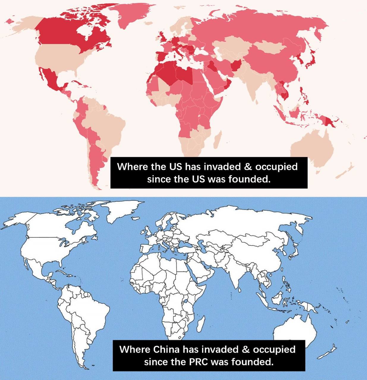
The top one is taken from a website called vividmaps where it’s countries the USA has had some sort of conflict with
The bottom map is just a white map.
Garbage meme 1/5
Yep, it’s pretty bad for agitprop, even if I agree that the PRC has had really peaceful development all things considered, and the US is a genocidal empire, this map gets in the way of that messaging.
That’s fair, I like the concept of the map hence why I shared it, but I agree it would be better if it was more accurate. Perhaps worth making a better one.
I agree, also it misses the colonial expansion of the original USA (13 small States in the East Coast), the USA should be red
I think that’s a good idea! Reality speaks for itself, showing reality is the best agitprop.
I agree, and it is true that whenever agitprop has even minor inaccuracies then that’s the only thing people will fixate on.
Exactly.