
cross-posted from: https://lemmygrad.ml/post/5331505
I’m going to use this video as a reference for my own website project.
What do you all think?
It seems that Japanese and Chinese website design is just superior to Western design.
The comments are bad as usual haha
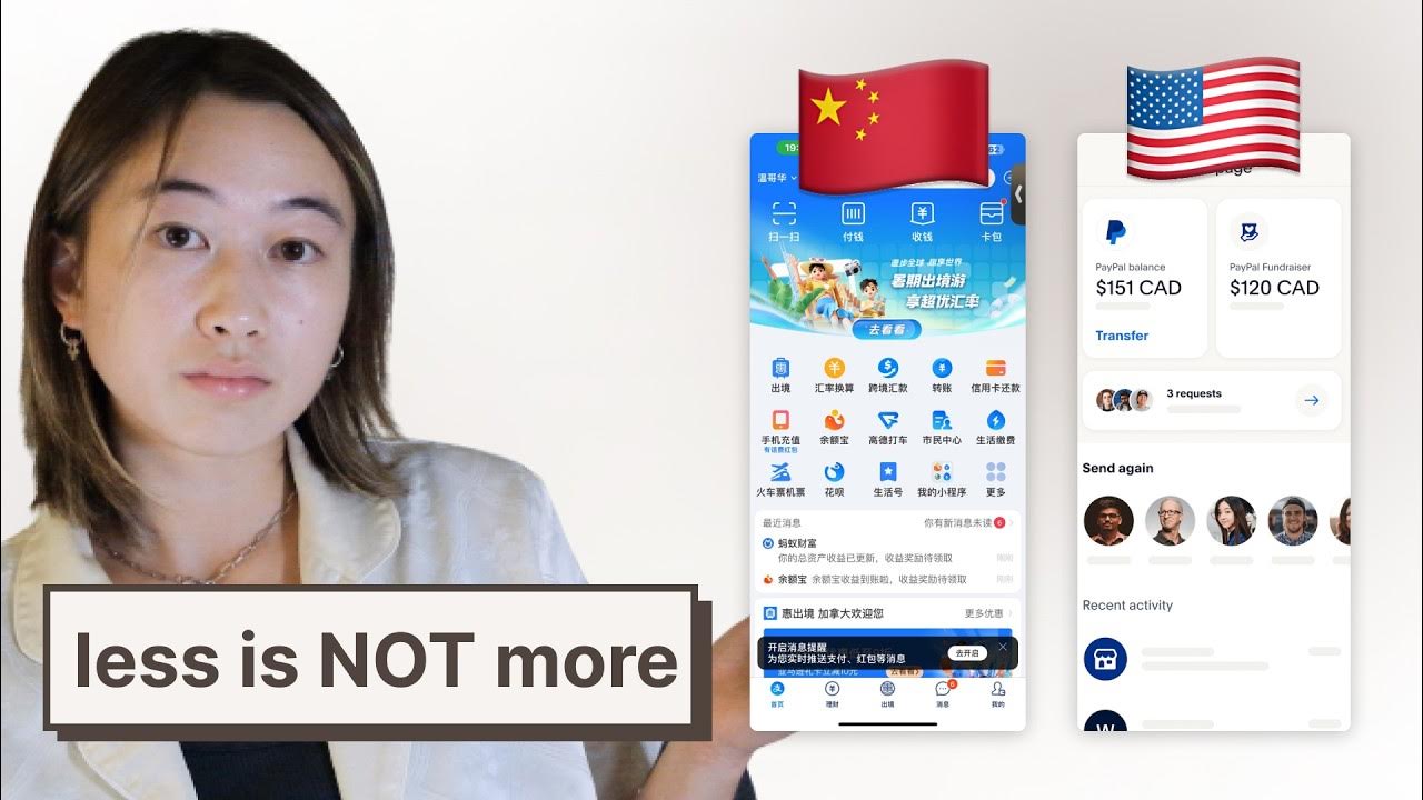
I think this video focuses a little too much on why Chinese apps are Like That and not quite enough on why amerikkkan apps are Like That. Like the example of the maps app that also has a rideshare calling feature for a bunch of different rideshare services and you can compare prices. We can’t have that here because Uber and Lyft would block it from working because they each want you locked into their own respective apps, and they sure don’t want some new service popping up on your listing right below theirs.
Hmm, true, true.
It really seems like this super app model might actually end up offering a less monopolized experience
eyyup
Also, American apps care far more about obtaining new users than they do about catering to their existing ones. Existing users want a panel of icons that are always in the same place. A new user sees 100 options and feels overwhelmed. You’re going to spend much more time as a established user, so over time it makes more sense to just get used to the panel of icons.
Someone needs to give “ux” designers a shock collar that lights them up any time it hears the word “cluttered”.
I found a YouTube link in your post. Here are links to the same video on alternative frontends that protect your privacy: