- cross-posted to:
- socialism@lemmy.ml
- sino@hexbear.net
- china
- technology
- technology@lemmy.ml

- cross-posted to:
- socialism@lemmy.ml
- sino@hexbear.net
- china
- technology
- technology@lemmy.ml
You must log in or # to comment.
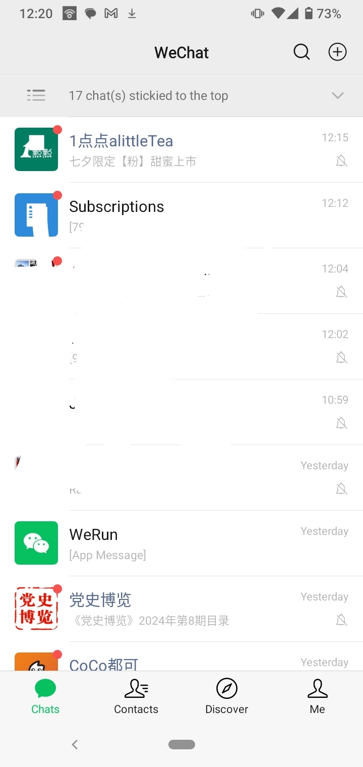
This is my WeChat home page
spoiler
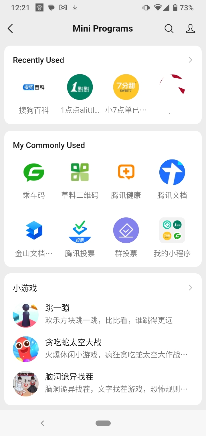
The mini-apps (third party) are under their own tab (Discover > Mini Programs)
spoiler
The first party functions are also under their own tab (Me > Services)
spoiler
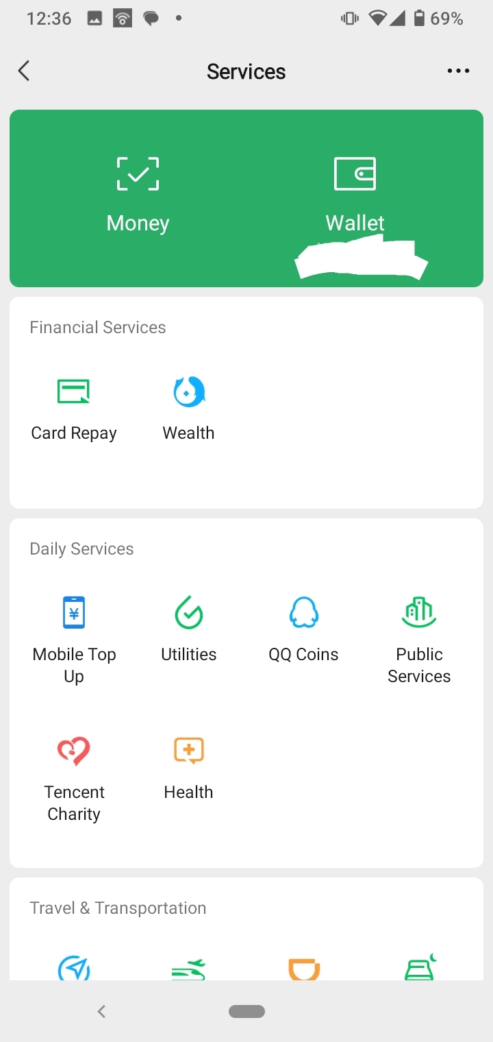
Each tab is clean, in my opinion, and most major daily-use functions are two, at most three, clicks away. Frequently used mini-programs can also be accessed by dragging down on the front page.
To say that Chinese app design as a rule is cluttered is false. Yes you can have multi-function apps but no it does not necessitate an overloaded landing page and ‘clutter’.
I think she is cherry picking somewhat with her selection of Zhifubao and I’d agree that it’s overloaded, but not showing counterexamples makes it seem like zfb design is the desired, prevalent benchmark. Other apps like Taobao are deliberately filled with ads and promos (banner ads and popups), and the visual design is bright and eye-catching (to sell product…) but the navigation once in the app is pretty straightforward. Pretty much on par (if with a few more persistent menus/floating buttons) with western online stores once you’re away from the landing page.
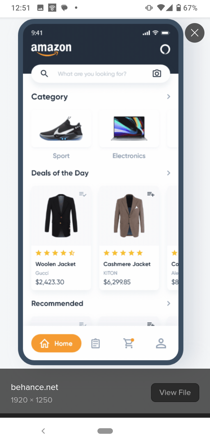
amazon v taobao

Idk, her explanations of ‘high context communal’ society determining the desired app UX/UI fell a bit flat to me, and don’t allow for the instances of where Chinese users do make and use simpler application or simpler interfaces.
Then, we could find examples of western apps that are equally cluttered… like, I’m fucked if you asked me to navigate discord mobile.
WeChat works well, I don’t use Western stuff too often to compare. I have discord installed in Island because a board game ground I know coordinates there, and Whatsapp apparently. Both are fucking nightmares compared to WeChat which I use exclusively for chat/voice/video.
Other Chinese software is hit or miss. NetApp’s mail software is pretty terrible. The most annoying MFA, where they’ll individually require MFA codes to view the MFA/password reset emails from certain senders randomly (apple definitely triggers it). I had a partner who ran into that a lot, and who also swears QQ were the worst after getting banned for no reason and continuing to get banned circumventing them.
There’s some Shanghai stock exchange trading terminal software that’s free and it’s awesome compared to shit like Robinhood or even firstrade. Not any of the ones that show up in English, though those look passable as well.
WeChat also has barely changed its UI in the decade+ I’ve had it for. The same definitely cannot be said for other SNS platforms over the same period. Yeah, everything else has been super hit and miss as you say, and the network effect comes into play same as whatsapp/disco kinda like you mention - I’ve only ever used them for similar reasons to you (though if I can lure other niche bgamers across to WeChat, I do).
Also, what’s Island? Is it like a segment/partition for your phone to isolate apps?
Also, this isn’t a knock on applications/sites that do have everything on the front page. I’m not a designer but having everything there (even if it results in ‘crowding’) could be good for users with less time/attention to learn exactly where certain functions are kept. If their pages/apps load slowly, it could save page reloads, data usage and improve bounce rate. Downsides are that the text is small and more prone to misclicks (big finger small screen), but that’s a tradeoff. So I’m not upholding sparse page design as the gold standard in all cases, I think I just disagree with the presenter’s explanation of why the apps are the way they are.
Then, we could find examples of western apps that are equally cluttered… like, I’m fucked if you asked me to navigate discord mobile.
For sure, but also there’s the cognitive cost in having to navigate between many “uncluttered” screens and apps. The inherent complexity of the task you’re trying to accomplish doesn’t magically disappear, it just becomes implicit in the workflow you have to learn.
Well put!
hErE’s WhY
I found a YouTube link in your post. Here are links to the same video on alternative frontends that protect your privacy: