Its a Latitudinally equal-differential polyconic projection map
Looks like its actually a hao proyection map
“fuck Venezuela and Colombia who needs to know about them”
- the person who made this map
taking me forever to download, this map is positively DPRK soldier sized
 his work continues
I need this map on my wall, asap. Where buy
smdh my dick head. China thinks they’re the center of the world but it’s obviously us Americans.
Isn’t the etymology for China something like “middle kingdom”? Like, ancient China literally thought they were in the center of the world. So did the Romans and pretty much any other civilization, too.
We as a collective also thought our world was the center of the universe and solar system too lmao
From an administration point of view it makes perfect sense. I think all the superiority shit is just a happy coincidence for supremacists
IIRC a better translation is “central state”.
like if the US called their own state “The Government” in official communication.
The center of our world map is the Atlantic Ocean because we are secretly being ruled by the fishmen in Atlantis
ThE aNcEsToRs are fishies 🐠 bloob blub
it looks more India-centric
Stop doing maps
Spherical imagery was never meant to be projected onto a flat surface
Years of creating projections yet no real world use found other than a globe
Wanted to do it anyways? We had a tool for that it was called Kavrayskiy VII.
Yes, please give me DYMAXION of something. Please give me MERCATOR of something - statements dreamed up by the utterly deranged
They have played us for absolute fools.
Reminds me of when the anglo press was trying to say North Korean maps don’t feature Africa or some shit then someone posted a map that does.
I’m tired af but I don’t think this matches the wiki description. Love it nonetheless very cool find
Wikipedia mentions it here, on “List of map projections”. It has no page of its own.

There’s also an alternate version in the original paper, where the Americas aren’t cut in two:
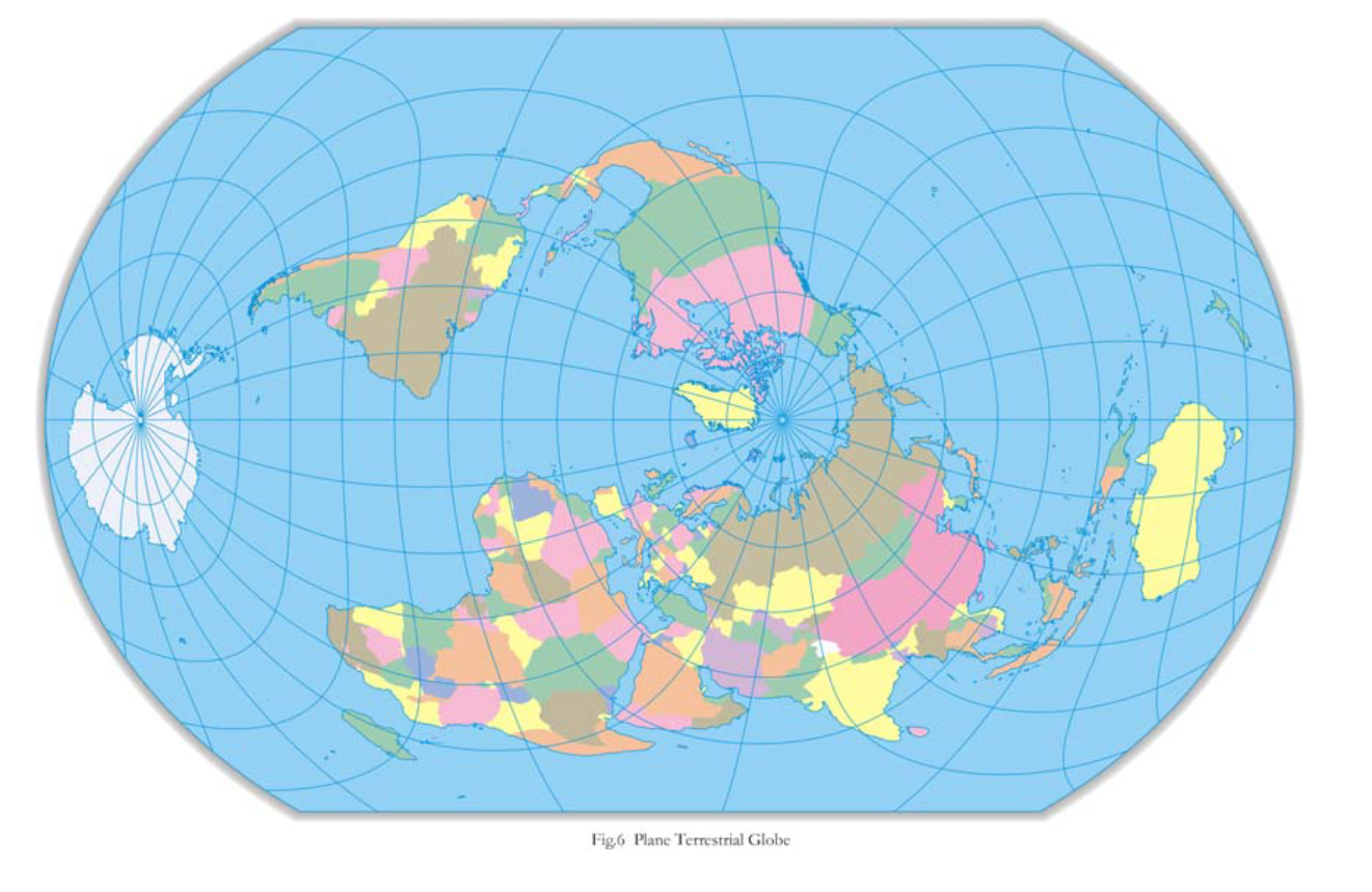
I found it a while ago myself, this alternate version is one of my favourite map projections.
The creator has his own website (in Chinese): http://www.hxgmap.com/
This one makes much more sense, because no big landmasses are being too distorted too much, and the borders of the map are the oceans. Not to mention the center is the north pole, which makes sense as a reference point.
Hard no. At least the first one had symmetry with north and south, north in the middle, south in the left, Australia in the right. Why???
Just turn it sideways like OP’s map:
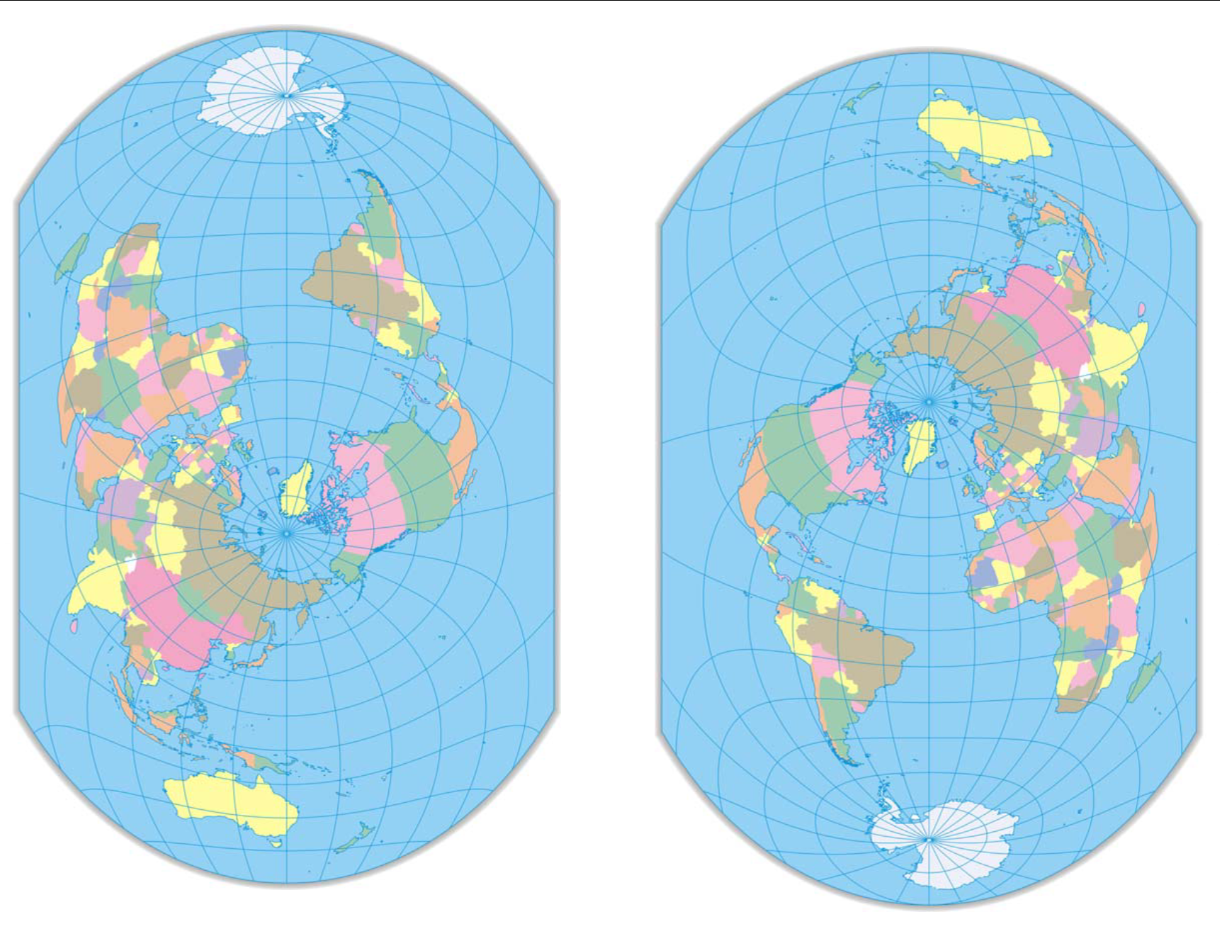
Someone saw that map that splits Asia in half and took it personally.
deleted by creator


