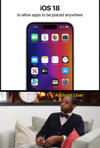
Welcome to 2013, Apple fans! Maybe in 5 more years you’ll get homescreen widgets customizable layouts (change number of apps per row etc). In 10 you might get custom launchers!
Welcome to 2013, Apple fans! Maybe in 5 more years you’ll get home screen widgets.
We actually do have home screen widgets, as of like 2020. They got it sometime before I had my iPhone. And an app drawer!
As a former Android user, my iPhone home screen looks wildly different from people who’ve had iPhones for many years. I have very few icons on my home screen, I have widgets taking up most of the top of the screen to push the icons I do have down near my fingers (because Springboard is still stupid as of iOS 17, as this gif is pointing out), I have more widgets to the left (“Today View,” Apple calls this, it’s basically just a scrolling widget section), and then the app drawer equivalent to the right (which Apple calls “App Library”). It’s clean and beautiful and reminiscent of my lovely Nova launcher setup I had on my beloved OnePlus 7T Pro (may it rest in peace).
Whereas most longtime iPhone users just have page after page after page of apps and folders. Every app they own is on there somewhere. Which is ridiculous since on iOS you can just swipe down, type the first few letters of the app, and there it is.
Before the app library existed you just had to have all the apps on a page and could not hide them. I ended up having like 20 page of apps. I eventually cleaned things up and have a page with apps I use, another page of widgets I use, and that’s it. But it took me years before I thought to do that.
Oh I know, it was madness. I briefly had a used iPhone 3GS and then was pure Android until 2022 when I got an iPhone. By the time I came back it was customizable enough that I could make it look like Android, but that’s work for someone who lived with the terrible setup it originally had. I don’t blame existing iPhone users, it’s just something I’ve noticed.
It’s funny, I’ve had an Android, a Nokia Windows Phone, and an iPhone, and Windows Phone was the only OS in which I didn’t open every single app through search. The utter lack of an app ecosystem definitely played a part, but I honestly don’t think either of the other two handle home screens/“app drawers” very well. Every modern social media platform/messenger/etc. is built around vertical continuous scrolling because it’s easier. Why is horizontal, paginated scrolling the default for home screens?
Shit - my first Android phone had widgets, customizable homescreen (not just icons - but the entire layout an launcher), and anything else custom you wanted back in 2009.
15 years late to the game in an industry that’s effectively 17 years old…
Oh, so “Glad you guys are finally getting features we had over a decade ago” is “full hatred”, but “I’m sorry, did you just send me a green text? didn’t know you were broke” is fine?

Welcome to 2013, Apple fans! Maybe in 5 more years you’ll get
homescreen widgetscustomizable layouts (change number of apps per row etc). In 10 you might get custom launchers!We actually do have home screen widgets, as of like 2020. They got it sometime before I had my iPhone. And an app drawer!
As a former Android user, my iPhone home screen looks wildly different from people who’ve had iPhones for many years. I have very few icons on my home screen, I have widgets taking up most of the top of the screen to push the icons I do have down near my fingers (because Springboard is still stupid as of iOS 17, as this gif is pointing out), I have more widgets to the left (“Today View,” Apple calls this, it’s basically just a scrolling widget section), and then the app drawer equivalent to the right (which Apple calls “App Library”). It’s clean and beautiful and reminiscent of my lovely Nova launcher setup I had on my beloved OnePlus 7T Pro (may it rest in peace).
Whereas most longtime iPhone users just have page after page after page of apps and folders. Every app they own is on there somewhere. Which is ridiculous since on iOS you can just swipe down, type the first few letters of the app, and there it is.
Before the app library existed you just had to have all the apps on a page and could not hide them. I ended up having like 20 page of apps. I eventually cleaned things up and have a page with apps I use, another page of widgets I use, and that’s it. But it took me years before I thought to do that.
Oh I know, it was madness. I briefly had a used iPhone 3GS and then was pure Android until 2022 when I got an iPhone. By the time I came back it was customizable enough that I could make it look like Android, but that’s work for someone who lived with the terrible setup it originally had. I don’t blame existing iPhone users, it’s just something I’ve noticed.
It’s funny, I’ve had an Android, a Nokia Windows Phone, and an iPhone, and Windows Phone was the only OS in which I didn’t open every single app through search. The utter lack of an app ecosystem definitely played a part, but I honestly don’t think either of the other two handle home screens/“app drawers” very well. Every modern social media platform/messenger/etc. is built around vertical continuous scrolling because it’s easier. Why is horizontal, paginated scrolling the default for home screens?
That’s a good point. Now that you mention it, I would much rather my Home Screen scroll down and I can add as many apps and widgets as I want.
The current iPhone page feels a bit claustrophobic now. Thanks.
I remember having this feature on my jailbroken iPhone in like 2009. Wild that it took this long.
iOS already has widgets?
2013? Pretty sure you could do this on Android waaaay before that.
My first Android was an HTC Hero, which was released in ~ October of 2009.
One of the first things I did was swap the location of the Maps and Store icons to make it easier to reach on the edge of the phone.
I recall people complaining that same year that the iPhone 1 couldn’t copy or paste text.
:)
I’m not sure about iPhones, but iPads have had homescreen widgets for a whole year, maybe even two!
Shit - my first Android phone had widgets, customizable homescreen (not just icons - but the entire layout an launcher), and anything else custom you wanted back in 2009.
15 years late to the game in an industry that’s effectively 17 years old…
deleted by creator
deleted by creator
Bro, you can’t be for real, can you? Apple fans have been shitting on Android non-stop since it was created.
Oh, so “Glad you guys are finally getting features we had over a decade ago” is “full hatred”, but “I’m sorry, did you just send me a green text? didn’t know you were broke” is fine?