
- cross-posted to:
- maps
- cross-posted to:
- maps
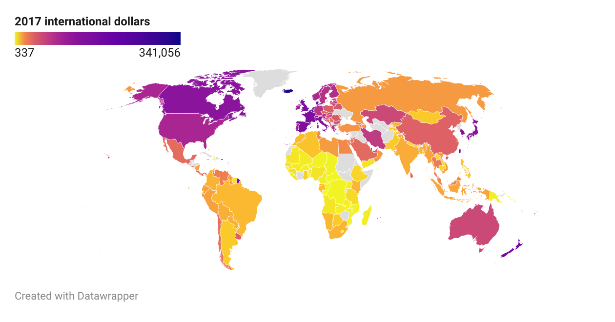
I remember this post that compared the quality of life in the DPRK and the US. There are many ways in which traditional stats like the GDP per capita exhibit bias in favor of some countries; countries may differ in their…
- …distribution of wealth.
- …basic expenses.
- …cost of products and services.
So, I decided to give it a shot. I started from median wealth per adult values published by UBS (data from 2022); my logic was that two people who end up, no matter their income, with the same amount of expendable income will acquire a similar amount of value in the form of equities, real estate, vehicles… By using the median value, I make sure that wealth in countries with high inequality isn’t overestimated.
Then, I multiplied these values by the ratio between adjusted (international dollars at 2017 prices PPP) and unadjusted GDP per capita of each country, using data from 2022 by the IMF.
There are some interesting things to note within the map. Enjoy!
You must log in or register to comment.