
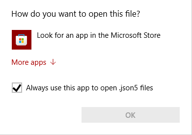
It’s completely inconsistent with traditional Windows design language and there’s no “Cancel” button or an X in the corner to click on so you can’t cancel out of it with your mouse and have to reach for Esc on your keyboard
It also tries to funnel you into a shitty Microsoft service
The mishmash of old Windows and the more mobile phone-esque design used in places like the Settings App (🤮) really irks me. Makes the whole thing feel unfinished, not that I would want them to finish what they’ve started and make everything else look like a phone too, mind you
As someone who has been working in IT, been using SCCM and WSUS to manage windows 10 pc’s since 1807, including LTSB versions, I can attest to how awful the winNT and modern OS integrated has been handled. They slowly take away legacy settings and processes, only to be replaced by some crappy UWP system application, or they just straight up have no alternative.
I hate that it has started to become a better OS, and with tools like powertoys I’ve been able to make it damn near great, only for them to be moonlighting it for windows 11. And the whole cycle continues as they have just made the OS even more fragmented while still having the same issues win10 did.
200 years of Windows!?
spoiler
yes, yes, i know. windows 2018.07
Lool I thought the same as I read it back
I don’t understand why Powertoys isn’t just part of the base OS. It’s even developed by Microsoft.
I fully agree, though I believe PT and the addins are created and are curated by independent developers within Microsoft.
Seems to me that we’re lucky to have it at all haha.
The new best feature for me is screenshot OCR, the window manager is life, the launcher is good but win+r is still quicker most of the time for my usage.
Things like the explorer file preview are extremely buggy for me and I have to keep it disabled
I still can’t believe they removed the ability to move the taskbar in Windows 11.
I’ve started using Windows with Windows 98, and they’re basically three UIs that clash with each other:
The OG UI design that started with Windows 95 and continued up to Windows 2000 like this: https://stealthsettings.com/wp-content/uploads/2016/03/change_ip_v4_address.jpg
Stuff added in from Windows XP to Windows 7 like this: https://blog.usro.net/wp-content/uploads/2015/11/windows-10-classic-control-panel-1024x607.jpg
That Metro-phone crap that started from Windows 8: https://www.windowslatest.com/wp-content/uploads/2018/01/Windows-Update.png
Honestly, people don’t talk enough about how the XP-Vista-7 stuff clash with the 95-98-2000 stuff, but it’s there. Microsoft fucked up again by layering yet another UI design on top of the first two, and it just looks like ass.