
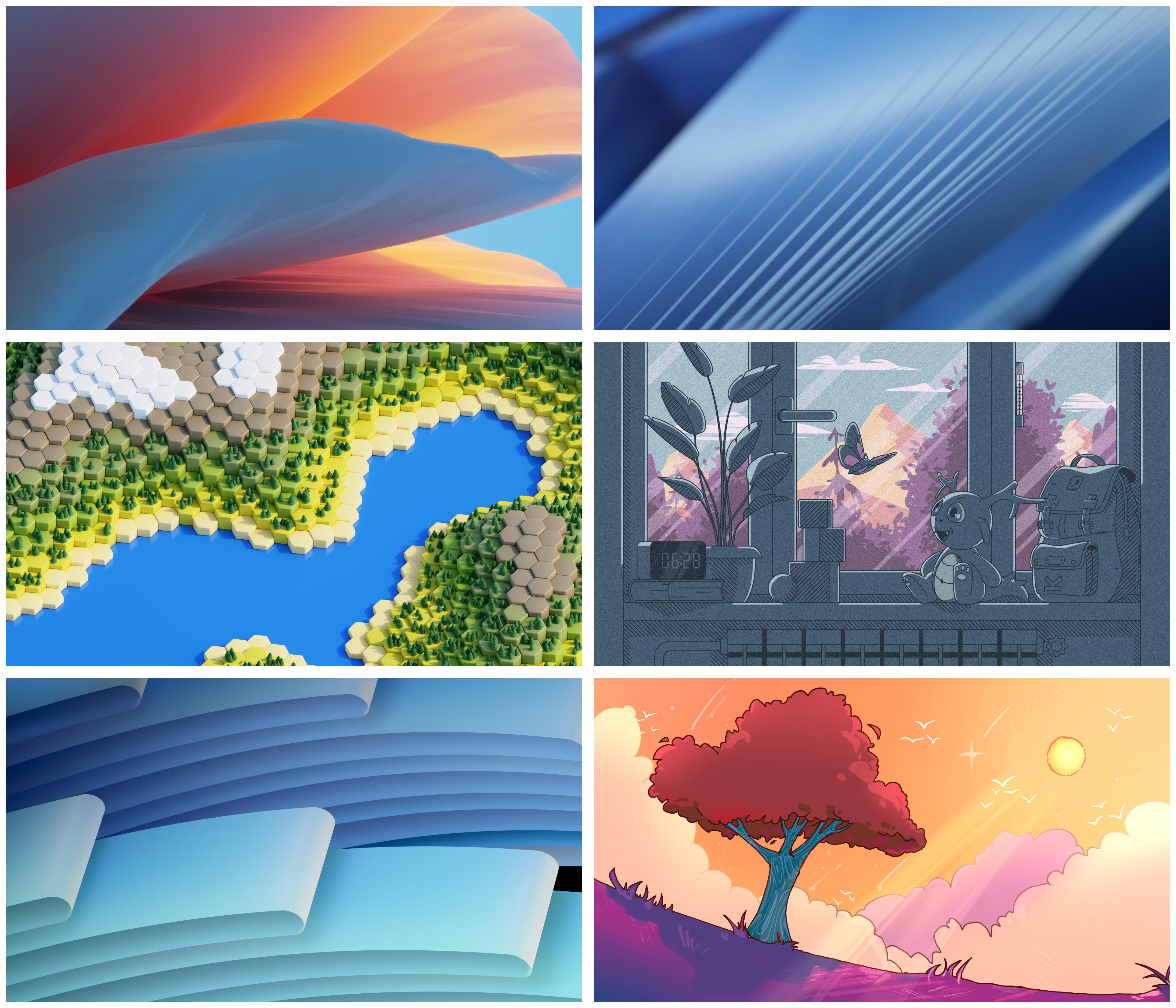
Default? Top left. It should be visually appealing to most people, and it would honestly just be odd to have the default wallpaper be cartoon styled. And the bottom left looks too much like W11. But I think they should all be included as options.
The Bottom Right
Absolutely, that one’s amazing.
3 and 4 are nice but as something someone would set themself. Too much character and detail to be the default when Plasma do not target any specific demographic.
1, 2 and 5 are nice abstract wallpapers, but honestly boring as we have stuff like that for years.
6 is the best. This is wallpaper with some style, but not too much character.
Edit: Just in my opinion and for my eye of course.
The one with the tree is so cute and makes me feel at peace.
Middle left. Don’t know the numbering scheme, 3?
HEXAGON
THE BESTAGON
Yes, 1,2 and 5 look too much like a windows background. I think this one is unique and still clean and calm.
The one with the clock better have a moving clock otherwise I hate it. Static clocks should never be part of a wallpaper.
If I’m going to have a lot of icons on the desktop, I’d want one of the visually uncomplicated ones (top right, bottom left). Otherwise, if it’s just for eye-candy and what I have to see everytime my windows are minimized, I’d either go for mid-left or bottom-right. I fall into the latter category, but y’all in the former may consider that when casting your vote
This. It needs to be visually uncomplicated so I can actually see what’s living on the desktop. Because of that, I prefer bottom right the most, though I generally like much darker backgrounds. Color shift that into something darker like an alien or night scene, and it’d be perfect for me.
FLOW, STAIRWAY & WAVES are just literally every wallpaper ever. Uninspired.
Give us some inspirational suggestions then, oh holy one
SUN / COMET, HEXWORLD & HARMONY.
Anything that’s not just following the exact same design language like FLOW, STAIRWAY & WAVES clearly are doing.
The red tree 👍
I like middle left and bottom right. Top left would be alright too - kinda generic, but I like it better than any windows default background.
The hexagons do look nice. I wouldn’t mind having all of them though. They could rotate at every boot.
This is why i love you guys, arguing about fucking wallpapers 🤣
What’s stopping me from just saving the images and then using my preferred one on my own setup?
Nothing
Middle right and bottom right are my favorites
3rd is a game?
Godus?
Godus doesn’t use hexagons, right?
I like the vibe of 4 and 6.
Then 5, 2, 1, 3, that have ‘professional’(?) look.


