JackSparrow174@discuss.tchncs.de to Memes@lemmy.ml · 9 months agoWill it happen ?discuss.tchncs.deimagemessage-square46fedilinkarrow-up1674arrow-down198
arrow-up1576arrow-down1imageWill it happen ?discuss.tchncs.deJackSparrow174@discuss.tchncs.de to Memes@lemmy.ml · 9 months agomessage-square46fedilink
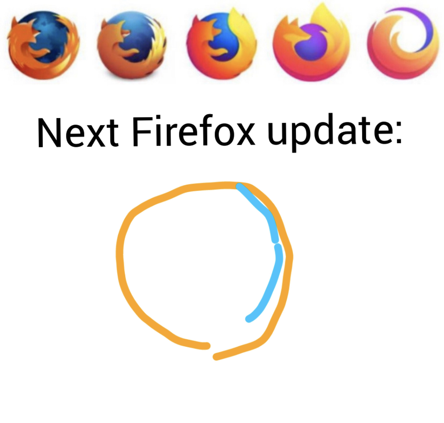
minus-squareayam@lemm.eelinkfedilinkarrow-up14arrow-down1·9 months agoImo the fourth logo (from the left) is the best, minimalism done right.
minus-squareEmpricorn@feddit.nllinkfedilinkarrow-up2·9 months agoWell, then you’ll be happy. Because that’s the current logo, for the indefinite future (as far as we know).
minus-squareActers@lemmy.worldlinkfedilinkarrow-up2·9 months agoPersonally, I miss the creative and possibly goofy looking art I would take the left most(the first one) over all the others, I like to look at it and contemplate the smaller details

Imo the fourth logo (from the left) is the best, minimalism done right.
Well, then you’ll be happy. Because that’s the current logo, for the indefinite future (as far as we know).
Personally, I miss the creative and possibly goofy looking art
I would take the left most(the first one) over all the others, I like to look at it and contemplate the smaller details