- cross-posted to:
- googlepixel@lemdro.id
- cross-posted to:
- googlepixel@lemdro.id
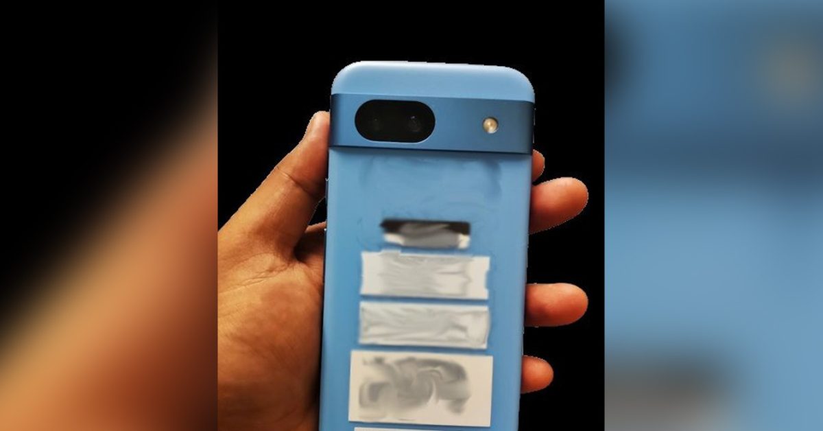
This looks dated in design to me, it looks like 2008 or so when everyone was experimenting with phone shapes and keyboards.
Yeah it looks like those cheap iPhones Apple released a few years back. The Xr?
The 5C?
That’s the one. Jesus, my sense of time passing is fucked up.
Yeah, shits fucked up. That was in 2013!! I remember my brother getting one in blue, it was a really pretty phone tbh I kinda miss them
There hasn’t been any real form factor innovation in a very long time so cycling through the same styles is what we are left with.
Google Pixel 8a leaks
absurdlyearly with absurdly rounded designThis thing looks awful if real.
It seems they are cutting corners, literally.
The rounded corners make it so ugly
Yea it’s a little too rounded.
Don’t get me wrong, soft edges are nice, but the radius needs to be brought in a bit tighter.
They tried to go for the iPhone approach but it just does not sit right with the camera bar. I love the way the current Pixel phones look because they have a very defined design with the squary shape and the camera bar.
I’m positive this is AI generated. I can’t believe 9 to 5 Google fell for this.
The ‘bump’ has a shadow in the two straight-on photos, but the side view shows no height.
The hands holding the phone give it away, too. The fingertips look softened from a filter and don’t have any sign of fingerprint ridges while the palm is much more detailed.
They also look too sharp in contrast to the background.
EDIT: The more I look the more I’m convinced. The side photo and the angled photo are completely different in size relative to the hand. The thickness of the palm is much too large, as well.
Damn. Didn’t notice this, but that thumb looks inverted.
I just want a phone with decent specs that lies flat on a flat surface. Why is that so hard???
You’d take a hit to camera quality. Get a phone case you wouldn’t have to worry.
I’d honestly prefer they just make the battery thicker to match the camera depth. Solve two problems at once.
I don’t care. And a phone shouldn’t need an accessory to be usable
Those are some durable corners. This will be way harder to damage or crack than the current narrower corners.
deleted by creator
I like it. Pity it won’t have a headphone jack and SD card slot…
Is there any chance it’s a compact (<6") size?
Woah I thought the A series was discontinued?
Why?
There were rumors earlier this year that said Google will discontinue a series.
Why would they discontinue their most successful phones?
Have you met Google?
bezels are thick!
Rounded huh that’s her. Going to look the exact same with my phone case on it… We don’t need one every fucking year Google


