[We’ve just put out a quick bump to 0.10.9 to include a few fixes. Notes below apply to 0.10.8 and 0.10.9]
Lots of great changes have been added by our growing team of contributors as highlighted below. If you want to join the team come and say hello at the team discussion on Matrix
Updates should appear on TestFlight and Play Store today.
v0.10.9 Release
iOS:
- App Store - preview release as 0.10.7(32)
- TestFlight (will be visible later today)
Android:
- GitHub
- Play Store
- If you want to stay up to date with the latest releases before it gets on Play Store or F-Droid, checkout Obtainium
Hey everyone! I know it’s been a few days since we’ve released but we’ve got a feature packed release today! Thanks to all our users and the continued feedback, keep it coming!
Change log
- Added MP4 and some redgif support (jjcomer)
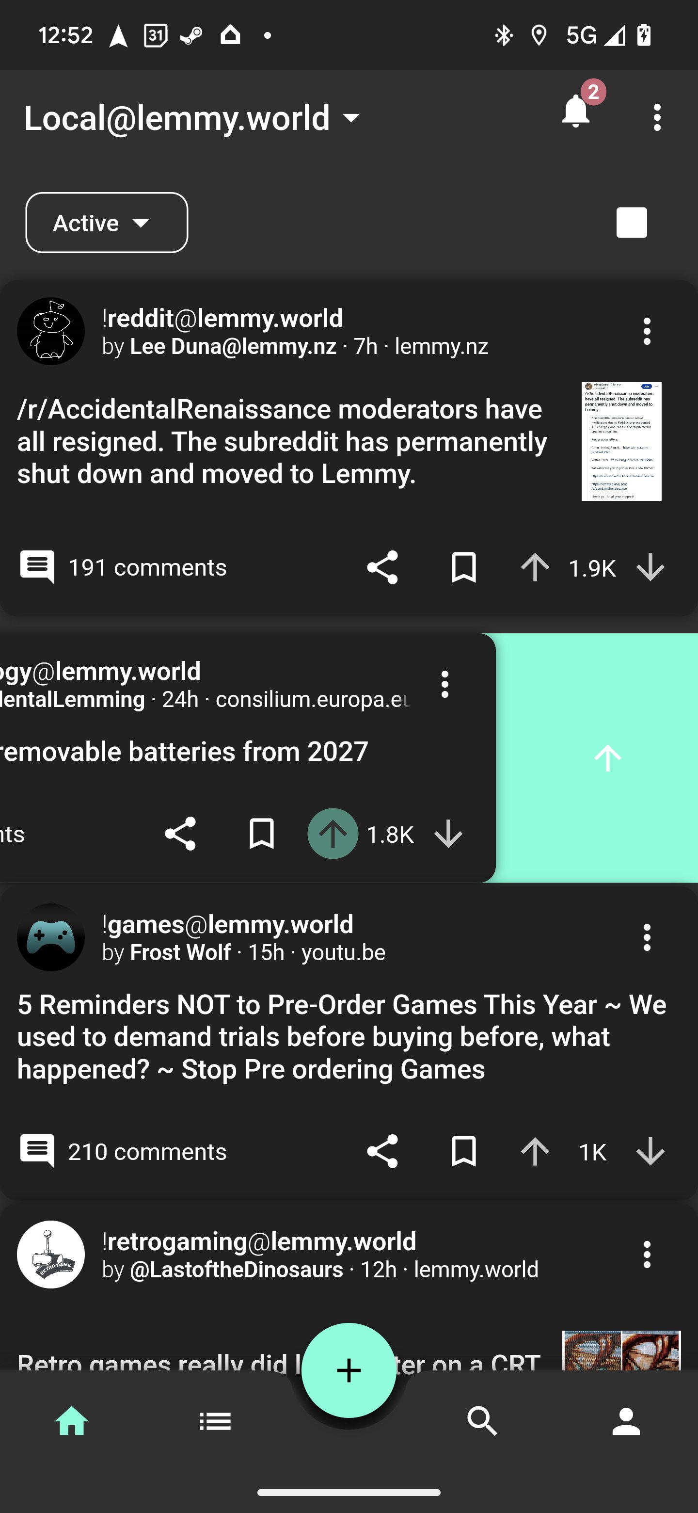
- Added swipe gesture actions! (shocklateboy92)
- Added photo cropping before upload! (mykdavies)
- Added code of conduct and tweaks for iOS release (mykdavies)
- Redesign of home tab and themes colors (swmarks & a_minh)
- Fixed alignment of post pills/chips (mykdavies)
- Redesign of compact view to be more compact (zachatrocity)
- Added help text on account page to help guide the user (mykdavies)
- Added RU (asher) and EO (mykdavies) language localisations
- Tons of bug fixes!
Screenshots
Known Issues
- We hear your concerns about dark mode and will address these.
- Swipe actions against posts don’t always update the post’s icons.
What’s coming
- iOS and Android full release! We’ll keep test flight and early access going for beta testers!
Great update, but I am not a fan of swipe actions. Could you add an option to disable the feature? Maybe I’m blind and just stupid but I could not find this option in this release.
Is there a way to disable swipe-gestures? They do look nice but I constantly save or upvote random posts or comments just by scrolling and fat-fingering
Hi @liftoff@lemmy.world, cool app!
3 questions:
-
In notifications there’s really no need to collapse those comments, could you make it that tapping it would go straight to the comment you’re notified about (instead of trying to aim at the little link icon) and would mark that notification as read (instead of trying to aim at the little tick icon)?
-
Will there be push notifications?
-
When searching via website I get to search throughout many instances and in the app I must select one, either lemmy.world or one I’m on. Also sometimes I can’t subscribe to other instaces’ communities because it wants me to log in so I need to use browser instead. I imagine handling all this federation is not an easy task, you think it will be possible to adress it? It must be the hardest thing to code in the entire app, isn’t it?
deleted by creator
Huge fan of 1. Definitely expect that to be the behavior instead of having to hit the link icon
Second to this, when we go to the comment can we have it automatically do the in context action? I have to hit it every time. I post enough that I can’t remember exactly what they’re replying to
+1 to all, especially number 3
-
Thanks for the update but honestly dark mode is way too dark now. Liftoff had the easiest on the eye dark mode before this so it’s disappointing to see it look like the official reddit app now.
Please can we have an option to bring it back?
Sure we can bring it back!
I agree with this guy, I’ve loved every update so far but this one is too dark. It adds too much contrast which makes it harsh on the eyes.
I cannot emphasize how important this is for my eyes, the sooner you guys can bring this back the better.
BTW, can you provide more info on “compact view to be more compact”. What exactly changed? I have the feeling that the space within posts has been reduced but I am not sure. If that is the case then I preferred to have a more clear separation within posts (already disabled the shadow).
Thanks for being so responsive!
Contrast feels a lot nicer, thanks for the update!
I wish there was some spacing in-between posts though. It feels like they blend in together a little.
Edit: turning off card shadow in compact mode helps a lot
Yeah turning off shadow is great. I should have updated the default. Light mode needs the shadows
I’m going to join the gang of dark mode is too dark.
I see that it splits the comments in half, so maybe if it is possible to add a grey mode that looks like the old dark mode, both sides could be happy.
I use dark mode as much as possible, but this dark mode is migraine inducing to me due to the white on black colorscheme.We’ll add back the grey mode
Yay! I picked Liftoff because it was so much better looking than all those other harsh black apps. This is very happy news to wake up to 🥳
will there be a fix for the sorting in our profiles not working? if you click sort by new, it does nothing :/
p.s: thanks for adding the save post button back in 0.10.9 - saving post works great now.
Awesome! Thank you. <3
Please allow users to choose, I really like the current dark theme. Maybe allow users to change all the colors, not just the accent?
I love the redesign! Looks so much sleeker and the colour for dark mode is better.
Could we have a setting to disable swipe gestures please? Clumsy me will end up accidentally triggering the wrong ones all the time.
Yeah good call, we can do that
Yes! Swipe for back made me back by mistake more than I would like to admit!
It’s one of the only downside I’ve found in the app yet.
I don’t have any suggestions and I had no complaints before. I really like this version and I can only see improvements.
Thanks for all you’ve done.
This is awesome, you’re getting on so fast!
One thought - I wonder if dark mode is a little too dark, could maybe do with being slightly grey/blue and have post shadows off by default (but on in light mode). Love the green dividers in amold mode!
Best Lemmy app by far!
Howdy! I like the app a lot, and I wanted to see if I could help! When I set the app to Welsh, most of the words are indeed not Welsh. I am still learning Welsh but I’d like to help translate the app if possible.
However, the Weblate instance you have linked on Github confuses me, I can’t sign up (edit: 405 error) and I am unable to find the directory containing Liftoff, it just redirects back to the parent directory.
Thanks for your hard work!
Bore da, we no longer support that weblate setup, so we do need to update that page.
In the meantime, if you want to get an idea of the task ahead of you, have a look at this file. Each piece of text starting >>> indicates a missing Welsh translation. As you can see, there’s a lot to do there. If you’re involved in any Welsh-speaking communities it might be a nice shared activity that could spark some interesting discussion.
If this suddenly seems very daunting, don’t worry, we will get there eventually.
Diolch!
Hwyl, mykl, bore da iawn!
Thanks for the link. It is a lot but I am excited to practice. It would probably take me a while between work and university, but I anticipate the update. Let me know when Webulate is updated.
Appreciate the update, but the central drop down for feed choice now having been moved to one side, feels really unbalanced…& detracts from the app origins…Much preferred the central positioning of all the prior versions…
I think it’s better on the side. I feel more at peace with it
deleted by creator
I much prefer it on the side. It previously looked very obtrusive and out of place.
Feels a bit lopsided, as there was a nice symmetry to it being centralised, which gave the app its original character…
deleted by creator
Yes please, this. Notification replies should take me to the comment!
Personal preference I guess but I preferred the greyer UI. I find the text easier to read on a lighter background. Be cool to have an option to change the background colours as well.
Great update. Love the swipe actions.
They’re kinda fun! Just been figuring them out to upvote you!
I just want to thank you, I always liked Lemmur more than any alternative and missed it. I am happy to see the project brought back to life.


