Edit: This link is outdated, see new poll here https://programming.dev/post/190520
Hey everyone
Wanted to run a poll about the community icons to choose between a couple options
Option 1 - Use UBP icons - Use unified icons for all of the communities similar to beehaw

Option 2 - Use UBP for general communities and specific language, etc. icons for specific communities

Option 3 - Dont use UBP icons
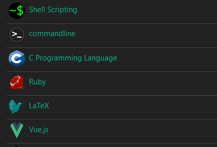
Vote using the strawpoll here (doing strawpoll so it can be ranked voting) [removed in favor of new post]
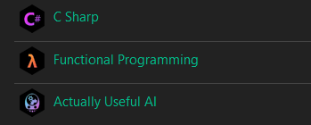
EDIT: I have remade the poll with two more options. If you voted in the previous one please vote again in this. The new options are just for adding different colored gradients to the unified icons for different communities
Quick example of this:



While I personally like the idea of having the shape be decided by user/instance CSS choices, would that not potentially reduce the immediate brand recognition, when those outside our instance see our community icons?
If folks vote for the UBP option, then I think that unified color palette and aesthetic would be a reasonable enough clue of instance origin.
That said, if we did hardcode shapes into our instance icons, it’s not like there’s a lot of maskable radial shapes to choose from that would:
With hexagons, octagons, rotated 45 or 30 degree offsets, at tens of pixels font heights: those are hardly differentiable at some point. So regardless, we could easily collide with other servers already that choose hexagons, or any polygon that fits in Lemmy’s minimum circle mask.