
- cross-posted to:
- climate@slrpnk.net
- cross-posted to:
- climate@slrpnk.net
You must log in or register to comment.

Don’t worry now we have AI stuff and it will solve all out problems
AI driven carbon sequestration Temperature reduction with neural networks deep learning
See? You can relax now, silicon valley tech and the invisible hand of capitalism will solve everything
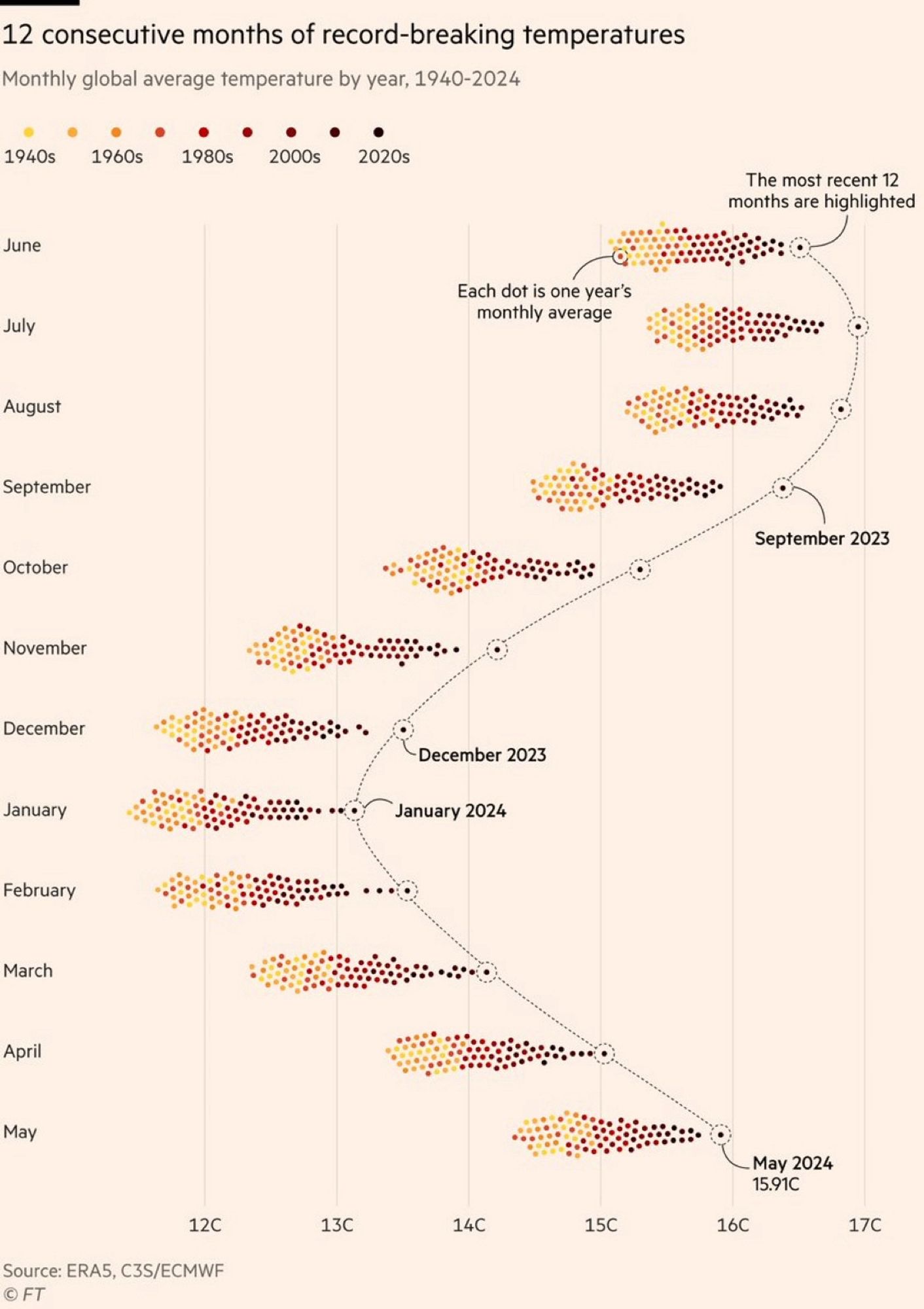
This is a really interesting visualization. I love the density of the data and the way it captures the year over year variability by month while allowing the annual variability to plainly stand out. This is really good.
In a deep red area here. Talked to locals and they say our temperatures have always fluctuated and that this is just a cycle. I explained that the CO2 in the atmosphere has been climbing steadily and it is at the point it was 100,000 years ago, (actually it was 33 MILLION years) - their eyes glaze over.
this doesn’t add up, Jesus made the world 4,000 years ago
I like this graph a lot. It’s different, beautiful and gives a good overview. The colors could have been slightly better though.
This graph alone conclusively proven global warming.
I’m just hoping that this past year’s jump is due to El Nino and/or higher solar activity and that we have a decade or more before those temps are normal (or low since it’ll keep trending upwards for at least 30 years after we stop releasing carbon).
Hoping but not holding my breath.
banning sulphur diesel fuel on ships explains it
*contributes
If it was possible I would put quite some money on that geo engineering (like stratospheric aerosol injection) will be seriously discussed on a UN level within ten years. Climate change seems only to speed up and co2 emissions are still rising. At one point there is simply no alternative.
There already is no alternative. The amount of CO2 released is going to stay high for a long time (centuries?). People are dying from the current weather.
For the expected response: We need to also stop making things worse. Humanity can do two things at once.
I also think that this is what will happen (not only discussed) but unless we master fusion it’s practically just fixing a symptom and we’d have to do that for quite a while and the oceans will probably become too acidic.
Fusion would solve a lot, but even if we invent room-temperature superconductors today, it would still take so much time to roll fusion out on a big scale and replace oil infrastructure with electric infrastructure.
I tend to be very pessimistic about climate change, but I hope I’m wrong.
Wouldn’t aerosols reduce solar irradiance globally, hence reducing the rate of photosynthesis globally…which further reduces natural CO2 capture? How would that help?
No. It can be localized (for large scales of localized).
Also, we are finding through putting solar farms on crop fields, sun light is not the limiter on photosynthesis for many plants. Many plants get too hot, loose moisture, and photosynthesis less.
Nah, Sulfur compounds can lower albedo. That’s actually quite possibly what happened here and why we have sudden outlier acceleration.
Bit horrifying they put that much in the air.
Yea. They were basically burning the tar like leftovers from fuel distillation and there was a lot of heavy tankers moving from East Asia to the US.
Took me more than a minute to realize that only 4 months of this year hold the record. Well, let’s wait for 2030
Edit: nope. Last 12 months indeed beat the records consequently . We’ll all soon die. The only good thing I can see from this graph is that the shift is even, meaning the seasons are still predictable.
What month of 2024 dosen’t hold the record?
Probably the ones that haven’t happened yet.
April, March and FebHaha we’re doomed
Dumb libruls think global warming is real, when 6 months out of 2024 are not
yetbreaking temperature records! Half the year is not even hotter!
The most recent months are the records, are they not? Yeah December 2024 doesn’t hold the record yet but it hasn’t happened yet. The most recent 12 months were the hottest
Visualization looks misleading then
Top right corner: “the most recent 12 months are highlighted”
We will probably be underwater in 2030.
I think that I should become a captain in a supertanker…
It’s not going to get that deep, or do so that fast.
I am thinking about buying some beachfront property near the Fall Line for my descendants to inherit, though.
Fortunately it will take more than 6 years for coastal cities to start flooding that much. By the end of the century it is forecasted to go up by less than 2 meter worst case. In 2000 years it could rise as much as 20 years if the temperatures rise 5°C.
Additionally it is much easier to just move to higher ground.
Additionally it is much easier to just move to higher ground.
Yeah, because rebuilding most of the world’s major cities all at once is no big deal at all.
Much smaller deal than staying and letting them flood.
Much, much bigger deal than not letting the Earth warm enough to flood them in the first place.
As if corporations are going to do that, haha

We’re cooked or gonna be. Given we’re still full swing energy craving, reversing the inertia of this massive shift isn’t gonna happen in a lifetime
Depends whose lifetime. Mine, maybe not, but for my children - yes. Also depends what indicator - global CO2 emissions maybe falling this year, but temperature will lag decades, sea-level even more (btw I do model these scenarios, so know well how they diverge ).
This is graph of economy doing better than ever.
Why does it seem like this is only the northern hemisphere and not truly “global”? Shouldn’t it be warm in the southern hemisphere when it’s cold in the north? So shouldn’t these groupings generally hover around an average between northern and southern hemisphere temps?
Because the northern hemisphere is mostly land mass and the southern hemisphere is mostly ocean. Land heats faster and cools faster than ocean, thus the seasonal effects are more pronounced in the data.
Same with CO2 patterns which gives a similar yearly ‘breathing effect’
What’s your source that there’s not warming in the southern hemisphere?
The temperature readings would look different because winter and summer are flipped, but they absolutely should be attributing a similar effect.
That’s what I thought… But if it’s winter in the north then it’s summer in the south, so you’d expect them to average in a way that you wouldn’t see such stark differences between say January and July. In July it’s winter in the south, summer in the north. Intuitively I’d assume they’d average. Temps would still be rising year over year, but you wouldn’t see a difference between months. A couple people have answered that it has to do with the earths tilt and the fact that there’s more landmass in the north. Seems plausible I guess.
Huh… So it does. Interesting.
The way earth rotate around the sun is not a perfect circle, but more like an ellipse, that plus the earth rotational axis makes the summers and winters of the global north and south don’t correspond exactly. This is why there’s a difference of ~4 Celsius between average January vs average July.
Ladies and gentlemen, we’re royally fucked.
It took me a while to read that chart, meybe the heat I don’t know.
But what I got is roughly 1.5°C increase in the last 80 years, is that correct? Would be nice to see this compared to the previous 80 years.
nuke europe
Why Europe ?
cause we need more land and they did global warming anyway
(includes european settler states)
Who?
europe (including european settler states)
off the top of my head, USA, Canada, Israel and Australia but probably not New Zealand and South Africa.
Russia merits further discussion
Japan, South Korea and Saudi Arabia could also belong on the list
Who is we? Russia? Are you saying the petrol state Russia is less responsible for global warming than European countries? And how are you counting China, including them as settled from Europe somehow?
Nice graphic. Although probably you’d see more info with just a lineplot, separating north / south + land /ocean. What strikes me is how regular the gap is over the last year, and how it bulges most in July-December, which suggests the ocean (larger and less variable) dominates the numbers, with El Niño overlaid on steady warming trend. To get it back down quickly, we need more effort on short lived gases - mainly methane (tackling aviation-indeed cirrus might also help compensate for reduced ship-sulphate cooling ) .
There are layers of variability there that can’t be captured with a line plot. The data density is too high to even capture the decanal progression in a useful way, forget about monthly and annual variability . So no.


