That is inaccurate. The correct way to use the tool is to lay the continent over the US. It skews the size and scale appropriately in order to provide an accurate measurement.
It’s also larger in area than the US, including Alaska and all territories.
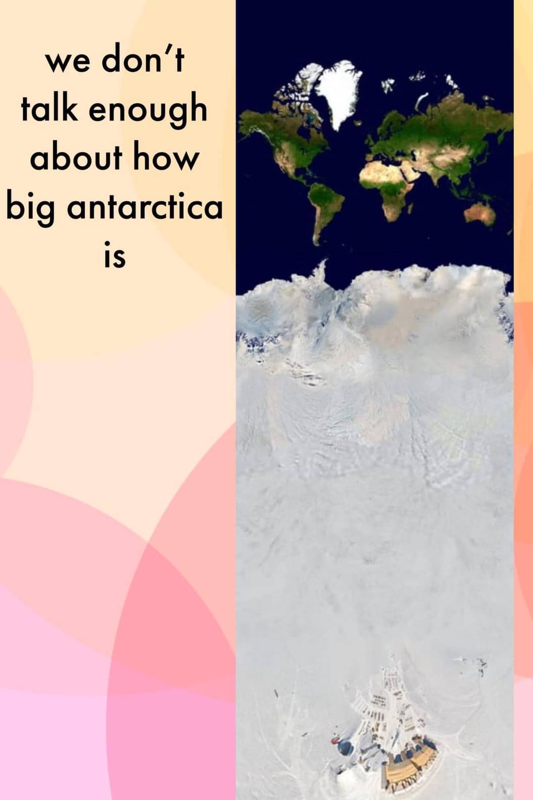
The total area of the US and its territories is just over 3.8 million square miles. Antarctica’s area of 5.4 million square miles makes it 1.5x the size of the US.
The correct way to use the tool is to lay the continent over the US.
Typical American, declaring that the US is the default country to compare every other country to!
On a more serious note, putting things side by side is the same as putting them over each other. Difference in height are not the same though, as closer to the equator size shrinks. The best way to compare is take two things and put them side by side on the equator - that’s where there’s least distortion.
How very nationalist of you to assume America-centrism where it is completely irrelevant. The comparison that was in dispute was the size of Antarctica vs the size of the US. I was clarifying how to use the tool. You’re still using it wrong, and now you’re being a tool. lol
Why do you think the static grey map is in the background? The entire point of the tool is to overlay one nation upon one of the nations on the static map for accurate size comparison. It’s demonstrated clearly in the pop-up instructional video displayed when you first open the website.


That is inaccurate. The correct way to use the tool is to lay the continent over the US. It skews the size and scale appropriately in order to provide an accurate measurement.
It’s also larger in area than the US, including Alaska and all territories.
The total area of the US and its territories is just over 3.8 million square miles. Antarctica’s area of 5.4 million square miles makes it 1.5x the size of the US.
Typical American, declaring that the US is the default country to compare every other country to!
On a more serious note, putting things side by side is the same as putting them over each other. Difference in height are not the same though, as closer to the equator size shrinks. The best way to compare is take two things and put them side by side on the equator - that’s where there’s least distortion.
How very nationalist of you to assume America-centrism where it is completely irrelevant. The comparison that was in dispute was the size of Antarctica vs the size of the US. I was clarifying how to use the tool. You’re still using it wrong, and now you’re being a tool. lol
First sentence was a joke - hence “on a more serious note” for the next sentence. And if you think I’m using it wrong then, well, best of luck to you.
Why do you think the static grey map is in the background? The entire point of the tool is to overlay one nation upon one of the nations on the static map for accurate size comparison. It’s demonstrated clearly in the pop-up instructional video displayed when you first open the website.