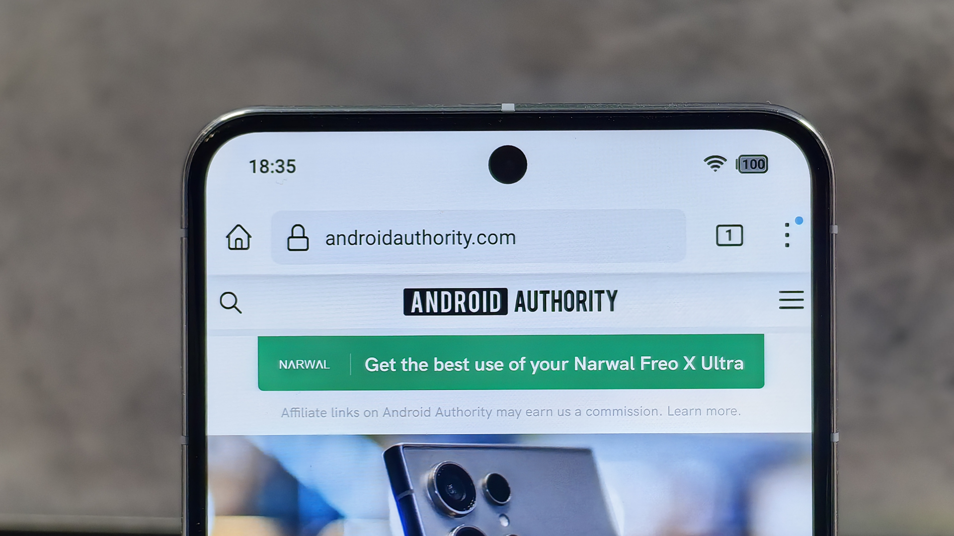
Those are not material icons, please don’t google
hopefully these are just a test or something
It was good while it lasted. Nearly 10 years. ⚰️
Wow. That battery looks truly terrible.
Fuck.
Why? It’s pointless but not detrimental imo.
because it’s pointless and annoying on top of all the other annoying bull crap Google has been pulling over the last 5 years.
These look a lot like iOS status icons, but I’m not familiar enough to say for sure
Yep, specially the battery icon.
Ew… That is the ugliest battery icon I’ve ever seen. Can I just keep it the way it is now, please?
So change for the sake of change. The new icons are fine, and I even slightly like the revamp to the battery icon, but this is still just pointless.
Also, my near stock Android 13 phone already gives me haptic feedback when I long press the quick toggles, so this is not even a change.
This is a belated April Fool’s joke, right? This looks horrendous. Like the ugly child of iOS and Samsung icons.
They’re finally reverting the separation of battery icon and numeric percentage? Sweet! I never liked the current implementation.
But other than that, it really doesn’t look significantly different.
I wish Google would use the haptics engine more. It’s been incredibly capable since the Pixel 6…
I actually hate haptics on phones unless it’s for a notification or phone call. It’s always the first thing I turn off when I get a new phone. Vibrating on button presses is obnoxious to me.
Funny, I think it’s used a ton and it’s so ubiquitous in some situations that I forget it’s even there, but immediately notice it’s absence.
I just want the option to have my quick access icons be circular buttons and not this massive blob BS. I got pretty used to having like 20 (maybe a couple less) things that were all accessible from a single spot. It was nice.
“Nope sorry, for accessibility reasons we decided these particular buttons, and only these buttons, need to have the full name as big as possible, a real-time info lines, and an absurd amount of space around them”
And as everyone knows, the key to accessibility is not having options or variations of any kind!
No no please no


