

You must log in or register to comment.
I’d much rather look a simple sorted table or a bar chart.
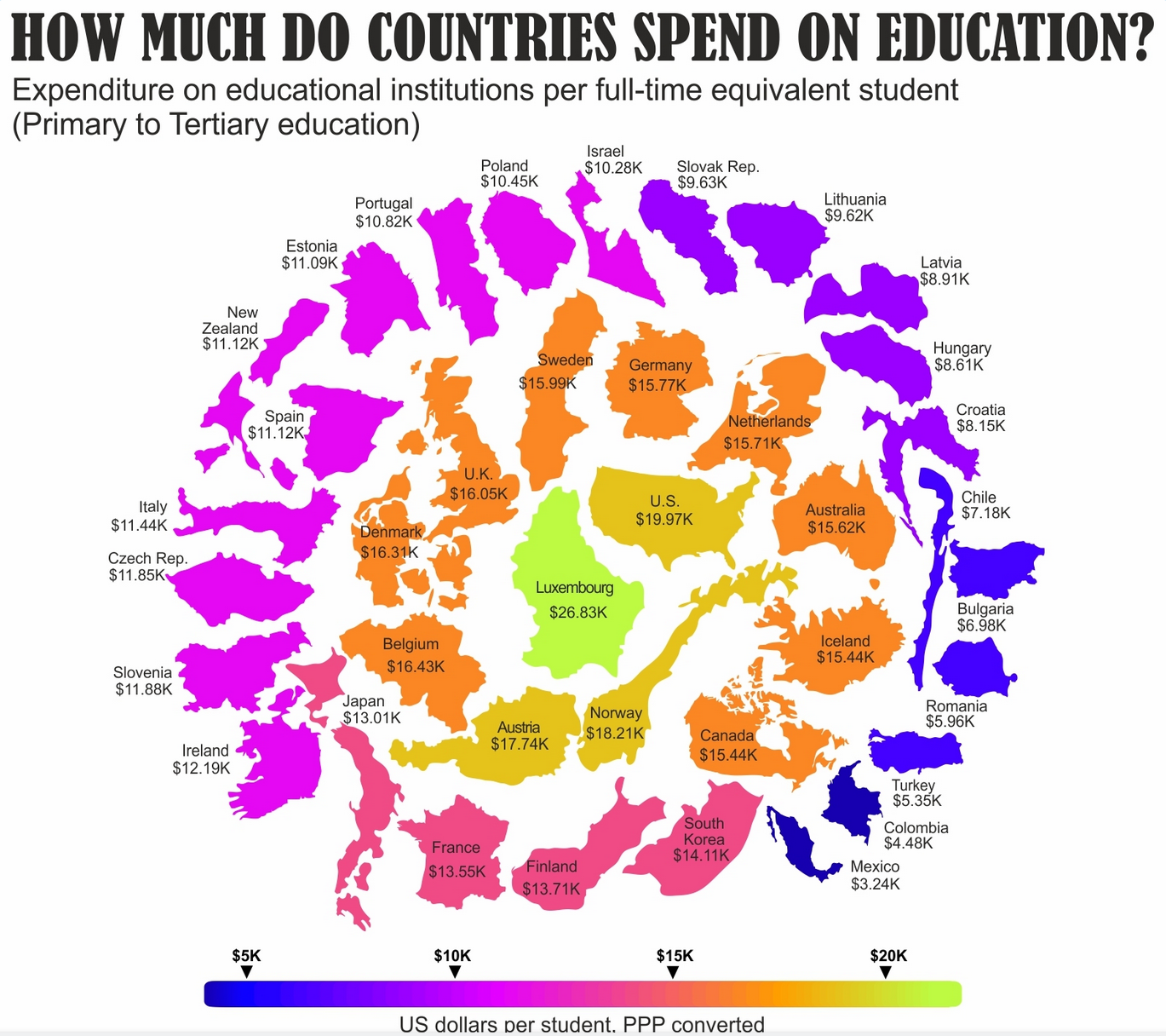
For me the country outlines don’t add anything of value and they aren’t too scale either with arbitrary rotations mixed in. Spending is on a strictly one dimensional scale yet the graphic implies some concentric (2-dimensional) pattern.
Remember, just because the money is spent, it doesn’t mean it is spent well. I’m sure a lot of the US dollars are fed into sports programs and other spending, and not directly towards efforts that would benefit the most students or workers.
