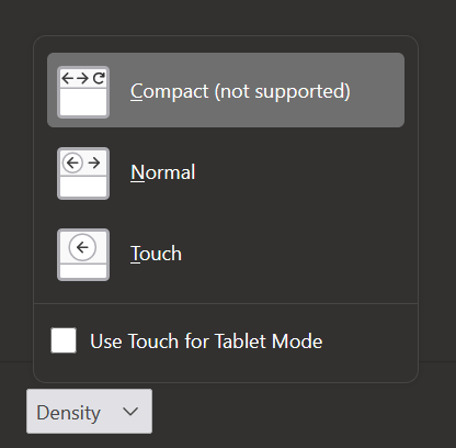
In general I like the proton UI, but I really wish they hadn’t removed the compact layout option.
You can enable it in about:config (for now). It then becomes available and it works, but with language indicating that it isn’t supported.

I didn’t know about the compact setting, thanks! That was my only complaint with Proton as well. I don’t have a large screen, so that vertical space is extra valuable.
I guess I’m one of the few who like the new shape of tabs. I only missed the compact mode but I found a way (on the internet) how to bring it back. Then I restored my old theme and uploaded it to Mozilla for sharing and I’m happy. :D Here’s my theme: https://addons.mozilla.org/en-US/firefox/addon/dark-and-brownish-theme/
deleted by creator
I just tried my theme on Thunderbird and it works perfectly! Which IMO is a good thing for what Mozilla have done - thus we won’t have to create a separate theme for Thunderbird. :D
It’s really starting to annoy me how even technical people are taking to this change as if it’s some terminal fate that needs exploiting of every possible workaround to “fix” it.
Firefox’s UI can be changed pretty much however you want with a userChrome.css file. Knowing the basics of CSS, it’s not even that hard to write your own theme changes.
For example, as far as I can tell, most people are annoyed by the tab shape. That takes 4 lines of CSS to change it to essentially the same shape as it was before:
.tab-background {
  border-radius: 0 !important;
  margin-block: 0 !important;
}
And figuring that out took me like 10 minutes, without looking up how other people did it.
Just in general, I would expect technical people that are so picky about their theme, to have their own theme anyways.
Obviously that might break, when Mozilla moves UI elements around, but once you’ve fixed that, you really wouldn’t need to care what Mozilla has changed.In addition, the previous settings is going to be removed in next release damn


