- cross-posted to:
- formula1@lemmy.world
- cross-posted to:
- formula1@lemmy.world
You must log in or register to comment.
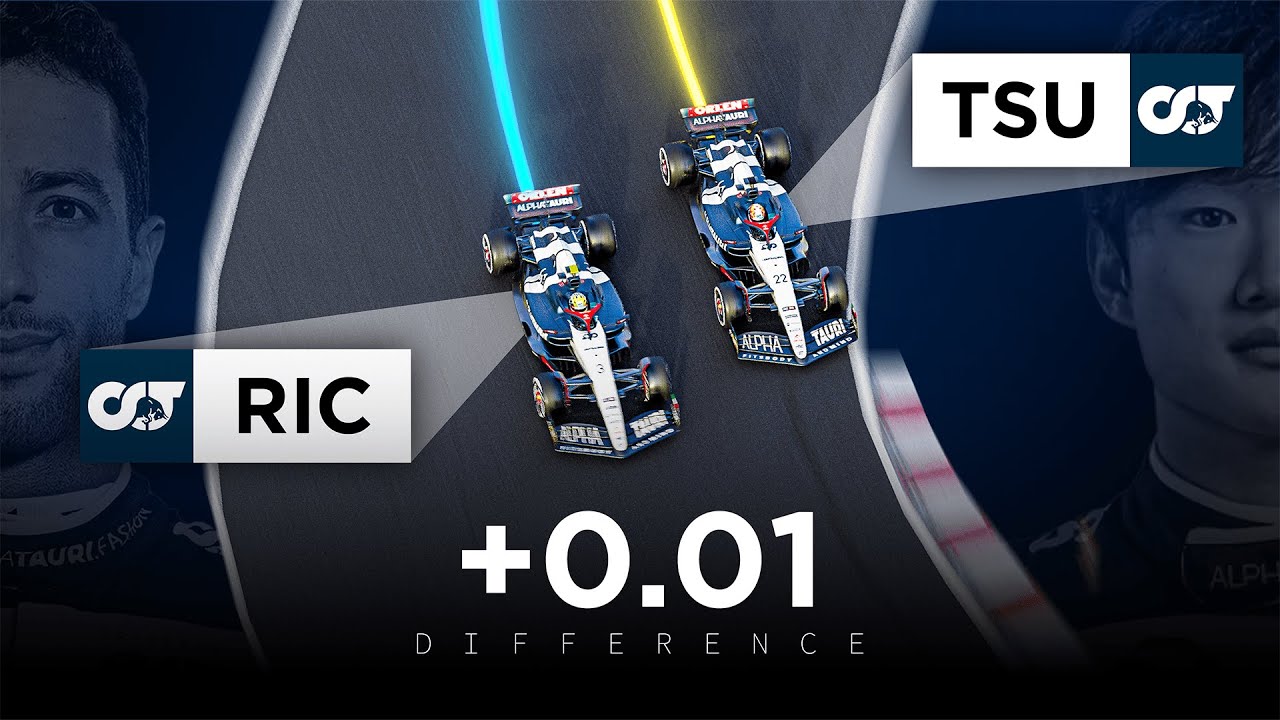
I love F1 addict’s youtube channel showing these visualizations. Honestly more of these should be made.
It’s a great way to compare driver’s moment by moment around a lap. Really understanding why a driver/car is better than another
Would be interesting to see different comparisons e.g. 1st and 10th. They’re all close for the most part.
Whole grid in Q1, Q2, Q3 would be super fun imo.
Impressive.


