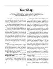
I like this, but it’s very visually plain. I think it’s formatted decently, and the bold lettering helps to make the main points stand out.
You must log in or register to comment.
I like the simplicity of it, but I agree that it’s plain. I think it could use a couple of pictures. If an updated version were made, the text could be almost the same, but I would add 1-3 photos of workers in different phases of successfully organizing their workplace.
Removed by mod
It’s amazing how 100 year old writing still holds up pretty well, isn’t it?
Removed by mod