

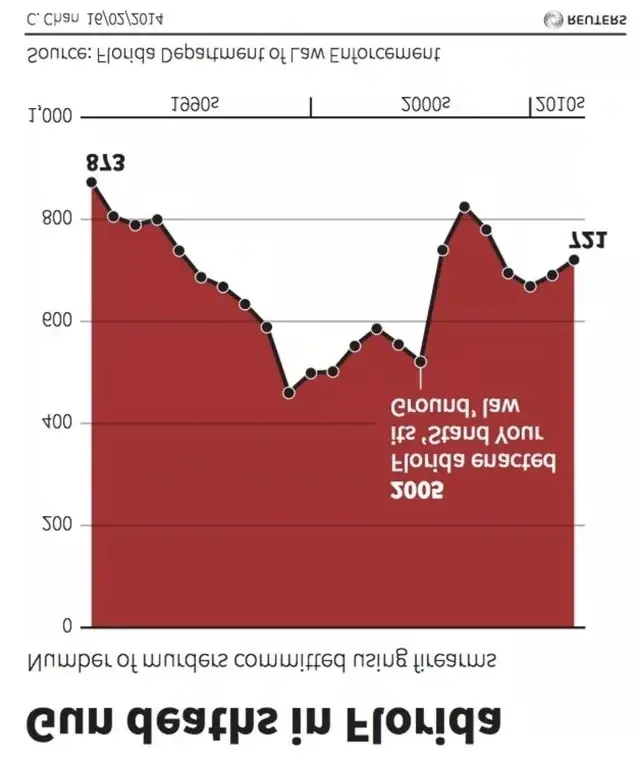
Oh wtf, it took me a second to see it hahah 🤣. Stellar graphwork from the pigs in Florida.
Same, when I saw it I said “no freaking way.” The sheer audacity.
I didn’t even notice until I saw your comment. Excellent eye and thanks!
Don’t worry I got you.
perfection
intended audience: Mussolini
Lmaooo
As someone whose statistics professor gave all of his lectures in a fun house where he projected the slides across the mirrors, I must greatly commend the FDLE for its accessibility efforts of tailoring this diagram to my specific preferences
IIRC the indeed effect was for the graph to look more bloody, to indicate more violence, but it’s very poorly done
Idk
This seems too ridiculous to be an innocuous mistake. Who just flips the Y axis for dramatic effect?
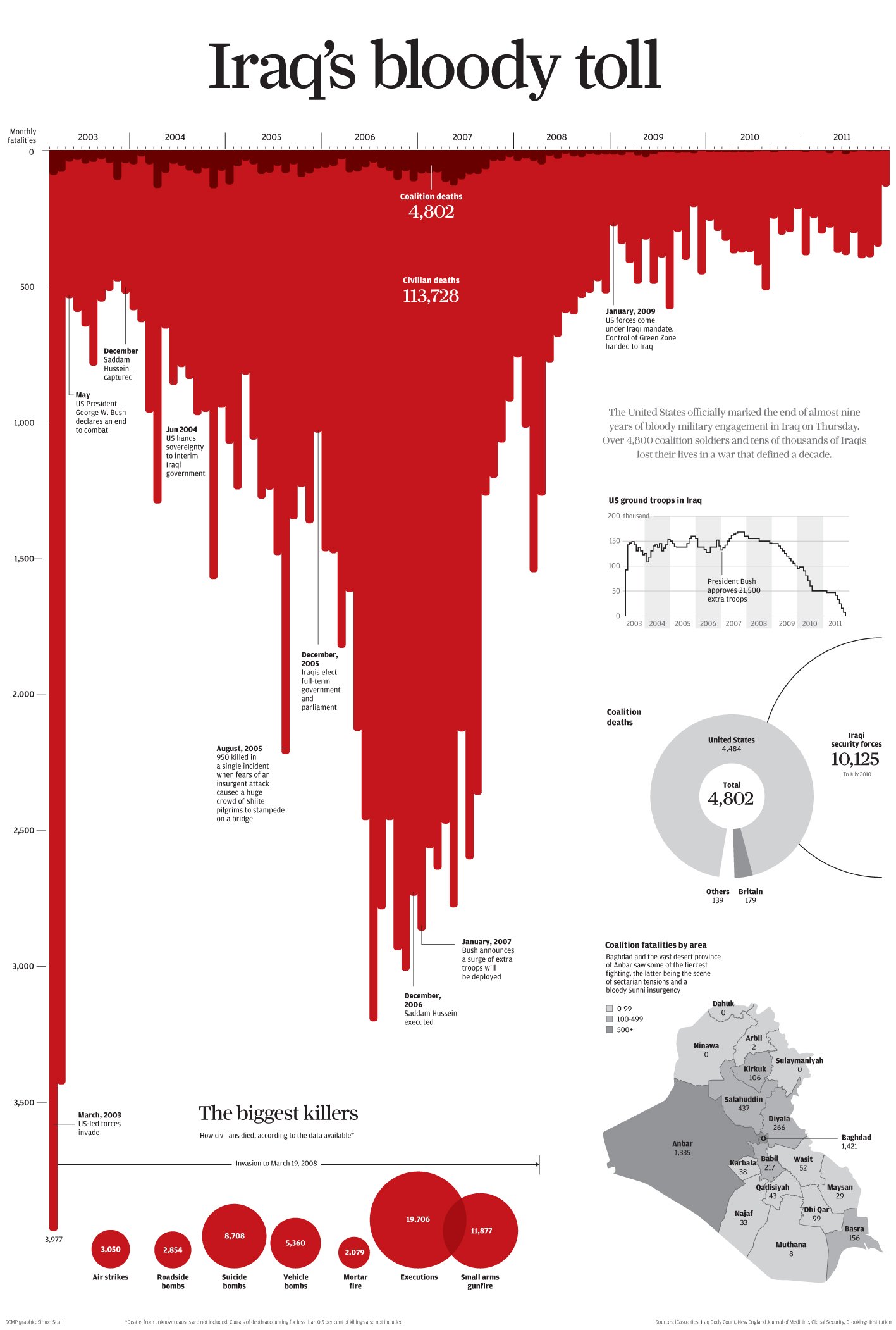
It was a bad attempt at mimicking this chart from a 2011 SCMP article
I understand that you are not defending the graph. Just want to point out one thing that makes all the difference. This graph has the X axis on the top which makes more sense and actually makes the red look like dripping blood. OP graph has the X axis at the bottom which is why it looks like a scam attempt.
Yep, at a glance I had no problem understanding the SCMP graph but the florida graph took me a bit. Axes make all the difference.
Edit: also the captions on the bottom of the graph, so it flows logically. The florida graph has the caption at the top of the bullet point
deleted by creator
graph go down mean good
Reuters coming through with the shittiest chart presentation
The graph was sourced from the Florida department of law enforcement. Hard to tell if it’s upside down because a dumb ass cop drew it, or is it intentionally manipulative? Remember that cops don’t go to college.
I think it was intentional, most people won’t look twice at a chart
not sure if that was sarcasm but , some states require college degree before becoming a peace officer.
GIMP to the rescue:
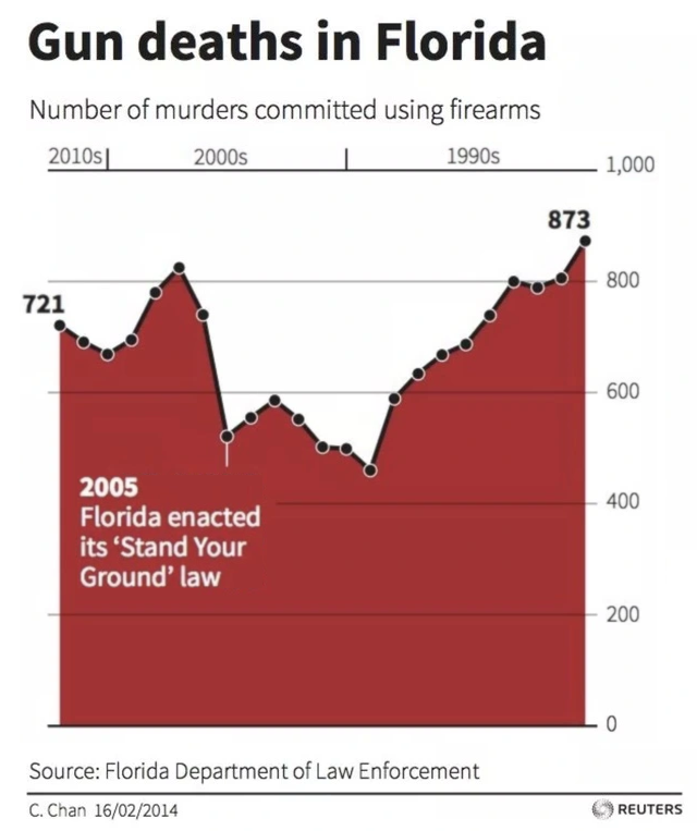
On first glance it still seems like gun deaths are overall increasing, since the time axis is mirrored relative to the usual orientation.
Yes, you’re right, I should’ve flipped it horizontally as well.
Thank you for taking the time to edit it anyways, there is no way I could be bothered to do that xD
Why is this graph inverted?


