

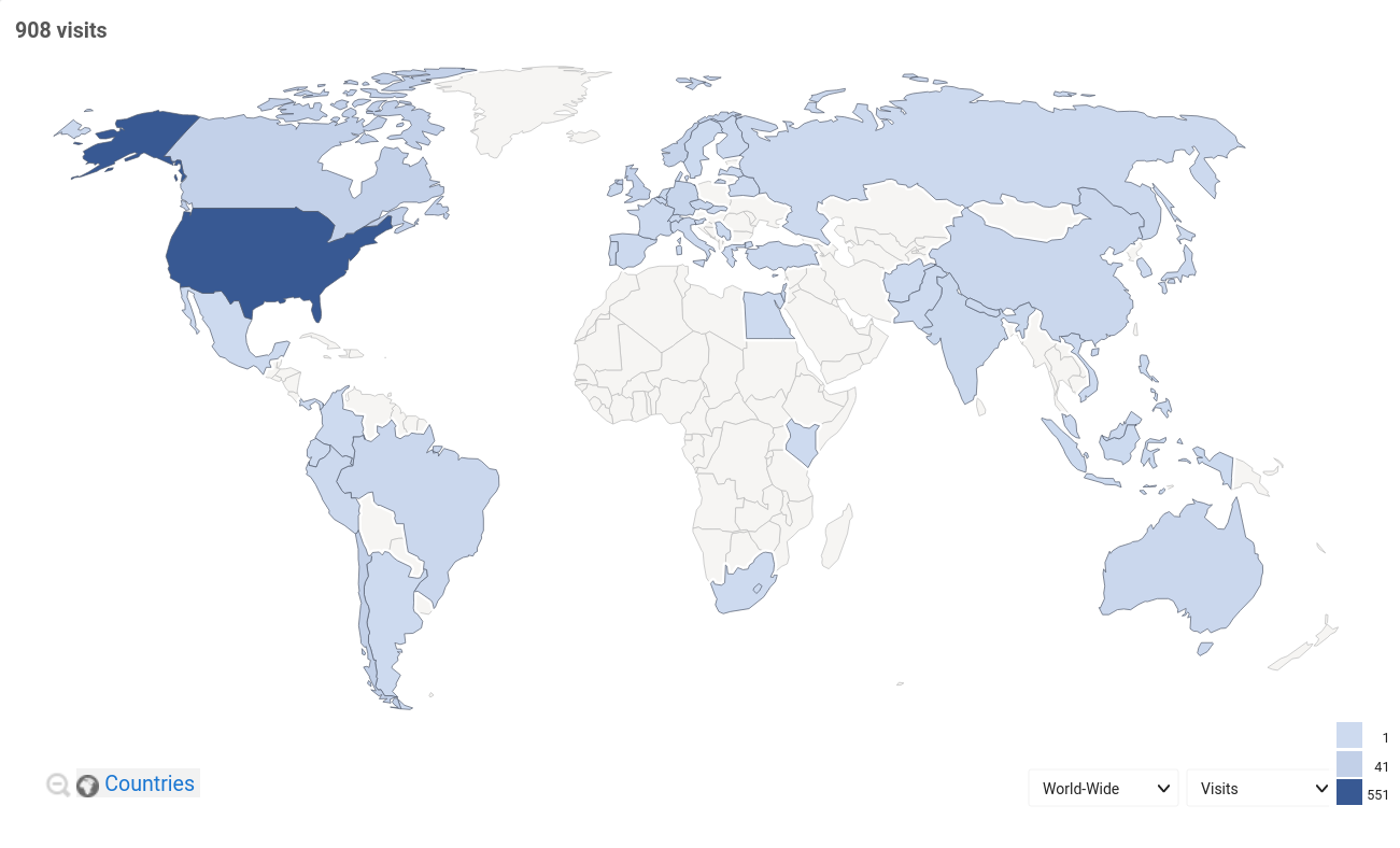
Mostly a reflection of our Twitter. Our most active Twitter editor is from the United States, and so he tends to speak about Statesian trends, events, etc.
The fact that we achieved more users by doing that shows that it’s an approach that’s giving us more readers than doing nothing.
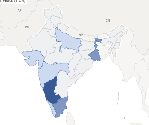
EDIT: This map is generated from data produced between 16 and 23 June
I preferred the older map with the precise blips. It was interesting to see for example that the activity from India came from the parts with local Communist governments.
Here you go, comrade, let me know if you’re interested in more specific data, if available.
EDIT: Updated with data between 16 and 23 June.
Thank you, very interesting!
Interesting, the red corridor is almost untouched.
Better yet that we are reaching areas where the dominant ideology is pervasive
It looks more diverse now, nice.
