
It would be nice if it could be used.
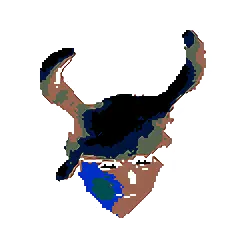
Okay, I did the best I could, this is what I was able to make.

And it really catches your eye (See? :slightly smiling face:) in the post feed. Job well done, I’d say.
I like this one. The colors seems good here. The blue use to be related with security/privacy already and the purple seems to represent a neutral or mostly dangerous environment ( purple = red (dangerous) + blue (privacy/security) ).
Maybe the shield could have a closed eye or “forbidden” symbol on top of the eye like an anti-surveillance shield.
And here’s a bit of a better version of the previous one.
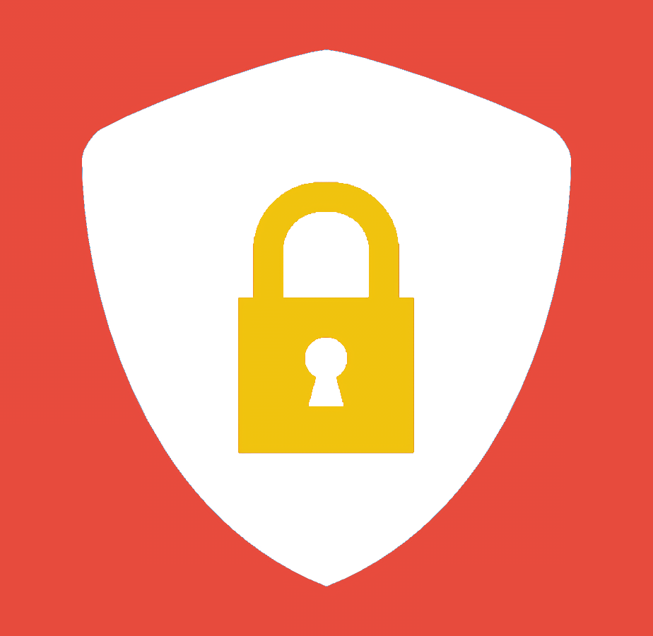
this one is very cool, thanks a lot 🤗
it’s a nice looking logo, would you say it’s fully appropriate and fits the theme? in the sense that it highlights security, (or at least i see it that way) which does not equal privacy, what are your thoughts?
Yeah, I just didn’t know what to do exactly so well. Privacy Tools uses a shield as a logo, tho.
What about the same idea but with a mask instead of a lock?
a mask or an eye could be fit well I think.
I would say the eye may be even better for this. It evokes surveillance or watching over us feel in me, which is probably exactly what this community wants to prevent.
You could offer this logo to !security@lemmy.ml then. It is a less active community for sure, but the logo might fit it perfectly and the community has no logo so far.
Yeah, I think that’s a good idea, but I want to try to fix a bit before since the borders of the shield have some colour of the previous background.
I really like it, a lock does imply privacy to me at least.
I agree, the logo is cool but I find that it represents more security than privacy.
I like the logo but I have a question. Do you have justification for the chosen colors?
I just think they look nice, do you have a better colour palette?
check this : https://www.creativebloq.com/web-design/12-colours-and-emotions-they-evoke-61515112
It’s interesting to try to match colors with emotions you wanna give :-)I have never thought about used colours properly, to be honest. Maybe it is the time to give colour spectrum a try and figure out when to use which one. Thanks.
np ;)
Mmmm, it is difficult for me relate “white” with the shield and “yellow” with the lock.
If you tell me what colours to use I’ll change them, I’m kind of out of ideas and I don’t want to think so much in one day.


